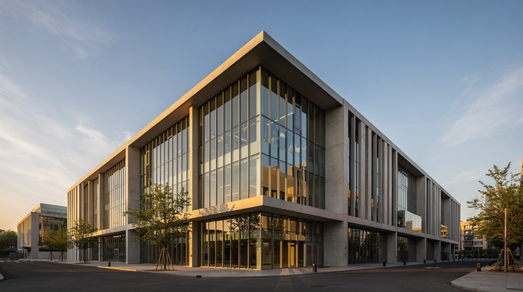
Every successful render starts with a decision that has nothing to do with materials or lighting: where to place the camera. The angle controls whether a space feels generous or cramped, believable or distorted, premium or flat. I’ve seen beautifully modeled scenes fall apart because of a careless camera placement — and I’ve also rescued mediocre scenes with a well-chosen view.
Why camera angle matters in architectural visualization
Camera angle is the first real design tool you have as an archviz artist. It dictates the visual hierarchy, the sense of scale, and whether the space reads as practical or artificially stretched. I’ve lost count of how many times a client asked for a dramatic low angle only to complain that the room didn’t look “real.” In architectural visualization, the best angle is rarely the most theatrical one; it’s the one that explains the design in a single frame and backs up the purpose of the render.
A solid camera setup does three things simultaneously:
- presents the building or room honestly, without misleading proportions;
- leads the eye directly to the main design features — the island, the fireplace, the façade rhythm;
- keeps perspective distortion under control so the image doesn’t scream “fake 3D.”
When the angle is off, even a flawless model and PBR materials can’t save the image. The space looks cramped, skewed, or simply untrustworthy.
Start with the render’s purpose
Before you even think about placing a camera, pin down what this particular image is supposed to do. A hero shot for a developer’s website has a completely different job than a technical view for an architect’s design review. When I start a project, I always ask the client a few targeted questions about the final use — it saves hours of iteration.
Common rendering goals
- Sales image: make the property feel inviting, aspirational, and emotionally convincing. Often works best with a warm three-quarter view and a hint of lifestyle.
- Design review: communicate proportions, circulation, and spatial relationships accurately. Needs a more neutral, eye-level, undistorted framing.
- Portfolio hero shot: build a memorable composition that shows off your lighting and material skills. This is where you can be slightly more creative with framing, but still keep the space readable.
- Marketing detail shot: focus on a material palette, a feature wall, or a furniture arrangement. A tighter lens and a lower, more intimate camera position work well.
- Exterior presentation: explain massing, façade character, and the building’s relationship to its surroundings. Often calls for a three-quarter or elevated contextual view.
A render made to sell a home should feel approachable; a render made to verify a kitchen layout should prioritize clarity over mood. The same room can look completely different depending on which goal you put first.
The most important camera angles in architectural renders
There are a handful of reliable angles that cover the majority of architectural visualization work. These are the ones I return to again and again, adjusting only the height, focal length, and framing based on the project.
| Angle | Best used for | Strengths | Risks |
|---|---|---|---|
| Eye-level | Interiors, exteriors, lifestyle scenes | Natural, believable, easy to read | Can feel ordinary if composition is weak |
| Three-quarter view | Exteriors, rooms with depth, hero shots | Shows volume and side surfaces well | Too much angle can make the space feel skewed |
| Frontal view | Elevations, symmetrical spaces, design clarity | Clean, controlled, graphic | Can feel flat if there is no depth |
| Bird’s-eye view | Site context, master plans, large interiors | Excellent overview and orientation | Often loses emotion and realism |
| Low-angle view | Tall façades, dramatic exteriors, statement architecture | Makes architecture feel monumental | Can exaggerate scale too much |
| Detail/close-up | Materials, fixtures, furniture vignettes | Strong atmosphere and tactile appeal | Hides spatial context |
Best camera angle for interiors
For interiors, I almost always start with a human eye-level camera paired with a moderate wide lens. It’s the least risky setup and keeps the space feeling like something you could actually walk into. I’ve experimented with dramatic tilted shots and ultra-wide angles, but in the end, the client usually needs a view that looks like a well-shot real estate photograph.
A practical starting point for interior camera height
Here are the baseline heights I use before fine-tuning based on the room’s character:
- Standing feel: 1.5–1.7 meters. This is your default for living rooms, hallways, kitchens, and general marketing shots. It matches how most people experience a space.
- Seated feel: 1.1–1.4 meters. Lowering the camera even slightly makes a bedroom, lounge, or dining area feel more intimate and relaxed — like you’re sitting and looking around.
- More room overview: slightly higher, maybe 1.8–2.0 meters, but only when you need to clarify the layout. Push it too far and the view starts to resemble a surveillance feed, losing all warmth.
A standing-height camera is my default because it avoids the “model look” that plagues so many renders. A lower camera is great for cozier spaces, and a higher one can be useful for open-plan areas or to show how one zone connects to another. But always ask: would a real person naturally see this view?
Lens range for interiors
The focal length matters more than people expect. A realistic lens keeps vertical lines controlled and proportions honest, which is far more valuable than a “cool” distorted wide shot.
- 24–35mm equivalent: the sweet spot. Wide enough to capture depth, but not so wide that the room balloons. I use this range for 90% of interior work.
- Wider than 24mm: use with caution. Edges stretch, furniture near the frame becomes distorted, and the space starts to look like a real estate agent’s dishonest listing photo. Sometimes it’s necessary for very small rooms, but only after you’ve tried moving the camera back.
- Longer than 35mm: great for detail shots or tightly framed vignettes. You’ll lose some context, but gain a pleasing compression that flatters materials and furniture.
The goal is to make a room feel spacious through lighting, composition, and the actual design — not by cranking the lens to 16mm.
Best camera angle for exteriors
Exteriors bring a different set of challenges. The camera has to communicate massing, façade rhythm, and the building’s relationship to the ground and surrounding context. A flat-looking shot can make even a striking design feel like a cardboard cutout.
Reliable exterior approaches
- Three-quarter street-level view: my go-to for most residential and commercial work. It shows two sides of the building, creates depth, and gives a realistic pedestrian perspective. It’s how we naturally approach a building in real life.
- Straight-on view: best when the design is symmetrical or when you need a clean, almost technical presentation for a board or portfolio. It works beautifully for classical façades and formal entries, but can fall flat if there’s no foreground layering.
- Slightly low angle: use this for towers, landmark buildings, or anything that needs a sense of monumentality. A small upward tilt (while keeping verticals corrected) can make the architecture feel powerful without looking distorted.
- Higher contextual view: for developments, masterplans, or when the site itself is part of the story. This might mean a drone-style shot or a view from a neighboring building. It loses intimacy but wins on orientation and context.
The three-quarter angle is the most versatile because it gives you volume and depth; the straight-on view is underrated but perfect for order and balance. I often test both before deciding which one tells the project’s story better.
How to choose the right angle step by step
A strong angle rarely comes from a single lucky guess. It’s the result of a short, repeatable process I use on every project. Here’s the workflow I follow, from first story to final framing.
1. Define the story
Before placing the camera, decide what this image should communicate. Is it about openness, luxury, privacy, or material quality? The angle has to support that message. For example:
- Size → show depth and layers, not just a wide lens.
- Luxury → slightly lower angle, controlled foreground, and intentional negative space.
- Openness → reveal sightlines through the space, perhaps from a corner.
- Function → keep the camera at a neutral height and show circulation clearly.
- Privacy → tighter framing, maybe showing fewer openings.
- Material quality → get closer or use a focal length that compresses surfaces.
- Relationship to site → include context, whether it’s a window frame or a neighboring building.
If the story is about intimacy, a lower, tighter angle wins over a sweeping overview. Always ask what the viewer should feel first.
2. Identify the hero element
Every render needs a clear subject — something the eye lands on within the first second. Otherwise the image feels like a random snapshot. Common hero elements:
- a fireplace with a stacked mantle;
- a kitchen island with statement pendant lights;
- a double-height void with a sculptural staircase;
- a façade entry with a landscaping moment;
- a terrace view through floor-to-ceiling glazing.
Once you know the hero, position the camera so that element sits near a point of interest in the frame — not dead center by default, but where the leading lines naturally pull the eye.
3. Position the camera where a real person would stand
This is the single most effective trick for making a render believable. If the view feels like something a human could actually see without a drone or a ladder, the image instantly gains trust. I ask myself three questions:
- Would someone naturally stand here, or is this angle physically impossible?
- Does the height match a normal eye level for the context (standing, sitting, walking)?
- Does the angle help the viewer understand the spatial relationship, or does it confuse it?
If any answer is “no,” I move the camera. It’s amazing how often a slight height adjustment fixes a mediocre render.
4. Check vertical lines
This is non-negotiable for most architectural work. Tilting the camera up too much causes vertical convergence, where walls lean inward and the building looks like it’s about to fall over. In 3D software, I always use some form of camera correction (vertical shift or tilt-shift) to keep verticals straight while pointing the camera at a lower or higher area. Most render engines have a simple “vertical correction” toggle, or you can do it in post.
A level camera with shifted framing is far more professional than a tilted camera with exaggerated perspective.
5. Refine composition
Once the angle is practical, focus on making the frame stronger. Look for:
- Leading lines — floorboards, ceiling beams, counter edges, paving patterns — that guide the eye toward the hero.
- Foreground elements — a doorway edge, a plant, a chair back, a column — that create depth and make the space feel three-dimensional.
- Clear negative space — don’t fill every corner. Let the architecture breathe.
- Balanced left and right sides — avoid placing all the visual weight on one edge unless you have a specific reason.
- A horizon line placed intentionally — whether you see it or not, its position affects the mood.
Composition rules that help architectural renders
The same principles that make a great architectural photograph also apply to 3D renders. Here’s how I use them in my projects.
Rule of thirds
Off-center placement makes the frame feel more dynamic and less like a security camera output. I usually place the main subject at one of the intersection points, or shift the horizon line to the upper or lower third. This works especially well for exteriors with dramatic skies or wide interiors with a strong focal point.
Leading lines
Lines are your best tool for guiding the eye. In interiors, I look for floorboard direction, ceiling beams, hallway corridors, countertop edges, or even the flow of natural light. A well-placed leading line can pull the viewer from the foreground straight to the hero element. In exteriors, paving, roads, or landscaping curves serve the same purpose.
Foreground framing
Adding a foreground element near the camera — a doorway edge, a plant, the back of a chair, a column — instantly adds depth and a sense of being inside the space. It prevents the render from feeling like an empty stage. I often add a subtle out-of-focus foreground object in post, but it’s better to model it in the scene for realistic parallax.
Symmetry
When the architecture is symmetrical, embrace it. A perfectly centered one-point perspective can create a sense of order, calm, and quiet confidence. This works beautifully for formal living rooms, classical façades, and grand entrances. Just make sure the symmetry is intentional; otherwise the image can feel static.
Negative space
Empty areas are not wasted. They give the eye a place to rest and emphasize the main subject. In a minimalist interior, negative space is part of the design language. Avoid filling every corner with furniture or décor just because you think it looks “used.” Sometimes less is more.
Camera angle mistakes to avoid
I’ve seen the same mistakes repeat across countless projects, including some of my own early work. They’re easy to make but also easy to fix once you know what to look for.
Common mistakes
- Choosing the widest possible lens just to “show more.” Clients often ask for this, but an 18mm lens on a living room makes the space feel like a garage. Real estate photographers rarely go below 24mm.
- Placing the camera too high. Above eye level, the room starts to look like a CCTV feed. You lose the human connection and the sense of intimacy.
- Tilting the camera upward until verticals converge badly. This is the most common giveaway of an amateur render. Walls leaning inward scream “3D software default camera.”
- Centering everything by default. Dead-center framing can work for symmetrical architecture, but most scenes benefit from a slight offset to create tension and movement.
- Cropping too tightly. You need context to understand a space. Cutting off the edges of a room or building leaves the viewer guessing.
- Using a dramatic angle that hides the design. A cool worm’s-eye view might impress other 3D artists, but if the client can’t see the kitchen layout, the render has failed its job.
Typical signs the angle is wrong
If you notice any of these, the camera needs to be rethought before you polish materials:
- furniture looks stretched or unnaturally elongated;
- walls feel like they’re closing in;
- ceilings appear ridiculously high;
- the room seems larger than its actual footprint;
- the viewer can’t tell how one space connects to another;
- the image feels like a photo of a miniature model, not a real room.
Interior angle recommendations by room type
These are starting points, not rigid rules. Adjust based on the specific layout and the story you’re telling.
| Room type | Strong starting angle | Why it works |
|---|---|---|
| Living room | Corner-to-corner eye-level view | Shows depth and furniture arrangement |
| Kitchen | Slight three-quarter angle | Reveals layout, worktops, and circulation |
| Bedroom | Lower, calm eye-level view | Creates intimacy and comfort |
| Bathroom | Tighter angle with controlled framing | Helps avoid distortion in small spaces |
| Hallway | Long perspective view | Emphasizes flow and direction |
| Open-plan space | Elevated eye-level or corner view | Explains zoning and scale |
Exterior angle recommendations by building type
Again, use these as a launchpad and refine based on the site and architectural character.
| Building type | Strong starting angle | Why it works |
|---|---|---|
| Detached house | Three-quarter street-level view | Balances form, façade, and surroundings |
| Apartment building | Slightly low frontal or three-quarter view | Shows massing and repetition |
| Luxury home | Hero angle with foreground and landscape | Creates premium appeal |
| Commercial building | Controlled frontal or corner view | Communicates structure and professionalism |
| Landmark architecture | Lower angle with strong perspective | Reinforces scale and presence |
A simple workflow for testing angles
When I’m unsure about an angle, I don’t waste time rendering full-quality images of each candidate. Instead, I set up a quick comparison with low-resolution clay renders or even viewport captures. The process is simple:
Angle-testing checklist
- create 3 to 5 camera options based on the story and hero element;
- change only one variable at a time — for example, keep the same focal length and only adjust height or rotation;
- compare all options at the same focal length first, so you’re evaluating composition, not lens distortion;
- pick the one that makes the design understandable fastest — usually the frame where you immediately know what you’re looking at;
- refine lighting and materials only after the angle is locked.
This method saves an enormous amount of time. I’ve seen artists spend hours texturing a scene only to realize the camera makes the room look terrible. Don’t be that artist.
How to match angle to client expectations
The most artistically interesting angle isn’t always the right one for the client. I’ve made renders that I personally loved, only to have the client say, “But I can’t see the kitchen island properly.” That taught me to align the camera with the project’s commercial goals first.
Ask the client or yourself:
- Which part of the design is the actual selling point?
- Is the priority emotional impact or technical accuracy?
- Does the audience need broad context or a close-up detail?
- Should the image feel luxurious, technical, or lifestyle-driven?
Here’s how I read different client types:
- A real estate developer usually wants an inviting, easy-to-understand view that makes the unit feel spacious and desirable.
- An architect often cares more about proportions, circulation, and honest representation of the design.
- A homeowner may want a personal, warm perspective that matches how they imagine living there.
So before locking an angle, I try to see the project through the client’s eyes — not just my own artistic preferences.
Practical camera angle cheat sheet
Here’s a quick reference for the next time you’re staring at an empty viewport:
- Eye level — your default for believable interiors and exteriors. If in doubt, start here.
- Three-quarter view — when you need depth, volume, and a more narrative feel. Works for hero shots and exteriors.
- Frontal view — when symmetry or graphic clarity is the priority, such as formal façades or balanced interiors.
- Bird’s-eye angle — only for site plans, contextual overviews, or when showing the layout is more important than emotion.
- Low angle — use sparingly and only when the architecture can handle the drama without looking distorted.
- Controlled verticals — always keep them straight unless you have a specific creative reason to tilt the camera.
Final checklist before rendering
Before I hit render on a high-resolution image, I run through this checklist:
- Does the angle support the specific purpose of the image, not just my own taste?
- Can a viewer understand the space’s layout and key feature within one or two seconds?
- Are the vertical lines straight (or intentionally controlled)?
- Is the focal length realistic for the scene? Would a real photographer use this lens?
- Does the composition place the hero element in a clear point of interest?
- Would a real person be able to stand here and see this view naturally?
If most answers are yes, the angle is probably solid. If not, it’s worth spending five more minutes adjusting the camera before you invest hours in rendering.
Conclusion
Choosing the right camera angle is a skill that improves with every project. It’s not about finding the most dramatic or unusual perspective; it’s about clarity, realism, and intent. The best angle communicates the design honestly, flatters the space without misleading the viewer, and guides the eye exactly where you want it to go. Get the camera right, and the rest of the render falls into place much more easily.
FAQ
What is the best camera angle for architectural rendering?
There’s no universal “best” angle, but an eye-level three-quarter view is the most reliable starting point for both interiors and exteriors. It shows depth and volume while keeping the scene believable and easy to read.
What camera height should I use for interior renders?
Start with 1.5–1.7 meters for a standing perspective and 1.1–1.4 meters for a more seated, intimate feel. These match real human eye levels and automatically make the render feel more natural.
Should I use wide-angle lenses in architectural renders?
Yes, but with discipline. A moderate wide lens (24–35mm equivalent) helps show space without major distortion. Going wider than 24mm stretches edges and makes furniture look unnatural, so use it only when absolutely necessary.
How do I make a render feel more professional?
The quickest wins are: use a believable camera height, keep verticals controlled, compose around one clear hero element, and avoid extreme lens distortion. These four things separate professional work from amateur renders.
Is a top-down view useful for architectural visualization?
It can be useful for site plans, masterplan overviews, or showing spatial relationships, but it rarely works for emotional or sales-oriented presentations. It sacrifices human perspective for information.
Why do my renders look unnatural even when the modeling is good?
In my experience, the camera angle is the most common culprit. If the height is off, the lens is too wide, or the framing feels impossible for a human viewer, the entire image loses credibility — regardless of how detailed the 3D model is.