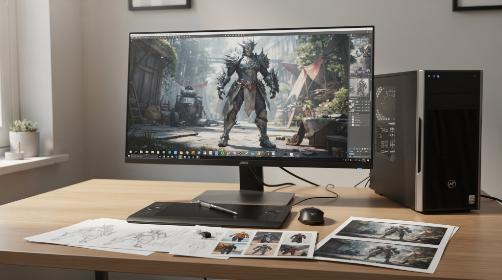
Building a 3D artist portfolio is not about dumping your best renders into a gallery and hoping someone calls. It’s about constructing a deliberate narrative that answers the question every potential client silently asks: “Can this person solve my specific problem?” For architectural visualization, that means the portfolio must demonstrate far more than technical ability — it has to prove you understand space, light, materials, and the commercial purpose behind each image. A single stunning render might catch the eye, but a well-structured project page that walks through the brief, the constraints, and the final delivery is what actually converts a visitor into a lead.
Why a 3D artist portfolio needs a strategy
An impressive-looking portfolio can still fail to attract the right clients if it reads like a random image dump. The most common trap is treating it as a personal gallery rather than a decision-making tool designed for a specific audience. In archviz, your visitors are typically developers, architects, property marketers, or interior designers — people who need to see reliability, not just artistic flair.
A strategically built portfolio should answer three questions within seconds of landing on the page:
- What do you specialize in? (interiors, exteriors, product viz, or a mix)
- What level of quality can I expect consistently?
- How do you think through a project — from brief to final pixel?
This is especially critical in architectural rendering, where clients often lack the vocabulary to describe what they want but can instantly recognize when something feels off. They look for proof that you understand real-world scale, physically plausible lighting, material behavior under different conditions, and composition that sells a property. A single beautiful render is nice. A project that explains the initial brief, the reference gathering, the lighting strategy, and the post-production decisions builds the kind of trust that leads to a signed contract.
My starting point: a general 3D art portfolio
Like many artists who eventually specialize, I began with a scattered portfolio — sci-fi environments, fantasy characters, hard-surface props, and a handful of architectural experiments. At that stage, the collection reflected my curiosity more than any professional direction. It showed range, which can be useful early on when you’re still discovering what you enjoy most, but it also created a serious problem: a visitor couldn’t immediately tell what I wanted to be hired for.
When a commissioned residential project shifted my focus toward architectural visualization, I didn’t nuke the old work overnight. That would have left the site looking empty and unprofessional. Instead, I kept the general 3D pieces online while quietly building a dedicated archviz section. This gave me breathing room to transition without making the portfolio feel incomplete or abandoned.
The portfolio shift: from generalist to archviz specialist
The transition happened in deliberate phases, each addressing a specific practical goal. Rushing the process would have confused returning visitors and diluted the new focus. Here’s how it looked in practice:
| Phase | What I changed | Why it mattered |
|---|---|---|
| Mixed portfolio | Kept all 3D work in one place | Preserved history and showed range |
| New archviz section | Added interiors, exteriors, and property renders | Started signaling a new specialization |
| Navigation emphasis | Promoted archviz in the main menu and homepage | Guided visitors toward the work I wanted to attract |
| Rebrand toward visualization | Reduced unrelated art and renamed sections | Made the site easier to understand |
| Blog expansion | Added process posts and case studies | Turned the site into a proof-of-expertise engine |
This phased approach worked because it mirrored how clients actually browse. They don’t want to decode your career evolution. They want to know, within seconds, whether you can handle a daylight exterior for a marketing brochure or a moody twilight interior with accurate artificial light falloff.
What I put in the portfolio first
When building a 3D artist portfolio, the temptation is to include every piece you’re proud of. That instinct usually weakens the result. A better rule is to curate ruthlessly around the work you want to attract. For architectural visualization, I’d prioritize the following types of content, because they directly address what clients ask for in briefs:
- Interior renders showing spatial flow, furniture staging, and natural/artificial light balance
- Exterior renders with contextual landscaping, accurate sun angles, and material weathering
- Property marketing shots — the kind that would work on a real estate listing or brochure
- Close-up material and lighting studies that prove you understand PBR roughness maps, fresnel effects, and how light behaves on different surfaces
- Before-and-after or process breakdowns that demonstrate deliberate decision-making
- Occasional animated walkthroughs or interactive 360° panoramas if relevant to the target market
If you’re still balancing general 3D art and archviz, keep the portfolio tight. A handful of focused, well-documented projects will almost always outperform a sprawling gallery of unrelated work. Clients don’t hire for versatility; they hire for confidence in a specific outcome.
A practical selection rule
When I audit a portfolio — my own or someone else’s — I apply a straightforward filter that cuts through emotional attachment to old projects:
- Keep work that directly matches the clients you want to attract
- Remove work that confuses your positioning or suggests a different specialty
- Keep only images that still look current in terms of lighting quality, material definition, and composition trends
- Avoid showing work that relies on outdated style, flat ambient lighting, or weak composition that you’ve since outgrown
If a piece makes you think, “I still like it, but it doesn’t help me get architectural clients,” it belongs in a personal archive — not on the homepage. Sentimentality has no place in a professional portfolio.
How many projects should be in a strong portfolio?
There’s no magic number, but the safest range is modest. A focused portfolio should feel curated, not exhausting to scroll through. In my experience, the sweet spot is:
- 8 to 12 strong projects for a compact, comprehensive portfolio
- 4 to 6 flagship projects if you want an ultra-polished, minimal presentation
- Enough variety to demonstrate range across building types and lighting conditions, but not so much that the quality dips
What matters more than raw count is coverage. Aim to show different scenarios that mirror real briefs. For example:
- One residential interior with soft daylight and lived-in staging
- One exterior daylight scene with accurate shadow casting and context
- One evening or twilight render where artificial lights and ambient sky interact
- One close-up detail or material study — think wood grain, fabric texture, or glass reflections
- One project with multiple views from the same brief, showing consistency across angles
That combination tells a far more complete story than ten visually similar hero shots of the same kind of space. It also signals to clients that you can handle the variety they’ll throw at you in real projects.
What makes a project page work
A project page should do more than display final renders at full resolution. It needs to explain the work in a way a busy client can scan in thirty seconds and immediately grasp the value. I’ve found that the most effective project pages include a predictable set of elements:
- A short project summary — one or two sentences that set the context
- The client goal or brief — what was the image supposed to achieve?
- Your specific role and contribution — modeling, lighting, materials, post-production
- The software or tools used, if relevant (3ds Max + Corona, Blender + Cycles, etc.)
- Key process images that reveal the build-up
- The final renders, presented cleanly
- A short result or takeaway — what changed because of your work, or what you learned
This doesn’t need to be lengthy. In fact, short and specific beats verbose every time. Clients aren’t reading for pleasure; they’re scanning for competence.
A simple structure for each project
I stick to a three-part format that keeps every project page readable and gives the images necessary context:
1. Brief
What was the project for? A marketing campaign, a design competition, an investor presentation? This immediately frames the purpose.
2. Approach
How did you handle composition, lighting, materials, and mood? Mention specific choices — for instance, using an HDRI from a certain time of day, adjusting the sun angle to highlight architectural features, or selecting a particular camera focal length to avoid perspective distortion.
3. Result
What changed because of your work? Did the client win approval, sell units faster, or simply understand the unbuilt space more clearly? Even if the result is “the image met the brief and was delivered on time,” stating it adds professionalism.
Show process, not just polish
One of the most effective changes I made to my portfolio was including process material alongside final renders. This isn’t about padding the page — it’s about proving that the final image was built deliberately, not stumbled upon by luck. I typically include:
- Wireframes showing clean topology and efficient geometry
- Clay renders that reveal lighting balance without material distraction
- Raw lighting passes (direct, indirect, ambient occlusion) to show how light builds up
- Material studies — close-ups of roughness maps, bump details, and how they react to light
- Composition tests — alternative camera angles that were considered and rejected
- Revision stages — how the image evolved based on feedback
- Final post-production comparisons — raw render vs. color-graded, retouched output
This matters because architectural clients often worry about whether an artist can replicate the quality consistently. A polished final render tells them what you can do. A process breakdown tells them how you do it, which is often more valuable when they’re thinking about deadlines, revisions, and communication.
Why process builds trust
Process pages build trust in three specific ways that directly address client anxieties:
- They demonstrate technical skill beyond the surface — understanding of light transport, material response, and render optimization
- They show problem-solving — how you handle tricky situations like balancing interior artificial lights with exterior daylight, or fixing tiling textures without obvious repetition
- They make your work feel real and repeatable — not a one-off lucky shot, but a systematic approach that can be applied to their project
For architectural clients, who often care as much about reliability and clear communication as about the final pixels, process documentation can be the deciding factor between you and another artist with a similar-looking portfolio.
How I handled the transition without hurting the site
I didn’t jump from “general 3D artist” to “archviz specialist” overnight. I treated the site like a living portfolio and shifted the emphasis gradually, so the change felt natural to anyone following my work. Here’s the step-by-step approach that worked without breaking the existing structure.
Step 1: Keep the old work, add the new focus
The first move was simple: I kept the existing portfolio intact but added a dedicated architectural visualization section. This let me test the new direction and build up enough quality work to carry the site, without abandoning everything I’d already created. It also prevented the site from looking sparse during the transition.
Step 2: Change the navigation
Once the new archviz work became strong enough to stand on its own, I moved it into the main navigation. This small structural change had a big psychological impact — it told visitors where the site was heading and what I wanted to be known for. The general 3D work remained accessible but no longer dominated the menu.
Step 3: Feature archviz on the homepage
The homepage is the most valuable real estate on any portfolio site. It should answer “what do you do?” within seconds. I made architectural work the first thing people saw — a hero grid or slider of the strongest interior and exterior renders — and pushed the broader 3D gallery lower down or into a secondary section.
Step 4: Reframe the older gallery
The general 3D gallery became a secondary archive rather than the main identity. I renamed it something like “Earlier Work” or “Personal Projects” to signal that it was historical, not current focus. This preserved the older pieces for those curious about my background while reducing confusion for new visitors.
Step 5: Build content around the portfolio
At the next stage, I introduced blog content specifically about architectural 3D: workflow breakdowns, case studies, software insights, and project stories. This gave the site more depth than a static showcase and started attracting search traffic for terms related to archviz techniques — which in turn brought in more relevant clients.
The role of the blog in a portfolio site
A portfolio proves you can do the work. A blog proves you understand the craft deeply enough to explain it. For architectural visualization, the blog becomes a powerful asset when it answers real questions that potential clients — and fellow artists — are actually asking:
- How do you build realistic interiors that don’t feel sterile?
- How do you handle daylight and evening lighting in the same scene?
- How do you present unfinished spaces without making them look empty and cold?
- How do you choose camera angles for property marketing that sell the space?
- How do you avoid common material mistakes like repeating textures or plastic-looking wood?
- How do you compare render engines or optimize workflows for tight deadlines?
This kind of content helps the site rank for specific, intent-driven searches, but it also helps potential clients trust you before they ever pick up the phone. They see that you’re not just an artist — you’re someone who thinks systematically about the craft.
Good blog post types for archviz
Over time, I’ve found certain formats work particularly well for an archviz portfolio blog:
- Case studies that walk through a real project from brief to delivery
- Behind-the-scenes breakdowns with raw passes and commentary
- Before-and-after comparisons showing the impact of lighting or material adjustments
- Workflow guides — for example, “My Corona Renderer setup for interior daylight scenes”
- Software tips — optimizing V-Ray settings, using Forest Pack for vegetation, etc.
- Opinion pieces on visualization trends — photorealism vs. stylized, real-time vs. offline rendering
- Lessons learned from client work — what went wrong and how you fixed it
If the portfolio is the storefront, the blog is the proof that the shop knows its subject inside and out.
Common portfolio mistakes to avoid
A lot of talented artists lose opportunities not because their work is weak, but because their portfolio sends mixed signals or creates friction. These are the most common mistakes I see, and they’re all fixable:
- Including too many unrelated styles that dilute the core message
- Showing weak older work just to fill space — it drags down the perceived quality of the whole site
- Not explaining what the viewer is looking at — no captions, no context, no brief
- Hiding the best work deep in the site behind multiple clicks
- Using huge, uncompressed images that load slowly — a portfolio that takes five seconds to load loses visitors
- Presenting final renders without any process or story — it feels like a lucky shot, not a professional deliverable
- Making the site look like a personal art dump instead of a curated professional portfolio
The biggest mistake, however, is trying to appeal to everyone. If your portfolio attempts to attract game studios, film clients, product brands, and real estate developers simultaneously, it often fails to connect deeply with any of them. A better approach is to choose one clear direction and let every element of the site support that choice.
How to decide what stays and what goes
When I reviewed my own work during the transition, I used a brutally simple test. For each piece, I asked:
- Does this piece match the clients I want now?
- Does it show a skill I want to be hired for?
- Does it still look strong compared with my current work?
- Does it help explain my process or approach?
- Would I be comfortable sending this to a serious client today as an example of my best?
If the answer was “no” to most of those questions, the piece went into an archive — not deleted, but removed from the main portfolio flow. This kept the site tight and credible.
Quick checklist for portfolio edits
Whenever I do a portfolio refresh, I run through this checklist to make sure nothing slips through:
- Keep only your strongest images — if you hesitate, it’s probably not strong enough
- Group work by category or client intent, not by date
- Write a short note for each project — even two sentences of context help
- Remove anything that feels off-brand or belongs to a past phase of your career
- Make the homepage clear within seconds — a visitor should know your specialty instantly
- Test the site on mobile — many clients browse on phones
- Make contact details easy to find — don’t hide the email behind a form if you can avoid it
What clients actually look for
Most clients don’t study your portfolio the way another artist would. They don’t zoom into pixels or analyze your normal map workflow. They scan for confidence, relevance, and reliability. Specifically, they want to see:
- Believable lighting — natural light that feels grounded, with correct color temperature and falloff
- Clean materials — no obvious tiling, physically plausible roughness, proper fresnel on dielectrics
- Strong composition — camera angles that flatter the space without extreme distortion
- Good taste in camera placement — avoiding awkward cuts, keeping verticals straight, using focal lengths that feel natural (24-35mm for interiors, 50-85mm for details)
- Consistency across projects — a recognizable quality bar and post-production style
- Evidence you understand real-world spaces — furniture scale, traffic flow, how light behaves at different times of day
- Proof that you can work professionally — meeting briefs, handling revisions, delivering on time
That’s why architectural visualization portfolios need to feel practical and grounded, not experimental for the sake of experimentation. A client who needs to sell unbuilt apartments doesn’t care about your abstract lighting study; they care whether you can make a living room feel warm and inviting at dusk.
My final portfolio structure
By the time the site reached a mature stage, it followed a clear hierarchy that made the visitor’s path obvious:
- Homepage with the strongest archviz work front and center
- Architectural visualization as the main portfolio category, subdivided into interiors and exteriors
- General 3D work kept in a secondary section labeled “Personal Projects” or “Earlier Work”
- Blog used to explain process, share case studies, and demonstrate expertise
- Contact paths made simple and visible — a clear call-to-action on every page
That structure made the site easier to understand for first-time visitors and more aligned with the work I actually wanted to do. It stopped being a collection of images and started functioning as a positioning tool.
Key lessons from the process
The biggest lesson I took away is that a portfolio is not a gallery of finished images — it’s a positioning tool that either works for you or against you. What made the biggest difference in my transition was:
- Narrowing the focus gradually rather than abruptly, so the site always felt complete
- Showing process instead of only finals, which built trust and demonstrated repeatability
- Organizing the site around client intent — what would a developer or architect want to see first?
- Using the blog to add depth and authority, turning the site into a resource, not just a showcase
- Keeping the user’s path simple — reduce clicks, make navigation intuitive, and never make someone hunt for contact info
Conclusion
Building a 3D artist portfolio from concept to final render is really about constructing a clear, honest story around your work. If you want architectural clients, your site should demonstrate that you understand architecture, presentation, and visual communication — not just that you can produce pretty images. Start with your strongest relevant work, explain how each project came together, and let the portfolio evolve deliberately toward the direction you actually want. That’s how a mixed 3D gallery becomes a focused professional asset that attracts the right opportunities.
FAQ
How many projects should be in a 3D artist portfolio?
A focused portfolio usually works best with 8 to 12 strong projects, or even 4 to 6 flagship pieces if the presentation is highly polished and each project includes process documentation. The key is quality over quantity — a smaller set of excellent, well-explained work beats a large gallery of inconsistent renders.
Should I include process images?
Yes. Wireframes, clay renders, lighting tests, and material studies help prove your workflow and build client trust. They show that the final image wasn’t an accident and that you can replicate the quality under different briefs. For archviz specifically, process images also demonstrate your understanding of real-world lighting and material behavior.
Can I keep general 3D art in the same portfolio as archviz?
Yes, but keep it secondary if your main goal is architectural visualization. The site should make your specialization obvious within seconds. A clearly labeled “Personal Projects” or “Earlier Work” section can house general 3D pieces without diluting your primary message.
What should each project page include?
A short brief, your approach (covering composition, lighting, materials, and mood), final renders, process images, and a concise explanation of the result. This structure gives context to the images and helps potential clients understand not just what you did, but how you think.
Is a blog necessary for a portfolio site?
Not strictly required, but extremely useful. A blog can strengthen SEO for niche archviz topics, demonstrate deep expertise, and help potential clients understand your working methods before they ever reach out. It turns a static portfolio into an active proof-of-knowledge platform.