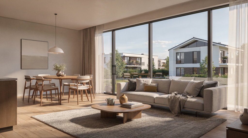
Nothing sells a home faster than the ability to see it clearly before the first brick is laid. Yet architectural visualization for apartments and houses is far more than just pretty pictures. It transforms technical drawings, material schedules, and even rough sketches into images that let buyers, developers, architects, and homeowners make smarter, faster decisions. When done with genuine care, a residential render doesn’t just show a building — it answers the quiet questions every viewer asks: “Will this space feel like home? Can I really live here?”
The most effective visualizations are the ones where accuracy, atmosphere, and a tight connection to the brief work together. They interpret how light moves through a kitchen at breakfast, whether the sofa leaves enough room to walk around, and why the façade materials make sense in the local climate. In short, they turn a set of floor plans into a believable experience.
What Architectural Visualization Actually Does
At its core, architectural visualization sits at the intersection of design and communication. It decodes everything from wall sections to RCPs so that people without technical backgrounds can instantly grasp the intent. For residential work this typically translates into a set of deliverables that go far beyond a single hero shot:
- Interior renders covering living rooms, kitchens, bedrooms, bathrooms, and shared amenity spaces
- Exterior renders of houses, façades, gardens, terraces, and driveways
- Cutaway views or sectional perspectives that clarify plan layouts for planning authorities or buyers
- Lifestyle vignettes that communicate scale, natural light behavior, and how a family might occupy the space
- Still images, walkthrough animations, or interactive views for marketing suites, web campaigns, and design approvals
Notice that none of this is about “decorating” a project after the architecture is done. The real job is to make an unbuilt apartment or house feel understandable, credible, and genuinely desirable — without overpromising on finishes or proportions that the actual construction won’t deliver.
Why Residential Visualization Matters
Trust is the currency of off-plan sales. When a property exists only in drawings and numbers, potential buyers and investors need a way to project themselves into the future. A strong render bridges that gap. It turns a floor plan into a room they can imagine walking through at sunset.
Quality visualization supports:
- Off-plan apartment sales and reservation campaigns
- Investor presentations where confidence is fragile
- Planning and design committee submissions
- Pre-construction marketing that runs months ahead of completion
- Interior design sign-off between client and architect
- Renovation decisions where clients need to compare “before” and “after” quickly
- Launch campaigns for developers and brokers that need a coherent visual identity
A single well-crafted render removes uncertainty about room depth, ceiling height, or material harmony. A carelessly made one introduces doubt that’s hard to undo — and in practice, the difference almost always traces back to whether the image respects real spatial logic, physically plausible materials, and lighting that could authentically be replicated in the built environment.
Apartments vs Houses: What Changes in the Visual Approach
The 3D workflow may look similar at first glance, but the visual strategy demands a different starting point for each typology. Apartment renders and house renders answer different questions, so camera placement, styling density, and even the way we handle post-production shift accordingly.
| Property type | Main focus | Common challenge | Best visual angle |
|---|---|---|---|
| Apartments | Space efficiency, functional flow, finish quality, daylight penetration | Small rooms can easily feel cramped or too generic | Wide interior views with strong depth cues, realistic staging, carefully managed distortion |
| Houses | Volume, lifestyle character, façade articulation, connection to landscape | It’s tempting to over-dramatize or flatten the architecture with a single camera | Exterior hero shots, indoor-outdoor transitions, context‑rich compositions that include landscaping and approach paths |
Apartments usually require more discipline in composition because every square meter counts. You need to show the full room without exaggerating the width, which means focal lengths around 24–28 mm on a full-frame sensor feel natural while still communicating space. Houses, on the other hand, demand a strong sense of place. The surrounding streetscape, the way morning light hits the garden, and even the visual rhythm of the façade panels play a role that’s just as important as what’s inside.
A Practical Workflow for Apartment and House Visualization
Over the years I’ve learned that a bulletproof process prevents late-stage panic and protects the trust between artist and client. The steps below are what I rely on, whether the project is a compact studio apartment or a sprawling family villa.
1. Collect the right source material
Begin with the hard facts:
- Floor plans with dimensions
- Elevations and sections
- Material schedules and finish boards
- Furniture or fit-out references that match the developer’s target market
- Site photos or drone imagery for context and accurate lighting conditions
- Brand guidelines, if the project is part of a larger development identity
- Mood boards or design references that define the emotional direction
If any of these are missing or ambiguous, raise flags before the model gets built. In my experience, incomplete dimensions, undecided material palettes, and vague lighting preferences are responsible for at least half of all revision rounds. A 15-minute call early on saves days of rework later.
2. Define the visual objective
Before opening 3ds Max, Blender, or whatever you use, articulate what the image must achieve. The objective controls everything downstream: camera height, styling density, color temperature, and even how “clean” or “lived-in” the space should appear. Common objectives include:
- Sell a premium off-plan apartment to an investor audience
- Present a family house with warm, inviting character for owner-occupiers
- Demonstrate the indoor-outdoor flow for a planning submission
- Compare two finish options side by side for an interior designer
Nail this early and half of your creative decisions are already made.
3. Build the base model accurately
The first iteration of the model is about proportion, not beauty. Check wall thickness, ceiling heights, window and door placements, stair dimensions, balcony depth, kitchen and bathroom clearances, and exterior massing. A render that looks breathtaking but ignores the fact that the dining table blocks the walkway immediately loses credibility. In residential work, accurate scale is one of the strongest trust signals you can send.
4. Choose cameras that explain the space
Camera choice is a storytelling tool, not just a compositional one. The goal is to help viewers understand the property intuitively. Practical principles I return to again and again:
- Keep verticals straight — tilt-shift correction or vertical lens shift keeps walls parallel and avoids unsettling distortion.
- Avoid extreme wide-angle lenses (e.g., 14 mm) unless the project genuinely requires dramatic exaggeration; 24–28 mm usually gives a natural feel for interiors.
- Place the camera where a real person might stand — near a doorway, at the edge of a sofa, or at standing eye height. This reinforces realism.
- Choose viewpoints that reveal both function and atmosphere. For example, a kitchen shot should let you see the work triangle and the relationship to the dining area.
- Avoid framing that hides the layout. If a client can’t tell how the rooms connect, the render hasn’t done its job.
For apartments, one strong wide view backed by one or two supporting close-ups is often more persuasive than a dozen near-identical angles. For houses, aim for at least one image that reads the façade, one that describes the entrance experience, and one that links interior to exterior — ideally showing how light travels through on a typical day.
5. Develop materials with restraint
Residential visualization collapses fast when materials look too perfect. Real surfaces — even high-end ones — have micro‑variation, subtle edge softness, and slight inconsistencies that the brain expects. In a PBR workflow, that means using roughness maps with enough variation, adding a tiny amount of anisotropy where it makes sense, and avoiding 100% glossy reflections everywhere.
Wood grain needs natural warmth and texture falloff. Stone and concrete benefit from subtle color variation maps, not just a single diffuse tile. Glass should feel physically present with correct IOR values, not invisibly perfect. And for metals, watch out for unrealistically crisp reflections — a barely perceptible roughness break goes a long way toward believability. A polished apartment kitchen should still feel like someone could comfortably cook there, not like a showroom prototype sealed in plastic.
6. Light the scene for function and mood
Lighting defines the emotional backbone of a residential render. A typical brief might ask for:
- Daylight conditions that make the interior feel open and naturally bright (often best achieved with an HDRI environment plus a sun aligned to the geographic context).
- Evening scenarios that convey comfort, warmth, and intimacy through layered artificial lighting — not just boosting a single ceiling fixture.
- Exterior lighting that sculpts the architecture without blowing out highlights or killing shadow detail.
- Interior lighting that balances practical task light with ambient fill, avoiding harsh, flat results.
Use light to reveal form, depth, and material grain. A room that reads as uniformly bright but lacks a clear lighting hierarchy will still feel lifeless, no matter how high the samples are pushed. Conversely, if shadow regions go too dark, buyers stop reading the layout and start questioning the rendering itself.
7. Add styling only where it helps
Furniture and accessories should support the architecture, not compete with it. Good styling does three specific things: it clarifies scale by placing recognisable objects in the scene; it demonstrates how a space might be used; and it reinforces who the property is for. A compact city apartment may need minimal, clean-lined pieces to keep the eye moving. A large family house thrives with slightly softer, lived-in details — a casually draped throw, a few books on a coffee table. A luxury villa usually wants a more controlled, elegant setup that feels curated but never cluttered.
Over-styling is a common trap. Too many props turn a render into a stylist’s portfolio piece and distract from the actual layout and finishes that the client is paying to communicate.
8. Review, correct, and finalize
The best review process is structured and ruthless about the things that matter. On every round, check:
- Dimensions against the latest plan set
- Window and door positions
- Material consistency across all cameras
- Furniture scale relative to the architecture
- Lighting direction and quality
- Reflection accuracy and noise levels
- Exterior landscaping matches the site context
- View accuracy — does the camera show what was briefed?
- Alignment with any brand or sales messaging
One rule I’ve found indispensable: never push structural corrections into post‑production. Fixing a misaligned window or an incorrect floor tile in Photoshop is harder, riskier, and ultimately dishonest. Solve it in the 3D scene.
What Makes a Residential Render Feel Real
Photorealism isn’t about 8K textures alone. It’s about consistency across a whole bundle of visual cues that the human eye parses in a fraction of a second. If even one of these signals drifts, the image feels subtly “off,” even if the viewer can’t pinpoint why.
The main realism signals
- Believable scale relationships between furniture, windows, and room volume
- Natural light falloff that matches the setting — soft shadows near large windows, sharper shadows under focused artificial light
- Controlled contrast without crushing blacks or blown‑out highlights
- Surface variation that avoids perfectly uniform colours; even painted walls have micro‑scratches and slight tonal shifts
- Correct shadow softness driven by light source size and distance
- Sensible object placement that respects real‑world habits (for instance, you wouldn’t block a doorway with an armchair)
- Physically plausible reflections; metals reflect more when viewed at grazing angles, and glass always has some visible thickness at the edges
- Environment context that ties exteriors to the site — correct sun direction, neighbouring buildings, vegetation that matches the climate
When these signals align, the image communicates “this could be real,” which is exactly what a client or buyer needs to feel confident.
Common Mistakes in Apartment and House Visualization
Even experienced artists can slip into habits that sap credibility from residential renders. Here are the most persistent ones I see — and what to do instead:
| Mistake | Why it hurts | Better approach |
|---|---|---|
| Over-wide camera lenses | Rooms feel distorted and untrustworthy; proportions appear exaggerated | Use natural perspective with focal lengths of 24–35 mm and careful framing |
| Too much perfect symmetry | Creates an artificial, static look that rarely occurs in lived-in spaces | Introduce subtle asymmetry — varied furniture placement, uneven cushions, slightly open doors |
| Generic furniture | Strips the space of any identity and emotional connection to the target audience | Match furniture style, period, and quality level to the property type and buyer profile |
| Flat lighting | Hides depth and material quality; the image feels like a washed‑out concept sketch | Build a clear lighting hierarchy with key light, fill, and accent to reveal form |
| Overdone glossy materials | Surfaces look wet or plastic‑like; reflections that are physically impossible break credibility | Use restrained glossiness with subtle roughness maps; most real‑world surfaces aren’t mirror-smooth |
| Ignoring context | Exteriors appear detached, floating in a void, undermining the sense of neighbourhood | Include site details, background planting, and neighbouring cues, even if softly out of focus |
| Too many props | Clutters the composition and pulls attention away from the architecture and room flow | Keep only details that reinforce the story: a book on a bedside table, not an entire library |
| Trying to make every image do everything | One render cannot be a sales hero shot, an interior magazine spread, and a technical diagram simultaneously | Assign a clear purpose to each render and stick to it |
Deliverables That Work Best for Residential Projects
Different stakeholders need different visual packages. A developer’s marketing team rarely wants the same set of images as an architect reviewing design options. Tailor the output to what each audience needs to decide or feel.
For developers and agents
- A hero exterior render that captures the character of the building and its setting
- An interior of the living room or kitchen — the spaces that sell the lifestyle
- One bedroom or amenity view that reinforces the property’s quality level
- A dusk version for emotional impact in brochures and billboards
- Optionally, a floor plan overlay or key‑features graphic that annotates what’s visible
For architects and designers
- Accurate daylight views without heavy post‑production filters
- Material studies showing finishes under natural and artificial light
- Alternative camera angles to evaluate spatial flow
- Design comparison images that pit variant A against variant B for real‑world feedback
- Sectional or explanatory visuals that reveal structural or interior logic
For homeowners
- Before‑and‑after comparisons that visualize renovation impact
- Renovation concept renders that let them see material swaps and layout changes
- Finish option renders — e.g., two kitchen worktop selections under the same lighting
- Room‑by‑room interior previews to support decision‑making on furniture and colours
A focused, well‑curated package nearly always outperforms a bloated gallery of every possible view. When clients receive five images that each do a specific job, they respond faster and with more trust.
How to Brief an Architectural Visualization Project Properly
A thorough brief is the single best investment you can make before any polygon is modelled. It aligns expectations, prevents costly missteps, and gives the artist a clear creative boundary to work within.
Include these points
- Property type: apartment, house, townhouse, villa, renovation, or mixed scheme
- Target audience: investors, owner‑occupiers, planning committee, internal design team
- Purpose: off‑plan sales, planning approval, design review, marketing launch, etc.
- Required views: exact number and rough angle descriptions (e.g., “kitchen view from island to dining,” “front façade at golden hour”)
- Style direction: modern, classic, warm, minimal, luxury, family‑friendly — or a specific reference image
- Material references: floor finishes, cabinetry, wall treatments, external palette, even rough texture preferences
- Landscaping or context notes: existing trees, neighbouring buildings, site slope, street furniture
- Deadlines and revision rounds: how many feedback loops are expected and by when
- Output formats and resolution: print‑ready TIFFs, web JPEGs, frame ranges for animation
Questions worth asking early
- What must this image convince the viewer of — comfort, luxury, efficiency, lifestyle?
- Which elements are decision‑ready and which might still change during the process?
- Are we rendering a finished, signed‑off design, or a conceptual iteration that needs flexibility?
- Do we need straight realism, a hint of lifestyle warmth, or forensic technical clarity?
- What would count as a “successful” final image in the client’s mind?
Getting answers to these questions at kick‑off significantly reduces the number of late‑stage revisions triggered by “it just doesn’t feel right.”
A Simple Quality Checklist
Before delivery, I run every render through this mental checklist. It’s fast, practical, and catches the mistakes that matter most:
- Proportions match the approved drawings
- Furniture fits logically — no chair oversized relative to the door, no dining table that chokes the walkway
- Lighting direction is consistent across all elements: sunlight, shadows, and reflections agree
- Materials look believable under the chosen lighting; no textures break or tile visibly
- The camera angle supports the property’s story (a façade shot that hides the entrance is rarely useful)
- The image tone suits the target audience — aspirational but not alienating
- No floating objects, clipping geometry, or duplicated assets
- Reflections and shadows obey physical logic; glossy floors reflect what’s actually in the room, not a generic environment map
- Exterior context feels appropriate — the right trees, sky, and ground plane
- The final image answers the original brief without needing extra explanation
If two or three items fail, the render isn’t ready — no amount of post‑production magic can fix a flawed foundation.
When to Use Still Images, Animation, or Both
Still images remain the backbone of residential visualization because they’re fast to produce, easy to distribute, and hard to misinterpret. A well‑exposed still can hold a viewer’s attention long enough for them to absorb layout, light, and mood simultaneously.
Animation becomes the right tool when the space is genuinely difficult to read from a single angle — for instance, a townhouse spread over four split levels — or when the development includes extensive shared areas (gardens, club lounges, roof terraces) that benefit from a walkthrough. It’s also valuable when a developer’s marketing campaign relies on social media cut‑downs or when a planning committee requests a sequential understanding of access and massing.
For the majority of apartments and houses, however, still renders remain the core deliverable. They’re lighter to approve, work across more channels, and put fewer demands on the client’s viewing hardware. If animation is added, it usually serves as a supporting piece rather than a replacement.
How to Present Residential Visualization in a Portfolio
A folio full of final renders alone tells only half the story. Clients and studios hire based on problem‑solving ability, not just a polished output. Structure a case study to show your thinking:
- A concise project summary — location, typology, scope
- The client’s goal in plain language (e.g., “raise investment capital before construction”)
- A floor plan or massing diagram that gives spatial context
- An early clay render or viewport grab — this demonstrates how you iterate on composition
- A material or lighting direction board (mood references, tone maps, colour palette)
- The final exterior or interior image, ideally with a brief note on the key challenge and how you solved it (e.g., “balanced strong afternoon sun with interior warmth using a subtle light portal in the window”)
This format shifts the conversation from “nice pictures” to “reliable partner,” which is what serious clients actually look for.
FAQ
- What is the difference between architectural visualization and interior rendering?
- Architectural visualization tells the full property story: it includes exteriors, context, and sometimes animation or interactive presentations. Interior rendering zooms in on rooms, finishes, and furnishings, often for interior design sign‑off. In practice, most residential projects need a blend of both, but the term “visualization” signals a broader, more strategic scope.
- How many renders does a typical apartment or house project need?
- A small apartment or a single‑family house often works best with 3–5 strong, purposeful renders. Larger developments or multi‑unit schemes may need more angles, but quality and visual variety always matter more than volume. One hero view that truly communicates the lifestyle is worth more than ten mediocre shots.
- What is the most important part of a residential render?
- Accuracy to the source plans comes first. If the scale, room dimensions, or material logic are wrong, the image loses trust instantly — even if it’s beautifully lit. Only after accuracy is locked in do atmosphere, composition, and styling become the difference‑makers.
- Should residential renders look highly stylized or very neutral?
- It depends entirely on purpose. Sales and marketing images can lean warmer, with a touch of aspiration. Design‑review visuals should stay closer to the measurable reality: correct colours, accurate shadows, minimal creative filtering. Knowing the audience is what guides this choice.
- What usually causes the most revisions?
- Incomplete or shifting briefs, late‑stage material changes, inaccurate plan drawings, and camera angles that weren’t approved early. The more decisions are made before modelling begins, the cleaner the revision cycle.
Final Takeaway
Architectural visualization for apartments and houses reaches its full potential when it marries unshakeable accuracy with a strong sense of atmosphere and clear communication. The best images don’t just look polished — they help people understand how a property works, how it will feel to inhabit, and why it deserves a buyer’s commitment.
When the process starts with a tight brief, respects real‑world scale, and treats light and composition as deliberate narrative tools, the final renders become practical instruments for approval, marketing, and confident decision‑making. That’s the difference between a picture that gets glanced at and one that gets remembered.