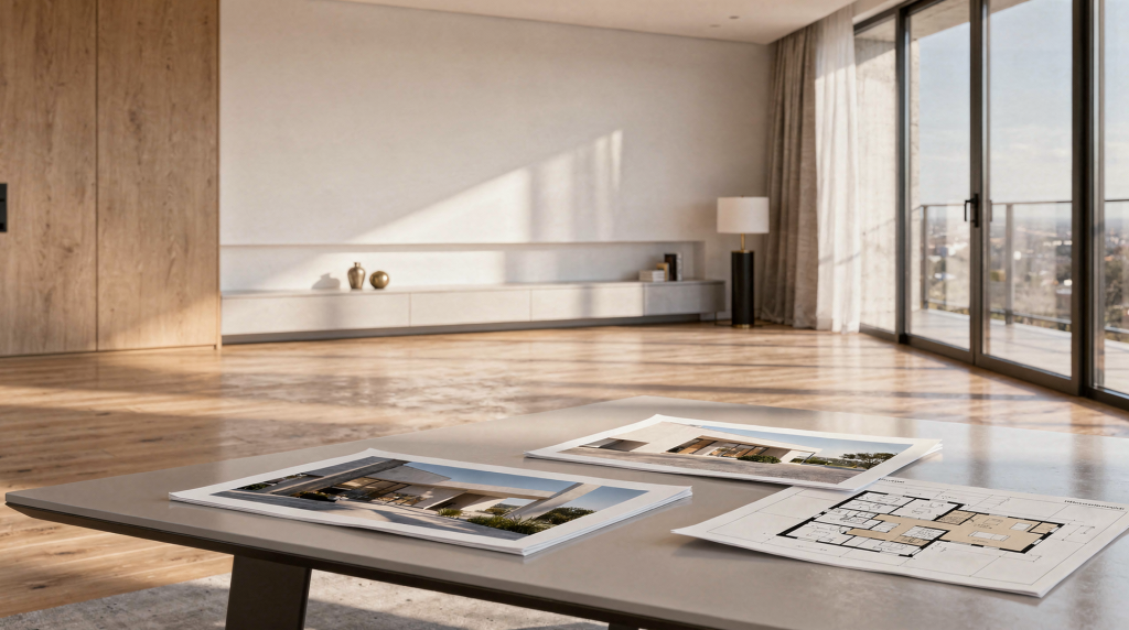
Let’s be honest — an architectural visualization portfolio is not a personal gallery where you dump everything you’ve ever rendered. It’s a precision tool. It needs to convince a studio lead, a developer, or an architect in under thirty seconds that you can turn a brief into a believable, production-ready image and that your decisions around light, material, and composition won’t fall apart under deadline pressure. A strong archviz portfolio proves you understand the business of selling unbuilt space, not just the software.
Why portfolio quality matters more than portfolio size
In this industry, the person with the most images rarely gets the job. What wins is consistency: a small set of renders where every pixel reinforces trust. I’ve reviewed portfolios with fifteen projects that felt weaker than one with just six carefully curated ones. When a potential client scrolls through your work, they’re not counting — they’re scanning for red flags: a material that looks plastic, lighting that feels flat, a composition that breaks the illusion of space.
The strongest portfolios I see always do three things without effort:
- they project clear visual quality the moment the page loads,
- they demonstrate enough range to show adaptability without diluting focus,
- they include just enough context to prove the artist thought about the brief, not only the beauty pass.
If a viewer finishes scrolling and still isn’t sure what you specialize in or what your contribution was, the portfolio has failed — even if the renders are stunning.
The core traits of a strong archviz portfolio
After working on both sides — as an artist and occasionally helping studios screen candidates — there are a few traits that consistently separate a workhorse portfolio from a forgettable one.
1. Strong first impression
Your first one to three images do the heavy lifting. They should be your absolute best — not your most recent, not the one you’re emotionally attached to, but the renders that immediately communicate ‘this person knows their craft’. A powerful opener usually carries balanced composition that guides the eye without gimmicks, lighting that could pass for real measured data, materials with the right PBR roughness breakup, believable scale, and a clear focal point that gives the image purpose.
One common mistake: leading with a moody dusk shot that’s all about atmosphere but says nothing about the space. While dramatic lighting has its place, a hero image should first prove you can handle clean, readable daylight interiors or well-structured exteriors before you get moody.
2. Consistency across the set
A single hero render means little if the next project looks like a different artist made it. Studios want to know whether you can repeat quality under varying conditions — a bright coastal residence, a dimly lit restaurant, a tight urban exterior. Consistency shows in your control of light temperature and intensity, material accuracy across asset types, lens choices that feel intentional, post-production restraint that doesn’t overcook the raw pass, and attention to detail that stays high even in secondary shots.
When I assess consistency, I look at whether the artist maintains the same standard of contact shadows, reflection roughness, and subtle imperfections across scenes. A lapse here — for example, floating objects or unnaturally sharp reflections on timber while everything else feels grounded — can break the spell instantly.
3. Relevant project selection
Archviz is broad: residential interiors, masterplan exteriors, product-style detail shots for furniture brands, real estate brochure renders. A portfolio aimed at high-end interior studios should not lead with an airport terminal. Your selection must telegraph who you are for. A focused set of projects that align with the work you want next beats a random mix every single time.
4. Production awareness
A beautiful image can be a one-hit wonder. What agencies value just as highly is evidence that you work in a way that holds up in production — that you can pass files, respond to feedback, and break down a task logically. Signs of this awareness are easy to bake in: state your role clearly, mention the software stack, outline the brief or objective, and include a few process images (clay renders, wireframes, lighting tests, before/after comparisons). Even a short note on why you chose a particular HDRI or how you handled glass reflections in a tricky scene tells experienced reviewers that you think like a production artist, not a hobbyist.
5. Presentation discipline
The portfolio layout can elevate or sabotage great work. Sloppy thumbnail cropping, mismatched ratio, tiny unreadable images crowded together — all of that signals a lack of care. The presentation should fade into the background and let the renders breathe. Clean grids, generous white space, consistent aspect ratios, and legible project titles go a long way. Think of the portfolio itself as a rendered scene: even the best model fails under bad lighting.
What to include in an architectural visualization portfolio
A reliable archviz portfolio balances final renders with enough context to make the work understandable at a glance.
| Portfolio element | Why it matters | How to do it well |
|---|---|---|
| Final renders | Proves visual quality | Use only your strongest images — one weak frame drags down the whole series. |
| Project titles | Gives orientation | Keep them short and specific: “Coastal apartment – living area”. |
| Project role | Clarifies your contribution | State whether you modeled, lit, shaded, rendered, or post-processed. |
| Client or brief type | Shows industry relevance | Mention residential, hospitality, real estate marketing, etc. |
| Process images | Proves workflow and thinking | Include clay renders, WIP shots, lighting tests, or raw vs. post pairs. |
| Short captions | Adds context without clutter | One or two practical lines max — skip the poetic storytelling. |
| Contact details | Makes conversion easy | Keep them visible and simple, ideally near the top and in the footer. |
If the portfolio is for hiring, tilt the balance toward process and role clarity. If it’s for direct clients, the finished work and market alignment take the lead.
How many projects should be in it?
There’s no magic number, but years of watching portfolios have taught me this: once you cross a certain threshold, weak projects creep in and hurt more than the extra volume helps. A practical rule of thumb: six to ten excellent projects for a focused book, ten to fifteen only if the range is genuinely broad and every piece holds up under scrutiny, and even fewer if the work is highly specialized and polished to a reflection’s edge.
Going beyond that creates two problems. First, mediocre work becomes a reference point that lowers the perceived ceiling of your best images. Second, viewers start browsing instead of remembering — they click faster and retain less. If a project no longer represents your current standard, cut it. Hanging on to outdated work out of nostalgia is a fast way to look junior.
What types of images should lead the portfolio
Lead with the work that echoes the briefs you want to land. It sounds obvious, but I’ve seen strong exterior artists bury their best work behind a set of average interiors because they thought variety mattered more. It doesn’t. Match the portfolio’s opening statement to your target market.
For interior visualization
Prioritize warm, believable lighting that makes the space feel inhabited, not sterile. Highlight material details — subtle bump on fabric, edge wear on wood, realistic falloff on curtains. Furniture styling and camera angles should support a lived-in feeling; avoid perfectly aligned cushions and sterile tabletops. Lived-in doesn’t mean messy, but it means human.
For exterior visualization
Daylight and dusk shots need accurate sun angles and physically plausible sky. Show landscaping and site integration, not just the building on a plain ground plane. Glass should hold reflections that make architectural sense, and shadows must be crisp where they should be and soft where atmospheric conditions demand. Strong silhouettes and clean context — neighbouring structures, vegetation, hardscape — place the building in a believable world.
For real estate marketing
Clarity wins. Commercial renders for listings need brightness, easy readability of space, and compositions that help a buyer imagine moving through the home. Minimize visual noise; emphasize flow and proportions. Polished presentation matters, but don’t let post-production become the star.
A portfolio that tries to be everything — a little interiors, a little products, a little characters — signals indecision. Make your positioning obvious from the first click.
How to structure portfolio projects
Each project page should read like a tiny case study, not an image dump. The viewer should understand the space, the challenge, and your approach in seconds, not minutes.
Recommended project structure
- Hero image
- Short project summary
- Your role and tools
- 2–5 supporting images
- Process or breakdown
- Optional outcome note (e.g. “used for pre-sale marketing”)
Example of a good caption
- Residential living room visualization
- Role: modeling, lighting, shading, post-production
- Tools: 3ds Max, Corona Renderer, Photoshop
- Goal: create a calm, premium interior for a pre-sale property
This is concise, professional, and gives the reviewer everything needed to slot the work into a real-world scenario without overexplaining.
What separates a weak portfolio from a strong one
| Weak portfolio behavior | Strong portfolio behavior |
|---|---|
| Too many average images | Only the best work is shown; curation is ruthless. |
| Random project order | Work arranged by strength and relevance to target market. |
| No context | Each project has a clear caption and defined role. |
| Heavy post-processing | Images feel realistic, not overcooked; post is supportive, not corrective. |
| Mixed quality in one gallery | Quality stays high throughout — no jarring drop-offs. |
| Generic titles | Titles reflect real project types: “Loft renovation – kitchen”. |
| Cluttered layout | Clean, simple presentation with intentional white space. |
The mistake I see most often is assuming that more content equals more credibility. In practice, the opposite is true: a lean, focused set of projects reads as far more professional.
Common mistakes to avoid
Showing unfinished work
Drafts, test frames, and old projects that don’t represent your current standard make the whole portfolio feel uncertain. If an image makes you think “it’s decent but I could do better now,” remove it.
Overusing dramatic lighting
Dusk shots and cinematic contrast can look impressive, but when every project relies on the same golden-hour trick, the portfolio becomes a one-note instrument. Mix in confident daylight and overcast scenarios to show control.
Ignoring scale and realism
A scene that feels physically wrong loses trust instantly. Common offenders: oversized furniture that shrinks the perceived room height, weak contact shadows that let objects float, impossibly perfect reflections that ignore roughness maps, and materials that lack subtle imperfections. Small inaccuracies add up.
Using poor thumbnails
If the thumbnail is dark, awkwardly cropped, or too small to read, many viewers will never open the project. Treat the thumbnail as a secondary hero shot.
Hiding your role
If the work was collaborative, state that clearly. Claiming to have done everything when you only handled shading erodes credibility fast. Transparency always reads as maturity.
Adding unrelated 3D art without strategy
A general 3D section can be fine early on, but it should not distract from your archviz positioning. If a sci-fi character or a fantasy landscape greets visitors before your first interior, you’re diluting the message.
How to present your work if you are transitioning into archviz
If your portfolio started as a broader 3D art collection, don’t nuke everything overnight — unless you’re ready to fully reposition. A gradual transition is smarter and preserves any existing traffic or SEO value.
A practical transition path
- Keep the current portfolio active.
- Add a new architectural visualization section or gallery.
- Feature archviz projects on the homepage immediately.
- Move general 3D art into a secondary archive or separate page.
- Slowly shift navigation labels, taglines, and bio toward architectural rendering.
- Publish process articles and case studies to build authority in the new niche.
This approach lets the portfolio evolve without breaking its existing structure. Once the long-term goal of a dedicated archviz brand solidifies, you can fully remove unrelated work, reframe all pages around property and interior rendering, and extend the site with technique-focused blog content — using the portfolio as proof, not the entire identity.
A practical checklist before you publish
Portfolio quality checklist
- Each project is genuinely strong — not “good enough”.
- The first image on every page is the best one.
- Lighting looks believable under scrutiny.
- Materials read correctly: roughness, reflection, bump, and displacement behave.
- Project captions are short, informative, and role-specific.
- Software and role are stated clearly without guessing.
- Layout is clean and consistent — consistent cropping, alignment, spacing.
- Thumbnails are readable at small sizes.
- Old weak work has been removed — no sentimental attachments.
- Contact details are easy to find in the flow of the page.
- The portfolio visually aligns with the type of work you want to book next.
How to make the portfolio more persuasive to studios and clients
A persuasive portfolio doesn’t just showcase taste — it reduces perceived risk. When someone hires you for a tight turnaround or a high-stakes client presentation, they need to trust that you won’t crash during crunch time. You reduce that risk when you demonstrate dependable quality across scenes, clear communication through your project stories, production realism via process breakdowns, experience with relevant project types, and an understanding of deadlines and commercial presentation standards.
That’s why a project page that includes a concise brief, a couple of clay renders, and the finished result often closes a deal faster than a gallery of perfectly polished but context-free images.
FAQ
How many images should a project page include?
Usually three to six strong images work. Add more only if each extra frame reveals something meaningful — a different angle that clarifies the space, a detail shot that proves material resolution, or a process step that adds insight. Any image that merely repeats what the viewer already saw is padding.
Should I include personal or unpaid work?
Absolutely, if it’s strong and relevant. Some of the best portfolio pieces come from personal briefs where you had full control and could push quality without client constraints. Just make sure the work matches the kind of commercial briefs you want to attract.
Do I need process images?
Not for every project, but including at least one breakdown — clay render, wireframe overlay, or lighting progression — can significantly boost credibility. It demonstrates you understand the full pipeline from blocking to final pixels, not just how to polish a beauty pass.
Is it better to show interiors or exteriors?
Show what supports your target market. If you’re aiming at residential real estate and interior design firms, interiors tend to convert faster. If you’re courting architecture practices and developers, exterior and context-heavy work may carry more weight. Don’t guess — align with the briefs you actually want.
Can a general 3D portfolio still work for archviz?
Yes, but only as a temporary or secondary section — not as the main meal. If architectural visualization is the goal, the portfolio’s primary identity must shift toward spaces, materials, and built environments over time.
Conclusion
A strong architectural visualization portfolio is focused, selective, and effortlessly trustworthy. It doesn’t try to impress with volume; it impresses with clarity, consistency, and a clear understanding of the kind of work the artist wants to be hired for. When the images are strong, the presentation is clean, and every project tells a short story of professional thinking, saying “yes” becomes a much easier decision for studios and clients alike.