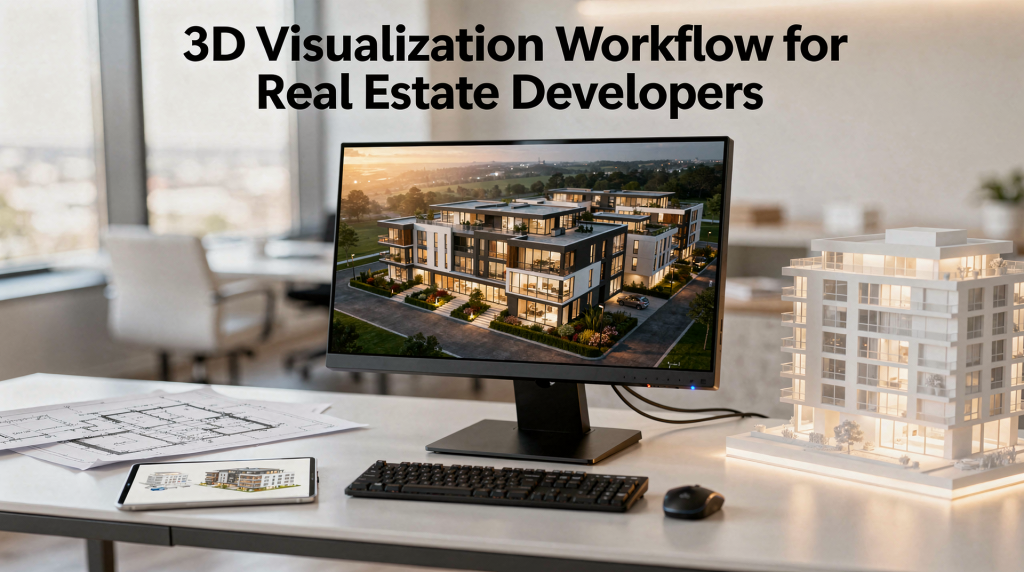
3D visualization has moved far beyond being a glossy add-on to a developer’s sales deck. Today it functions as a genuine decision-making instrument — one that lets teams pressure-test design choices, sell units that don’t yet exist, get stakeholders aligned, and avoid the kind of expensive miscommunication that only surfaces once foundations are poured. The catch is that none of this happens by accident. Without a structured workflow, even talented artists will deliver renders that miss the mark.
Why the workflow matters
A well-built 3D visualization workflow doesn’t just generate attractive images. It weaves together design intent, commercial goals, and production discipline into a single, repeatable process. When that workflow breaks down — and I’ve seen it happen often — you end up with inconsistent visual quality across the set, revision cycles that spin out to six or seven rounds, and final renders that look technically polished but fail to support the actual sales or planning objectives. The best developers treat visualization not as a creative service they order, but as a structured part of their project timeline. When everyone on both sides knows what happens next and why, the images actually help the project move forward instead of becoming another bottleneck.
What real estate developers actually need from 3D visualization
One of the first things I clarify with a new developer client is that different phases of a project demand fundamentally different types of output. A render that would work brilliantly for an investor pitch deck would look completely out of place in a consumer-facing sales brochure, and vice versa. Treating every visualization request as if it’s the same deliverable is a surprisingly common mistake that leads to wasted budget and mismatched expectations.
Typical outputs by use case
| Use case | Best visualization type | Primary purpose |
|---|---|---|
| Early investor pitch | Massing views, concept renders | Communicate scale, feasibility, and vision |
| Off-plan sales | Exterior hero renders, interior lifestyle images | Help buyers imagine the finished property |
| Planning or approvals | Accurate context visuals | Show fit, massing, and relationship to surroundings |
| Marketing launch | CGI stills, twilight views, short animations | Build attention and support campaign assets |
| Sales gallery presentation | Walkthroughs, 360 tours, interactive views | Improve spatial understanding and confidence |
The single most productive conversation you can have at the start of a project is not about software or resolution — it’s about what business problem the visuals need to solve. Everything else flows from that.
The ideal 3D visualization workflow
Over years of working on residential and mixed-use developments, I’ve settled into a seven-stage process that rarely fails: brief, asset collection, modeling, materials, lighting, rendering, and post-production. You can compress adjacent stages when the project is small, but skipping any one of them outright usually creates compounding problems downstream. A rushed materials stage, for example, often means the lighting artist has to compensate with unrealistic highlights, and the whole image loses credibility before it even reaches the client.
1. Define the brief
I’ll say this directly: the brief is the most important document in the entire production chain. Before touching a single vertex in 3ds Max or Cinema 4D, the developer and the visualization team need a shared, written understanding of what success looks like. This isn’t just a formality — it’s the only reliable defense against that sinking feeling of opening an email that reads “make it more premium” with no further context.
A useful brief clarifies at minimum:
- Who will use the visuals
- What decision they need to support
- Which spaces matter most
- What style the project should feel like
- Which deliverables are required
- What the deadline is tied to
When I receive a brief that’s been thought through at this level, I know we’re going to have a smooth project. When it’s sketchy, I push back until it’s solid. That five-minute pushback at the start saves hours of guesswork later.
2. Collect the source material
There’s a direct correlation between the completeness of the source package and the credibility of the final render. I’ve learned this the hard way. When a developer sends over a full set of organized files, the model practically builds itself and the materials feel anchored in reality. When the package is thin, the studio has no choice but to fill in the blanks with assumptions — and that’s exactly where accuracy begins to drift, often imperceptibly at first, then visibly by the time lighting and post-production reveal the gaps.
A solid project package includes:
- Floor plans
- Elevations
- Sections
- Site plan
- CAD, BIM, or SketchUp files if available
- Material schedules or finish references
- Landscape notes
- Branding or mood references
- Photographs of the site and surroundings
Site photographs are especially underrated. A quick phone photo of the actual view from the plot tells me more about how to set up the environmental lighting than a dozen generic HDRI skies.
3. Build a clean base model
This stage trips up a lot of newcomers who come from an engineering or BIM background. They try to bring every construction detail into the visualization model, which results in enormous file sizes, sluggish viewports, and geometry that breaks under camera movement. In archviz, the base model needs to be accurate enough to hold up under the intended camera angles — no more, no less. If a detail isn’t visible in any of the approved shots, modeling it is wasted effort and wasted render time.
What actually matters in the modeling phase:
- Correct proportions
- True window placement
- Accurate floor heights
- Clean facade rhythm
- Realistic surrounding context
- Proper camera-friendly geometry
A rendering model is often deliberately cleaner and lighter than a BIM model. BIM is built for documentation, clash detection, and construction sequencing. Visualization models are built for image quality, efficient rendering, and post-production flexibility. They serve different masters, and conflating the two creates unnecessary complexity on both sides.
4. Apply materials with intent
Materials do far more heavy lifting than most developers realize. They don’t just wrap surfaces — they communicate material quality, construction value, and lifestyle aspiration. A living room can use exactly the same base geometry as its neighbor down the hall, but one looks like a rental unit while the other feels like a designer show apartment, purely because of how the materials are authored.
A trustworthy material workflow includes:
- Matching finish references to real products
- Using physically based materials
- Checking reflectivity and roughness
- Avoiding over-shiny surfaces
- Keeping material variation believable
I’ve had clients ask why a lobby render doesn’t feel “luxury” when the 3D model is perfectly accurate. Nine times out of ten, it’s the stone floor reflecting light like polished chrome instead of a honed natural surface. That single material property — roughness — can make the difference between a space that reads as premium and one that just looks like a video game. The same goes for repeating texture patterns. Human eyes are exceptionally good at spotting repetition, and a tiled wood floor texture visible across a large open-plan area instantly breaks the illusion of reality.
5. Set up lighting early
I’ve watched too many projects derail because lighting was treated as a final touch rather than a foundational design decision. Lighting dictates mood, readability, and spatial hierarchy. It determines whether the buyer’s eye lands on the view through the floor-to-ceiling windows or gets lost in a dim corner. When it’s left to the end, you often discover that the entire image composition depended on a lighting scheme that was never planned — and by then, reworking it means re-rendering everything.
Use lighting to answer concrete questions like:
- Is this a bright family home or a dramatic luxury penthouse?
- Should the image feel open and airy or intimate and protected?
- Is the main selling point the view, the volume, or the interior finish?
For exteriors, the time of day is not an aesthetic afterthought — it’s a strategic choice. A harsh midday sun flattens facade detail; a low golden-hour light brings out material texture and creates shadow depth that sells the architecture. Twilight renders add atmosphere and a sense of arrival, which is why they dominate luxury residential marketing. For interiors, natural light should work in concert with practical fixtures. The space should feel lit, not overlit. I often start with just an HDRI dome and visible light sources before adding any fill lights, just to see what the architecture gives me naturally.
6. Choose camera angles strategically
A technically flawless render can still fail if the camera is telling the wrong story. The choice of angle is where visual craft meets marketing strategy. A good architectural photographer on a real shoot would spend hours finding the angle that best sells the space — we need to apply the same discipline in 3D, except we’re not constrained by physical access or weather.
Strong camera choices tend to:
- Show spatial depth
- Reveal the most marketable feature first
- Avoid distortions
- Support the buyer’s emotional response
- Match the intended channel
One practical distinction I always emphasize: a hero exterior image destined for a billboard needs a completely different focal length, composition, and aspect ratio than an interior shot for a website listing. The billboard image must read from a distance and prioritize the building’s silhouette; the website image can be more intimate and detail-oriented. Confusing these two purposes leads to renders that technically work but practically underperform.
7. Render, review, and refine
Rendering is not the finish line — it’s the point where quality control actually begins in earnest. I’ve structured my review process into distinct passes because I learned early on that trying to evaluate everything at once leads to confused feedback and missed problems.
A practical review sequence:
- Clay renders for spatial checks
- Draft previews for composition and lighting
- Material approval rounds
- Final quality pass
- Post-production refinement
Clay renders deserve special emphasis. By stripping away color, texture, and reflections, they let everyone — developer, designer, marketing lead — focus purely on proportion, spatial flow, and camera composition. I can’t count how many times a clay render has revealed that a key piece of furniture blocked the sightline to the feature window, something that would have been masked by finished materials until it was expensive to fix. It’s a low-cost checkpoint that every project should use.
A simple production sequence that works
Over dozens of developer projects, this sequence has proven itself reliable. It’s not revolutionary, but it keeps things organized and prevents the chaotic back-and-forth that burns budgets and deadlines.
- Set the objective and audience
- Gather architectural inputs and references
- Lock the required views and deliverables
- Build a base model or clean imported geometry
- Assign materials and environment context
- Test lighting and camera composition
- Produce draft renders
- Collect feedback in one structured round
- Refine and finalize
- Export formats for web, print, and presentations
The structured feedback round at step eight is the discipline that saves projects. When feedback arrives in scattered emails over two weeks, the artist is constantly context-switching and revisions start interfering with each other. Batching feedback into one consolidated round means every revision has a clear reason and a clear scope.
Common mistakes developers should avoid
1. Starting before the brief is clear
This produces images that look attractive but don’t align with the actual business need. I’ve had to redo entire sets of renders because we discovered halfway through that the target audience was investors, not end buyers — and investor visuals need to communicate different information.
2. Sending incomplete source files
Missing elevations, vague finish schedules, or plans from a previous design iteration create delays and force the visualization team into guesswork. Every guess is a potential inaccuracy that compounds through the production stages.
3. Requesting too many views at once
A smaller set of well-considered, strategic images will always outperform a bulk order of twenty average ones. Approving three or four key views first sets a quality benchmark and a visual language that carries through to any additional shots.
4. Overcorrecting after draft reviews
Without consolidated feedback, small tweaks can snowball. Changing a wall color might seem minor, but if it forces a re-light of the entire interior because the new color absorbs light differently, that’s hours of unexpected rework.
5. Treating renders as final truth too early
3D visualization supports decision-making brilliantly, but it does not replace architectural verification. A render can show you how light falls across a living room wall, but it won’t tell you whether the structural beam above it is properly sized.
6. Ignoring the end use
A render destined for a 6-meter-wide trade show banner needs fundamentally different composition, resolution, and detail density than one for a mobile-friendly website hero image. Output format should influence decisions all the way back at the camera and lighting stage.
What makes a render effective for sales
Effective sales visuals operate at the intersection of clarity, credibility, and aspiration. They need to be immediately legible, visually believable, and emotionally compelling. This isn’t about post-production tricks or oversaturated colors — it’s about understanding what the buyer segment actually values and then making sure the image delivers it without distraction.
A strong sales-focused image typically:
- Shows the property at its best angle
- Feels believable at a glance
- Highlights the main differentiator
- Includes context without clutter
- Supports the unit type or audience segment
Buyer psychology shifts dramatically between segments. A luxury apartment buyer responds to light quality, ceiling height, material refinement, and a sense of exclusivity in the view. A family-home buyer is more attuned to spatial openness, flow between kitchen and living areas, natural light in bedrooms, and a general feeling of warmth and practicality. The rendering should subtly signal the right priorities to the right audience. When I’m setting up a kitchen shot for a family-oriented development, I’ll choose a broader camera angle that shows the connection to the dining and living zones; for a penthouse, the composition might focus more tightly on the island, the pendant lights, and the texture of the stone.
Checklist for developers before approving a visualization project
Running through this checklist before signing off on a project start has prevented more misaligned expectations than I can count. It takes five minutes and forces clarity on both sides.
- Have the project goals been defined?
- Are the target audience and channel clear?
- Are all drawings and references complete?
- Are required views and formats agreed?
- Is the visual style aligned with the brand?
- Are revision rounds limited and scheduled?
- Is there a final approval owner?
- Do the exports fit print, web, and presentation needs?
If any item on this list feels ambiguous, the workflow will almost certainly slip at some point. Taking the time to resolve these ambiguities upfront is cheaper and faster than fixing misaligned renders later.
Choosing the right scope for the project
One of the most valuable things a visualization partner can do is advise against over-scoping. Not every project needs the full cinematic package, and trying to visualize everything often dilutes the quality of each individual image. Scope should match the marketing need and the current development stage with precision.
| Project need | Recommended scope |
|---|---|
| Early concept validation | Massing images, simple context scenes |
| Off-plan launch | Hero exterior, key interiors, amenity renders |
| Premium sales campaign | Still images, twilight views, short animation |
| Interactive sales tool | Walkthrough, 360 views, unit selector |
| Investor presentation | Concise set of polished visuals with supporting diagrams |
I’ve learned to appreciate restraint over scope creep. Three outstanding images that the sales team uses every day are worth far more than fifteen mediocre renders that sit in a folder.
How developers can work better with visualization teams
Smooth collaboration between developer and visualization studio is mostly about clarity and timing. The technical details of rendering matter, but they matter far less than whether the communication channels are functioning well. When both sides work from the same organized information and feedback is structured, production flows with surprising ease.
Practices that consistently lead to better outcomes:
- Share all source files in one organized package
- Approve direction before detailed production starts
- Keep feedback grouped and specific
- Use visual references instead of vague adjectives
- Assign one decision-maker for final sign-off
- Update the team when architecture changes
That last point is more critical than it sounds. Architectural designs evolve during the visualization production window, and if the studio is working from outdated plans while the architect has moved to a new revision, the final renders will reflect a version of the building that no longer exists. Version control is not glamorous, but it saves projects. I make a habit of confirming at the start of each major production phase that we’re still working from the current set of drawings.
When to bring visualization into the project
The short answer: earlier than most developers think. Visualization is at its most valuable when it can influence decisions, not merely decorate a design that’s already locked. I’ve seen the full spectrum — from developers who bring us in at concept stage, where a few quick massing renders can guide volumetric decisions, to those who call a week before a launch needing hero images from finalized plans that have never been tested visually. The former approach always yields better results and lower stress.
Ideal moments to integrate 3D visuals:
- Concept development
- Pre-sales planning
- Design option comparison
- Planning submissions
- Marketing launch preparation
- Investor presentations
Bringing visualization in at the end, when the architecture is fully resolved, reduces the work to a presentation layer. That can still be useful for marketing, but it misses the strategic value that early-stage visuals can provide. A quick set of volumetric studies during concept development can prevent a design team from pursuing a massing that later proves difficult to sell.
Final thoughts
A well-structured 3D visualization workflow allows real estate developers to move through projects faster, communicate with stakeholders more clearly, and sell with greater confidence — not because the images are prettier, but because they’re aligned with the business goals from the start. The best results consistently come from clear objectives, organized source materials, disciplined revision control, and visuals that serve a genuine purpose in the development process.
When the workflow is solid, 3D imagery stops being just another line item in the marketing budget. It becomes an integrated part of the development strategy — an asset that earns its place by helping the project succeed at every stage, from concept through to completion.
FAQ
What is the most important step in a real estate visualization workflow?
Defining the brief. When the goal, audience, and use case are unclear at the outset, every subsequent stage becomes harder, slower, and more prone to misalignment. I’ve never regretted spending extra time on the brief; I have often regretted rushing through it.
Do developers need BIM files for 3D visualization?
Not always. BIM files can accelerate the modeling phase and reduce manual rebuild time, but clean floor plans, elevations, and site information are sufficient for many projects. The key is completeness and accuracy, not necessarily the format. A well-organized PDF set often gets me further than a messy Revit export with inherited construction detail that I have to strip out anyway.
Why do studios use clay renders first?
Clay renders allow everyone to assess proportions, spatial relationships, and camera composition without the influence of materials and lighting. Colors and reflections can mask structural problems — clay removes the mask and forces honest evaluation of the space itself.
How many revision rounds should be included?
As few as possible while still covering the major approval gates. Two to three structured, consolidated rounds are almost always more efficient and produce better final quality than six or seven rounds of scattered, incremental edits. The discipline of batching feedback forces clearer communication.
What type of render sells off-plan property best?
A combination that typically works: a strong exterior hero image that establishes curb appeal and presence, one or two key interior visuals that convey lifestyle and finish quality, and any specialized view that highlights the property’s unique selling point — whether that’s a panoramic view, a double-height living space, or an exceptional kitchen layout.