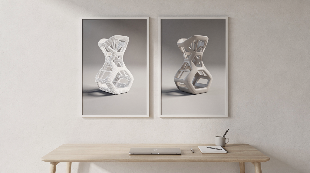
A strong 3D portfolio proves its worth in the details. Polished final renders are the hook, but they don’t tell the full story — wireframes and texture breakdowns do. In architectural visualization, this matters doubly: clients need to fall in love with the space visually, but they also need to trust that the geometry underneath is clean, the materials are repeatable, and the whole thing won’t fall apart when the camera moves to a different angle. That trust is built by showing the construction, not just the decoration.
Why wireframes and textures belong in a portfolio
Final images are excellent liars. A cleverly placed reflection can hide a UV seam that tears across three wall panels. A shallow depth of field can blur out stretched texels on a floor that looked fine at 1080p. A wireframe cuts through those tricks and reveals how the model was actually built — the edge flow decisions, the density distribution, the structural logic that holds the asset together under any lighting condition.
Texture maps do the same for surfaces. When I show a breakdown — base color, normal, roughness, metalness — I’m not just displaying files. I’m showing that the material wasn’t a single Substance Painter smart material slapped on with auto-unwraps and called done. The maps demonstrate intentionality: roughness variation where hands would touch a door handle, normal information that captures wood grain direction consistent with the joinery, metalness that differentiates coated metals from raw in architectural details.
In archviz specifically, the audience is often a mix of architects, developers, and marketing teams. The architect wants to know the window mullions are modeled accurately to the CAD files. The developer wants to see that the flooring pattern aligns correctly across an open-plan layout. Neither of them will say “nice topology” — but when the wireframe is clean and the textures are coherent, they feel the precision without needing the vocabulary. That’s the point. The technical images don’t slow down the emotional impact; they deepen it.
My basic presentation formula
Every project page I build follows a rhythm. It starts strong, proves itself, and closes with context. The sequence isn’t rigid, but the components stay consistent:
- One hero render — This is the image that stops the scroll. Usually the primary camera angle that captures the spatial intent of the scene, lit to emphasize depth and material hierarchy. In interiors, it’s often a wide shot from eye level; in exteriors, a golden-hour view that shows the massing against context.
- One or two supporting renders — Different angles, not just variations of the same shot. A close-up that reveals material grain, or a perpendicular angle that clarifies the layout. These prove the asset holds up under scrutiny from multiple viewpoints, not just the hero camera.
- A wireframe or topology view — Clean geometry overlay or shaded wireframe on a neutral background. Positioned near the final render it supports, so the viewer’s eye can flick between them and immediately understand the structure-to-result relationship.
- A texture breakdown or material sheet — Organized, labeled, showing the primary maps that built the surface. I avoid dumping every single map from the PBR stack; instead, I show what mattered: the normal that defined the stone relief, the roughness that separated polished from weathered areas, the albedo that drove color variation.
- A short process note — Two or three sentences that explain the core challenge and the logic behind key decisions. Not a software changelog. “This kitchen island required custom topology around the waterfall edge to avoid smoothing artifacts at the miter joint” tells a story; “Modeled in Blender, textured in Substance, rendered in Corona” tells a shopping list.
That combination gives a viewer both the visceral hit of the final image and the quiet confidence that the work has a spine. It respects the time of someone reviewing fifty portfolios in an afternoon, while still rewarding the person who wants to lean in and study the construction.
What wireframes should show
A wireframe’s job is to answer one question: does this model make structural sense? Not “is it dense enough” or “how many polygons did you use,” but whether the edge flow follows the form logically, whether the density is distributed where it’s needed for silhouettes or deformation, and whether the geometry is free of the kind of messy triangulation that causes micro-artifacts in reflections.
In architectural scenes, this often means paying attention to mundane things: the edge loops around a baseboard profile that needs to catch light cleanly, the vertex distribution along a curved ceiling coffer, the way wall intersections resolve at corners without z-fighting or gaps. A wireframe that shows these details communicates that the modeler understood the rendering consequences of topology, not just the modeling checklist.
Best practices for wireframe presentation
- Use a clean neutral background — mid-gray or a subtle gradient works better than pure white or black, which can clip the wireframe lines or make them hard to parse at a glance.
- Show the full model, not a cropped fragment, unless you’re zooming in on a specific detail that’s the point of the breakdown. Context matters; a wireframe of a chair leg without the rest of the room loses scale.
- Keep the wireframe visible but avoid visual chaos. Overlay mode with controlled opacity, or a shaded wireframe with backface culling off and a single color, often reads cleaner than the default dense mesh view with all edges on.
- Pair it directly with the final render. Side-by-side or stacked, the two images should feel like a before-and-after that explains themselves.
- Add triangle or polycount when the project is optimization-heavy — relevant for real-time archviz projects destined for Unreal Engine or Twinmotion, where every draw call matters and the viewer needs to see that you achieved the look at a sustainable budget.
What to avoid
- Overly dense wireframes that turn into gray noise. If the mesh is so heavy that the edges blend into a solid blob, pick a lower subdivision level or use a filtered view that shows control edges only.
- Random viewport screenshots with gizmos, grids, and UI elements still visible. These read as laziness, not transparency. The wireframe is a curated image, same as the final render — compose it, light it in the viewport if needed, and render it out properly.
- Wireframes without any label, context, or adjacent final image. A standalone wireframe floating on the page asks the viewer to guess what they’re looking at. Don’t make them guess.
- Showing only one tiny angle if the model’s structure matters globally. For a full building exterior, one front-facing wireframe doesn’t explain how the side volumes join or how the roof geometry resolves. Show the views that reveal the complexity.
A wireframe should feel like evidence, not exhaust. It’s there to support the story the portfolio is telling, not to dump every technical flag that proves you worked hard.
How I present textures without clutter
Texture sheets can easily become the visual equivalent of a spreadsheet — informative but soulless. The goal is to show material construction in a way that’s both technically clear and visually respectful. I organize maps in a consistent grid, usually two columns with base color and normal on top, roughness and metalness below, and any additional maps like height or ambient occlusion stacked beneath if they contributed meaningfully to the final look.
But a map sheet alone is never enough. Textures exist in context — a roughness map looks like a gray blur until you see the surface it produced under light. So I always pair the sheet with a close-up render of the material behaving in the scene: wood grain catching side light across a floor plank, fabric showing nap direction on an upholstered chair, stone revealing subtle displacement at a corner edge.
A good texture breakdown usually includes
- Base color or albedo
- Normal map
- Roughness or glossiness map — I keep these in the same workflow the renderer expects, so if the engine maps roughness directly, I show roughness, not a converted glossiness pass
- Metalness map when the asset uses a metallic-roughness PBR workflow
- Ambient occlusion if it drives meaningful detail in the shader or was baked into the maps
- A close-up render showing the material in action under representative lighting
For archviz, I also consider showing tiling behavior — a wider shot that reveals whether the pattern repeats visibly across a large surface, and what was done to break up repetition. In some cases, I’ll include a small UV layout snippet for hero assets where the unwrap quality matters to the final texture resolution.
Recommended portfolio layout for each project
A project page needs to work for two very different audiences: the fast scanner who gives each portfolio ten seconds before deciding whether to stay, and the detail-oriented reviewer who will zoom in on every edge. The layout should respect both. Here’s the structure I’ve settled on after years of iterating:
| Section | Purpose | What to include |
|---|---|---|
| Hero image | Immediate visual impact | Best final render, full bleed or large format, showing the project’s strongest angle and lighting |
| Supporting renders | Show range and composition | Wide establishing shot, medium detail view, close-up material study — different information at each scale |
| Wireframe | Prove structure | Full model topology view, paired visibly with the hero render it supports |
| Texture breakdown | Prove material work | Organized map sheets and contextual close-ups that demonstrate surface quality under lighting |
| Notes | Add context | Brief description of the challenge, constraints, and key decisions; tools mentioned only where relevant to the solution |
This format keeps the page scannable without sacrificing depth. Someone can absorb the hero image and skip everything else and still get the emotional hit. Someone who wants to dig deeper has a clear path through the technical evidence.
How much process work is enough
The amount of breakdown work scales with what the project is trying to prove. A polished exterior shot where the building benefits from clean but straightforward modeling might need just one wireframe and a material sheet. A complex interior with custom-designed furniture, detailed trim profiles, and hand-textured surfaces demands more: multiple wireframes for the key hero assets, texture breakdowns for the dominant materials, maybe a UV layout for the piece that required the most unwrap attention.
I follow a simple rule: if the final image sells the mood, show one solid technical breakdown. If the project sells modeling skill, show more topology and texture depth. If the project is for archviz clients — developers, architects, marketing agencies — prioritize clarity over quantity. These viewers aren’t grading your polygon efficiency; they’re judging whether you can deliver accuracy and consistency across a set of images. Give them the proof that matters to their trust, not the proof that matters to a forum critique thread.
More screenshots don’t automatically make a portfolio stronger. Better screenshots do.
Common mistakes I see
1. Hiding the technical work
Some artists fear that wireframes will break the magic — that showing the geometry underneath will make the final render feel less polished. In practice, the opposite is true. Clean construction builds trust, especially in a field like archviz where the viewer is imagining a real space they might one day inhabit or sell. A portfolio with visible wireframes reads as more honest and more professional.
2. Posting raw viewport dumps
Uncomposed viewport screenshots with axis gizmos, grid lines, or UI panels visible communicate carelessness. Technical images deserve curation just as much as final renders. Take the time to set up a clean viewport render or a properly exported wireframe pass that looks intentional.
3. Overexplaining simple work
A portfolio is not a production diary. If the render itself communicates the point, a short note is enough. Lengthy paragraphs about basic cube modeling or standard lighting setups dilute the impact of the projects where the process was genuinely complex.
4. Mixing unrelated assets
If the portfolio is shifting focus toward archviz, character sculpts, sci-fi props, or stylized game assets from earlier years should move to an archive section or a separate page. The presentation should read as cohesive and intentional, not as a timeline of every interest the artist ever had.
5. Showing technical images without context
A wireframe means little in isolation. Pair it with the final render, and add one sentence that explains what it proves — “Wireframe demonstrates consistent edge flow along the curved cabinetry, avoiding shading artifacts at the joinery.” That one line transforms a technical image from noise into evidence.
How this helps an architectural visualization portfolio
Architectural visualization is built on trust. A developer committing to a marketing campaign needs images that won’t be called into question when a buyer’s architect reviews the plans. An interior designer presenting concepts wants to know the material representations are accurate enough to guide real-world sourcing decisions. Wireframes and texture breakdowns communicate that the work isn’t just aesthetically pleasing — it’s controlled, repeatable, and grounded in production discipline.
This matters across every archviz category: interior scenes where custom furniture modeling needs to hold up at high resolution against strong natural light; exterior renders where modeled facade details, balcony railings, and landscape geometry must feel consistent from any camera angle; property marketing visuals where dimensional accuracy translates directly into buyer confidence; and conceptual designs where the client still expects the image to reflect buildable reality, not just an artistic impression.
When I present these projects, my aim is that the viewer feels the final image was earned — that it came from a solid, transparent process, not a combination of flattering angles and post-processing tricks. That feeling sticks longer than any single render.
A practical checklist before publishing
- Is the hero image the strongest image in the set, and does it immediately communicate the project’s intent?
- Does the wireframe show useful structure — edge flow, density distribution, form logic — rather than just visual noise?
- Are texture maps labeled clearly enough that someone unfamiliar with the project can understand what each map represents?
- Do the supporting images add new information (different angle, detail, lighting condition) rather than repeating what the hero already shows?
- Is there enough context — through image pairing, captions, or notes — that a viewer understands what they’re looking at within seconds?
- Does the presentation match the portfolio’s current direction, or are there leftover assets from a previous creative identity that dilute the message?
If all answers are yes, the project is ready to publish. If any is no, that’s where the polishing effort goes next.
Simple workflow I follow
- Choose the best final render first. This decision sets the emotional anchor for everything that follows.
- Add one supporting render that shows a genuinely different angle or a revealing detail — not just a subtle camera shift.
- Pick the clearest wireframe shot. Render or export it properly rather than grabbing a quick viewport screengrab.
- Prepare a clean texture breakdown — organize the maps, label them, and include at least one in-context close-up that shows the material working under light.
- Write one or two sentences about the core challenge. Focus on the “why” behind the approach, not the tools used.
- Step back and review the page as if encountering it for the first time. If the story reads clearly in ten seconds, the layout is working. If it feels confusing or cluttered, something needs trimming or reordering.
That last step is the most important one, and the easiest to skip. Fresh eyes catch what the creator’s brain learned to ignore after hours of tweaking.
FAQ
Should every 3D portfolio project include a wireframe?
No, not every project. But any project that aims to demonstrate modeling skill — especially custom architectural elements, furniture, or detailed hard-surface assets — almost always benefits from one. For scenes composed primarily of third-party assets, a wireframe may be less critical, though showing the overall scene topology can still prove it was assembled cleanly and without geometry issues.
What if the wireframe looks messy?
First, try presenting it differently — a cleaner angle, a lower subdivision level, a shaded overlay with reduced opacity. If it still looks chaotic, the model’s topology may genuinely need improvement. A portfolio is often better off not showing weak topology than advertising it. The solution is to fix the model, then update the wireframe.
Are texture maps necessary for every project?
Not always. They add the most value when material work is a meaningful part of the project’s quality — custom PBR materials in archviz, carefully layered surfaces, assets where surface response under different lighting was a key consideration. For quick concept work or projects where the main achievement was lighting or composition, a texture breakdown can be overkill.
Can I place wireframes in a separate gallery?
Yes, technically. But it’s almost always stronger to keep wireframes and texture breakdowns inside each project page, directly next to the final renders they support. The connection between structure and result is immediate when they’re side by side; in a separate gallery, the viewer has to mentally reconstruct that link, and many won’t bother.
How many images should one project page have?
Enough to tell the full story without repetition. For most archviz projects, four to seven carefully chosen images works well — a hero, a supporting angle or two, a wireframe, a texture breakdown, and maybe a process detail. Pushing beyond ten usually means some images are redundant and diluting the impact of the rest.
Conclusion
Wireframes and textures aren’t bonus content in a 3D portfolio. They’re the proof that separates a nice image from a credible professional presentation. A render can look beautiful for a hundred lucky reasons; a clean wireframe and coherent texture breakdown show that the artist understands why it looks beautiful and can reproduce that quality predictably.
For a portfolio moving toward architectural visualization, this matters even more. Archviz clients — developers, architects, agencies — make decisions based on what they see. The strongest presentation doesn’t just show them the finished space; it shows them the discipline that built it. It answers three questions quickly: what was made, how it was constructed, and why those choices were made. That’s the presentation that earns attention, and the one that earns trust.