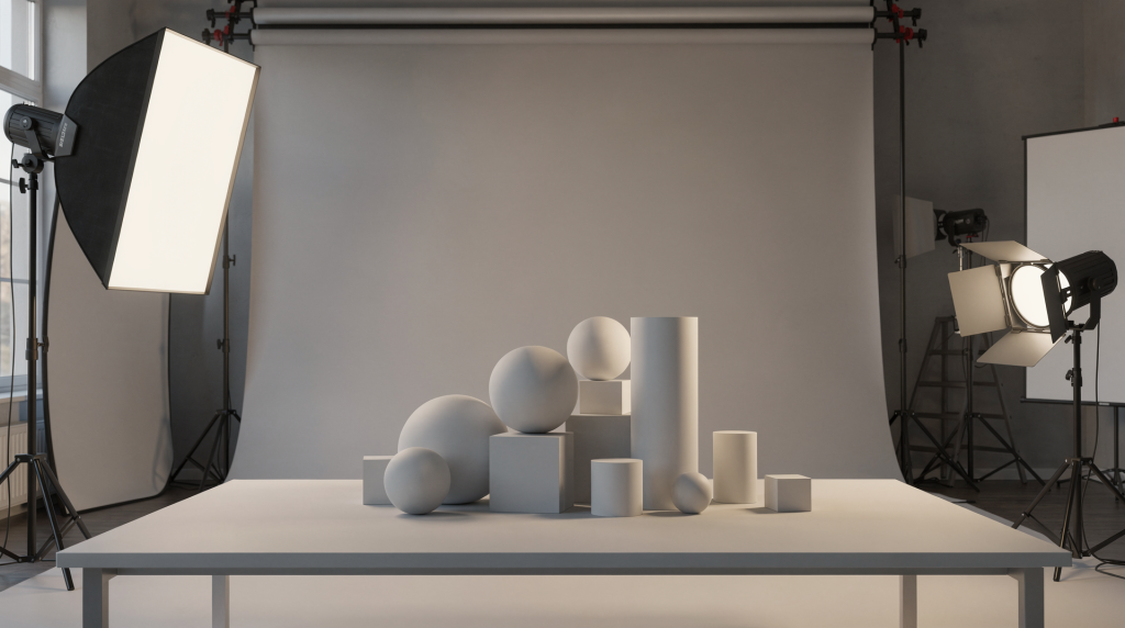
I used to think great renders were mostly about materials and detail. Over time, the biggest quality jump came from something simpler: getting the light hierarchy and composition right before polishing anything else.
That lesson has shaped how I approach interiors, exteriors, and even personal 3D art scenes. When lighting supports the subject and composition guides the eye cleanly, the image starts to feel intentional instead of merely detailed.
Why lighting and composition matter before details
A render can be technically sharp and still feel flat if the viewer does not know where to look. Good lighting gives the scene structure; good composition gives it purpose. In practice, both work together.
For architectural visualization, this is especially important because the image is often selling a space that does not yet exist. The render needs to communicate mood, scale, material quality, and spatial logic at a glance. That only happens when the frame is designed, not just filled.
I’ve lost count of how many times a client asked to “show everything” in one shot, only for the result to feel cluttered and directionless. Pushing back and narrowing the focus almost always leads to a stronger image. Before I even open a 3D scene, I ask myself what the single most important idea is that this frame must deliver. If I can’t answer that, no amount of texture detail or render engine settings will save it.
The main lesson: start with the biggest shape, not the smallest asset
One of the most useful habits I developed was to block out the scene in simple forms and judge the image in grayscale before touching fine detail. That makes it easier to see whether the composition reads clearly and whether the lighting creates depth.
In archviz, it’s tempting to immediately drop in high-poly furniture and start tweaking wood grain. But that’s like painting the trim before the walls are up. I now spend the first 20–30 minutes of any project with a clay render override active — everything is a neutral gray material, and the only things I care about are massing, camera angle, and the direction of shadows. This stripped-down view exposes weak compositions instantly.
A few questions help early on:
- What is the subject of this image?
- Where should the viewer look first?
- What supports the subject, and what competes with it?
- Does the scene have enough contrast to separate foreground, middle ground, and background?
- Can the image still work if materials are removed?
If the answer is unclear, the lighting and composition need work long before the scene is “finished.” I’ve scrapped hours of modeling because the underlying composition didn’t hold up in a grayscale test — and that’s far better than delivering a polished but forgettable image.
Lighting lessons that consistently improved my work
1. Decide the dominant light source first
Every scene needs a clear primary light direction. In exterior work, that usually means sun and sky logic first. In interiors, it means deciding whether daylight, artificial fixtures, or a mix of both should lead the image.
If the strongest light source changes from object to object, the scene feels inconsistent. A window cannot act like one light direction while a lamp behaves like another unrelated setup. I’ve seen renders where the sun casts a crisp shadow on the floor, yet a table lamp somehow produces a soft, diffused glow with no apparent falloff — the eye catches that mismatch immediately.
A practical order works well:
- Establish the dominant source.
- Add fill only where the image becomes too harsh.
- Introduce accent lights to separate forms.
- Use post-production to refine, not rescue, the lighting.
In exterior scenes, I often start with an HDRI that gives me a natural sky and sun angle, then dial in the exposure so the brightest highlights just kiss the clipping point. For interiors, I set the window light first (using a portal or area light matched to the sky intensity), then add artificial fixtures one by one, checking each against the overall balance.
2. Preserve shadow information
Early in my renders, I often overfilled shadows because dark areas felt unfinished. In reality, too much fill destroys depth. Shadow is not a problem to erase; it is part of the structure.
Useful rule: if every corner is equally visible, the image will usually feel dead. Controlled darkness helps define volume, material, and distance. In a living room scene, the space behind the sofa should naturally fall into shadow — that recession tells the viewer there’s depth, that the room extends beyond the frame. When I see a render where the ceiling, floor, and all four walls are lit to the same mid-gray, I know the artist was afraid of black.
I regularly check my renders with a false-color exposure view or a simple desaturation pass. If the shadow areas have turned into a uniform dark gray without any variation, I pull back the fill light or lower the ambient occlusion contribution. True shadows have subtle internal detail — they’re not just dark holes.
3. Keep practical lights believable
For interiors, practical fixtures should look motivated. A lamp should not turn into a glowing cannon. Kitchen pendants, sconces, and ceiling lights need to support the room, not flatten it.
The best test is simple: if you turn off the fixture mentally, does the room still make sense? If the lighting only works because everything is overexposed, it needs restraint.
I’ve learned to rely on IES profiles for downlights and spotlights — they replicate real-world light distribution, including the hot spot and gradual falloff. A bare sphere light with a uniform radius almost never looks convincing. Even a simple table lamp benefits from a small, warm-toned spherical light placed inside a translucent shade, with a subtle falloff curve. The difference between “CG light” and “real light” often comes down to that gradient.
4. Match interior and exterior light logic
When windows are visible, the outside environment matters. Interior window light should agree with the sky, weather, and time of day. A sunny exterior with a dim, muddy room usually signals mismatched lighting decisions.
This is one of the fastest ways to lose realism. The eye may not name the problem, but it feels it immediately. I’ve caught myself setting a bright, warm sun outside while the interior was lit by cool, flat ambient light — the result looked like two different times of day stitched together. The fix was to match the color temperature and intensity of the interior bounce light to the exterior sky, then let the artificial lights add warmth selectively.
In practice, I set my camera exposure for the exterior view through the window first, then adjust interior lights so they feel natural relative to that baseline. If the window blows out to pure white, I either reduce the exterior intensity or increase interior fill — but never both in a way that breaks the logic.
5. Use rim and edge separation carefully
Edge light is valuable when a subject gets lost against the background. It works especially well on furniture profiles, façade edges, and material transitions.
But it should stay subtle. If every object has a bright outline, the render starts to feel staged rather than observed. I reserve rim lighting for moments when a dark chair sits against an equally dark wall, or when a building’s silhouette needs to read against a twilight sky. A soft, off-camera spot with a tight beam and low intensity is usually enough — anything more becomes a visual gimmick.
Composition lessons that changed how I frame scenes
1. The camera is not just recording the space
A common mistake in 3D art is placing the camera where the room is most visible instead of where the image is most readable. Those are not the same thing.
A good camera angle should:
- Clarify the main subject
- Avoid cluttered overlaps
- Create depth through foreground, midground, and background
- Reveal enough context without showing everything
- Support the mood of the scene
For architecture, that often means choosing a viewpoint that describes form cleanly rather than trying to capture the whole room or building at once. I frequently test focal lengths between 20mm and 35mm for interiors — wider than that, and the perspective distortion starts to stretch furniture unnaturally; tighter, and the space feels cramped. The camera height matters too: eye level (around 1.2–1.5 meters) usually feels most natural, but lowering it slightly can make a room feel taller and more expansive.
2. Use asymmetry with intention
Perfect symmetry can work, especially in formal interiors or façades, but it easily becomes static. A small offset in furniture placement, lighting emphasis, or camera angle often makes the frame feel more alive.
The goal is not imbalance. The goal is controlled tension. In a symmetrical living room, I might shift a side table a few centimeters off-center or place a floor lamp on one side only. That tiny break keeps the eye moving. In exterior shots, an asymmetrical tree mass or a slightly angled sun direction can do the same job without undermining the architecture’s formality.
3. Frame the subject with the architecture itself
Doors, windows, beams, railings, corridor openings, and even shadow bands can act as natural framing devices. These elements guide the eye without looking decorative.
This works particularly well in architectural visualization because the environment is already full of structural lines. Use them to lead attention instead of fighting them. I often look for a doorway or a window mullion that can serve as a foreground silhouette, adding depth and directing the gaze toward the main subject. The trick is to keep the framing element slightly darker or out of focus so it doesn’t compete for attention.
4. Watch the edge of the frame
A render often fails at the borders, not the center. Tangents, cut-off objects, and accidental crops can create visual noise. If a sofa arm, tree trunk, or building edge kisses the frame in an awkward way, it steals attention.
A useful habit is to scan the outer third of the image separately from the center. Many composition problems show up there first. I’ve trained myself to run my eyes along all four edges before signing off on a render. A chair leg just barely touching the frame edge, a plant leaf intersecting the corner — these small distractions accumulate and undermine the image’s polish.
Interior vs exterior: what changes in practice
| Scene type | Lighting priority | Composition priority | Common mistake |
|---|---|---|---|
| Interior | Balance daylight, fixtures, and bounce | Keep layout readable and comfortable | Overbright lamps and flat shadows |
| Exterior | Establish sun direction, sky mood, and atmospheric depth | Organize massing and façade hierarchy | Front-lit buildings with no depth |
| Night scene | Layer practicals and selective accents | Make the brightest areas feel purposeful | Too many equal-intensity light sources |
| Close-up detail shot | Shape material and texture response | Keep the subject isolated | Background distractions and weak separation |
Beyond these differences, one universal truth applies: the lighting must always support the composition. In an interior, that might mean using a soft pool of light to define the seating area. In an exterior, it could be the way a low sun angle rakes across a façade, revealing material texture and depth. Night scenes demand extra discipline because every visible light source becomes a potential focal point — I usually limit myself to three or four distinct brightness levels and let the rest fall into shadow.
A practical workflow for stronger renders
Step 1: Block the composition in simple materials
Work in clay or minimal shading first. This removes the distraction of textures and forces you to judge the image honestly. I use a global override material (gray with slight roughness) and turn off all bump and displacement maps. The scene should look like a maquette — if it reads well as a physical model, it will read well as a final render.
Ask:
- Is the main subject obvious?
- Do the major forms read at a glance?
- Is there enough negative space?
- Are the camera angle and focal length helping the scene?
Step 2: Set the key light
Place the main light source and test the shadows it creates. The shadow direction should explain the form, not hide it. For an exterior, I rotate the sun until the building’s most important façade receives glancing light that reveals its massing. For an interior, I position the key light (often a large window or a dominant pendant) so that it naturally illuminates the primary subject — say, a dining table or a seating arrangement.
If the key light feels weak, the scene will often need structure before it needs more brightness. I’d rather increase the contrast ratio than simply boost the intensity.
Step 3: Add fill only where needed
Fill should soften, not erase. Use it to recover detail in important areas while leaving enough contrast for depth. In practice, I often use a large, low-intensity area light or an environment light with a very subtle blue tint to mimic sky bounce. The fill should never be brighter than the shadow side of the key light — if it is, the hierarchy collapses.
Step 4: Introduce accents and separation
Use smaller lights or controlled bounce to highlight edges, material transitions, or key design features. Do not light everything equally. I might place a narrow spot on a textured stone wall to bring out its relief, or add a soft rim behind a chair to separate it from a dark background. These accents work best when they’re barely noticeable — if the viewer can immediately point them out, they’re too strong.
Step 5: Re-check composition after lighting
Lighting changes what the eye notices. A frame that felt balanced in clay mode may become awkward once brightness and contrast shift. Always review the composition again after the light is in place. I often take a screenshot, desaturate it, and flip it horizontally — that fresh view reveals imbalances I’d grown blind to.
Typical mistakes I see in 3D art and archviz
- Too many bright areas competing for attention
- Symmetry used because it is easy, not because it serves the image
- Shadows removed entirely
- Windows glowing brighter than the sunlit exterior
- Interior fixtures that ignore real-world intensity logic
- Cameras placed too high, too wide, or too centered by default
- Backgrounds that are as important as the main subject
- Overuse of post-processing to fix weak lighting design
I’d add one more: relying on automatic exposure or “auto” settings in the render engine. These can mask poor lighting decisions by evening out everything. I always set exposure manually, based on the key light, and let the shadows fall where they may. That discipline forces me to light intentionally.
My personal checklist before calling a render finished
- The subject is obvious in the first second
- One dominant light source controls the scene
- Shadows still exist and help define form
- Secondary lights do not overpower the main idea
- The frame has depth, not just visibility
- The edges of the image are clean
- The composition feels intentional from every angle
- The render still works when viewed in grayscale
I keep this list open on a second monitor during final reviews. It’s saved me from sending out renders that were technically complete but visually aimless.
How these lessons apply to architectural visualization
These lessons became even more valuable once my work shifted toward interiors and exteriors. In archviz, lighting and composition are not just artistic tools; they are communication tools.
A potential buyer needs to understand the feeling of a space quickly. A developer needs the massing to read clearly. An architect needs the design decisions to feel believable. That is why disciplined lighting and framing matter more than excessive detail.
I’ve sat in meetings where a clean, well-lit render with simple materials got a better reaction than a hyper-detailed image that was visually confusing. The strongest archviz images I have made are usually not the most complex. They are the ones where everything unnecessary was removed from the frame and every remaining element had a clear job.
Final thoughts
The best lighting advice I can give from years of 3D work is simple: do not chase realism by piling on more lights and details. Build a clear hierarchy first.
If the composition leads the eye and the lighting supports that path, the scene feels real because it feels understood. That is the difference between a technically competent render and an image that people remember.
FAQ
What is the first thing to fix in a weak render?
Start with the composition and dominant light direction. Switch to a clay override or grayscale view and check if the main subject reads clearly within the first second. If you can’t tell what the image is about, no amount of material tweaking or post-processing will rescue it. Often, simply adjusting the camera angle or the sun position transforms a flat render into something with instant clarity.
Should I light interiors and exteriors differently?
Yes. Exteriors usually begin with sun, sky, and atmosphere — the HDRI or physical sky sets the overall mood, and the building’s form is revealed through shadow and light direction. Interiors usually need a balance of daylight, practicals, and bounce light. The key difference is that interior spaces have ceilings and walls that trap and scatter light, so you must account for secondary bounces and color bleeding. In both cases, the color temperature of the key light should be intentional: warm for sunset, cool for overcast, neutral for midday.
How do I know if I am using too much fill light?
If shadows disappear and the scene looks flat, the fill is too strong. A quick test: desaturate the image and check if you still have distinct dark areas that define volume. The deepest shadows should be near black, while the fill should only lift the midtones slightly. If your histogram is bunched up in the middle with no true blacks, pull back the fill or lower the ambient light contribution.
Is symmetry bad in 3D composition?
No. Symmetry can work very well for formal spaces and architectural façades — it conveys order and grandeur. It becomes a problem only when used without purpose, making the image feel static and predictable. If you do use symmetry, introduce a subtle asymmetrical element (a plant, a piece of furniture, a light gradient) to keep the eye engaged without breaking the overall balance.
Why do my renders feel busy even when they are detailed?
The frame may have too many competing focal points. Reduce visual noise by strengthening the main subject, simplifying the background, and controlling brightness more carefully. Try blurring your eyes slightly and noting where your attention lands first — if it jumps around instead of settling, you need to reduce contrast or detail in secondary areas. Sometimes, simply darkening the background or adding a subtle vignette can quiet a busy scene.