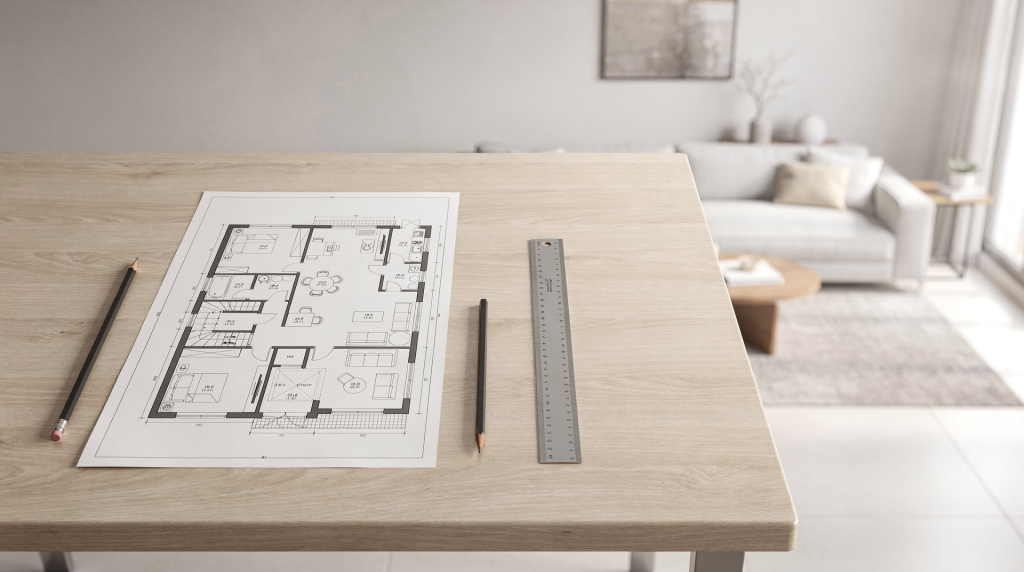
Turning a floor plan into a convincing 3D interior render is less about “making it pretty” and more about translating 2D information into a spatial story that feels accurate, readable, and believable. If the plan is solid, the render becomes an asset for design decisions, client approvals, and marketing.
Why the floor plan matters more than the final image
A good render starts with the drawing, not the materials. The floor plan defines the room sizes, wall positions, circulation, openings, and the relationship between spaces. If these basics are off, no amount of lighting or post-production will save the image.
I’ve seen too many renders where someone spent hours tweaking velvet shaders and adjusting IES profiles, only to realize the room proportions were wrong from the start. The floor plan isn’t just reference material — it’s the foundation. When I receive a plan, I treat it as a spatial brief that dictates every subsequent decision: where the light enters, how someone moves through the space, what the eye naturally settles on. Miss a dimension by 15 centimeters, and suddenly a sofa blocks the circulation path, or a window lands in an awkward spot relative to the furniture layout.
In practice, the best interior renders come from a workflow that moves in stages:
– verify the plan
– build the shell
– confirm proportions
– place cameras
– add materials and furniture
– light the scene
– render and refine
That order keeps mistakes cheap. It is much easier to move a wall before texturing than after a client has already approved the view. I learned this the hard way early on — spending an afternoon fixing UVs on a wall that later got repositioned taught me to lock geometry before touching a single material node.
What you need before you start
Before modeling, gather everything that affects accuracy and mood.
Essential inputs
– Floor plan with clear dimensions
– Ceiling height
– Door and window sizes and positions
– Elevations or sections, if available
– Reference photos or site photos
– Material references
– Furniture or FF&E list, if the project is furnished
– Any notes about style, budget, or target audience
Optional but very useful
– Site context for window views
– Contractor or architect markups
– Lighting schedule
– Product links for finishes and furniture
– A mood board showing the desired atmosphere
I always push for at least a rough ceiling height and window schedule before opening Blender or 3ds Max. Without ceiling height, you’re guessing at vertical proportions, and that guess compounds fast — a room rendered at 2.4 meters reads completely differently than one at 2.7. Site context matters more than people expect, too. If the window faces a brick wall two meters away, that changes the lighting strategy entirely compared to an open landscape. A mood board isn’t just decoration; it aligns expectations before you invest modeling time.
If you only have a floor plan, you can still produce a strong concept render. But you will make more assumptions, so those assumptions should be recorded and approved early. I usually note them in a quick email or markup: “Assuming 2.6m ceiling height and 900mm interior doors unless specified otherwise.” That single line has saved me from countless revision rounds.
Step 1: Read the plan like a 3D artist
A floor plan is not just a technical drawing. It is a map of the scene.
Look for:
– external walls and internal partitions
– door swings
– window locations
– fixed elements such as columns, stairs, kitchens, or built-ins
– room adjacencies
– circulation paths
– dimension chains and scale consistency
Architects read plans to confirm code compliance and design intent. I read them to understand how light travels, where the focal points sit, and which walls will anchor the composition. Door swings tell me where furniture can’t go. Circulation paths tell me where the camera should stand. A column that looks minor on paper becomes a major compositional element once you position a camera behind it.
Before opening 3D software, check whether the plan is legible enough to trust. If dimensions conflict, resolve them first. A render based on bad data will always feel “off,” even if the viewer cannot explain why. I’ve experienced this firsthand — a render where the dining table looked subtly wrong, and after an hour of adjusting focal lengths and camera heights, I discovered the room was 20 centimeters narrower than the plan indicated because someone miscounted a dimension string.
Common red flags
– Missing wall thickness
– No ceiling height
– Inconsistent dimension strings
– Unclear window head height
– Hand-drawn plans without scale reference
– Furniture blocks used as placeholders but mistaken for final layout
Wall thickness especially trips up beginners. A plan showing single-line walls gives no information about the actual mass of the architecture. That changes corner shadows, window reveals, and the perceived solidity of the space. I always ask for clarification if wall assemblies aren’t specified.
Step 2: Set up the scene scale correctly
The most common beginner mistake is working with the wrong scale. A room that is even 10–15 cm out can alter camera feel, furniture fit, and realism.
Scale errors don’t just look wrong — they feel wrong. Your brain knows how tall a door should be, how wide a corridor should feel. When those proportions are off, the image registers as uncomfortable even if viewers can’t articulate why. I’ve watched clients stare at renders with a vague unease until we discovered the ceiling was set to 2.2 meters by accident.
Best practice
– Choose a unit system at the start and stick to it
– Import the plan at true scale
– Measure the room after tracing it
– Compare wall lengths, openings, and diagonals against the source
A quick sanity check:
– A standard interior door is usually around 80–90 cm wide
– Ceiling heights often sit around 2.4–2.7 m in residential work
– A sofa that looks oversized in the viewport is usually a scale problem, not a style issue
I keep a mental checklist of reference dimensions: a kitchen counter sits at roughly 90 cm, a dining table at 75 cm, a standard stair tread around 25 cm deep. When something feels off, I measure it against one of these known quantities. It’s faster than hunting through the source files and catches problems early.
Step 3: Build the architectural shell
Once the plan is scaled, create the shell first:
– walls
– floors
– ceilings
– slabs or soffits
– stairs, where needed
– openings for doors and windows
At this stage, keep geometry clean and simple. The goal is not detail; the goal is accuracy. I typically use simple extrusions with proper wall thickness, avoiding booleans and complex operations that might create shading artifacts later. Clean topology now means fewer headaches when you start unwrapping UVs or adjusting normals.
What to check now
– Wall thickness looks realistic
– Door swings do not clash with furniture zones
– Windows align with the plan and elevation
– Room heights match the project data
– Corners and junctions are clean
If the room has built-ins, such as wardrobes or kitchen cabinetry, block those in early. They affect both composition and usability. A built-in wardrobe can become a natural frame for a camera angle, or it might block the sightline you were planning. Better to know that during the shell phase than after you’ve placed a dozen furniture assets.
I also check corner junctions carefully — gaps between walls and ceilings create light leaks in many render engines, and fixing them later breaks texture continuity.
Step 4: Block out the furniture before refining
Do not start with textures. Start with massing.
Place simple proxy objects for:
– sofas
– beds
– tables
– chairs
– cabinets
– lighting fixtures
– rugs
– key decor elements
This stage tells you whether the room works spatially. A beautiful render with poor circulation still fails. I use basic primitives or low-poly placeholder models — just enough geometry to judge scale and flow. The goal is to test the layout without getting seduced by a beautifully detailed chair that might not even stay in the scene.
What you are checking
– Can people realistically walk through the room?
– Is the furniture too large or too small?
– Does the arrangement match the plan’s intent?
– Does the composition support the camera angle?
This is where many “nice” images fail. They may look stylish, but the layout does not feel liveable. I’ve corrected renders where a coffee table sat 80 cm from the sofa — technically possible, but nobody would use the space that way. The blockout phase catches these functional problems before they get buried under materials and lighting.
I also test multiple furniture arrangements at this stage if the plan allows flexibility. Moving proxy boxes takes seconds; retexturing and relighting a finalized scene takes hours.
Step 5: Choose the right camera angle
Camera placement changes everything. A weak angle can flatten the space, hide the design, or distort proportions.
The camera isn’t just a viewpoint — it’s how you guide attention through the room. I think about what I want the viewer to feel first: spaciousness, intimacy, flow between rooms. Then I choose a position and focal length that supports that goal.
Good camera choices usually:
– show the room’s depth
– reveal the key design feature
– keep vertical lines under control
– avoid extreme wide-angle distortion
– support the client’s goal, whether that is sales, approval, or presentation
Useful rule of thumb
Pick the camera after the shell is built but before final detailing. That way, you avoid wasting time on objects that may not be visible. I’ve modeled detailed kitchen accessories that never appeared in the final render because they sat behind the camera frustum. That stings.
Common camera mistakes
– Too low, making furniture feel oversized
– Too wide, causing warped edges
– Framing too much ceiling or floor with little design value
– Hiding the room’s strongest feature
– Overlooking practical sightlines from a human eye level
I typically set the camera at around 1.1–1.2 meters for residential interiors — roughly seated eye height — and use a focal length between 24mm and 35mm (full-frame equivalent). Wider than 20mm, and the perspective distortion starts fighting against the realism you’re trying to create. Some spaces demand it, but it should be a deliberate choice, not a default.
Step 6: Add materials and finishes
Materials turn a blockout into a believable interior. But realism depends on more than the texture itself.
Material work should include
– base color
– roughness or gloss level
– scale of the texture
– surface imperfections
– edge wear or variation where appropriate
A wood floor with the wrong plank scale will ruin the illusion instantly — too wide, and the room feels miniature; too narrow, and it reads as dollhouse-scale. I always check texture dimensions against real-world references. A typical oak floorboard is about 180–220mm wide; if my texture shows planks spanning half a meter, the whole room shrinks visually.
A marble slab with repeating patterns will also stand out immediately. Always check texture scale against the object size. I’ve used tileable textures that looked seamless in the material preview but created obvious repetition patterns across a 3-meter kitchen island. Breaking up repetition with subtle variation maps or careful UV adjustments solves this.
Edge wear and surface imperfections matter more than high-resolution textures alone. Perfectly uniform glossiness across an entire floor screams CG. A slight roughness variation where footsteps would naturally wear the finish adds the kind of subtle realism that viewers register subconsciously.
Step 7: Light the room for mood and accuracy
Lighting is where the render starts to feel alive.
You usually need to balance:
– natural light from windows
– artificial light sources
– reflections on glossy surfaces
– shadow softness
– color temperature
I approach lighting as a hierarchy. Daylight establishes the base illumination and color direction; artificial lights add warmth and depth; accent lights draw attention to specific features. If any one of these layers overpowers the others, the image flattens.
Practical lighting approach
1. Set a clean daylight base.
2. Add interior lights to support the scene.
3. Check shadow direction and intensity.
4. Adjust exposure before adding visual effects.
5. Fine-tune contrast in post-production.
If the space is meant to feel bright and airy, avoid underexposing the room just to preserve window detail. That’s a classic trap — you expose for the window view, and the interior becomes a dark cave. I usually let the windows blow out slightly in the raw render and recover detail with a subtle highlight roll-off in post, or use light portals and interior fill lights to balance the exposure. If the goal is a cozy evening interior, warm practical lights may matter more than strong daylight. In those cases, I emphasize temperature contrast — warm 2700K lamps against cooler ambient shadows.
Color temperature consistency matters more than people expect. Mixing 3000K downlights with 4000K under-cabinet strips in the same kitchen creates a visual unease that viewers might not identify but will definitely feel.
Step 8: Add realism through lived-in details
This is where the image stops feeling empty.
Use details selectively:
– cushions
– books
– small decor
– folded textiles
– plants
– tableware
– curtains or blinds
– subtle surface clutter where appropriate
The trick is restraint. A few well-placed objects suggest occupancy without turning the render into a catalog shoot. I usually ask: “What would someone have left in this room if they stepped out five minutes ago?” A half-read book on the sofa, a coffee cup on the side table, slightly uneven cushions — these tell a story without clutter.
Do not overfill the room. Real interiors are not staged like catalogs all the time. A few believable details do more than dozens of decorative objects. I’ve seen renders where every surface held a perfectly arranged vignette, and the result felt like a furniture showroom, not a home. One or two intentional details per camera-facing surface usually suffices.
Curtains and blinds deserve special attention because they’re functional, not just decorative. How the fabric folds, how much light they block, whether they sit inside or outside the window reveal — these decisions affect both realism and lighting.
Step 9: Render test frames before final output
Never wait until the final render to discover a problem.
I render low-resolution test frames at every major stage: after shell, after blockout, after lighting setup. Each test answers specific questions and prevents the nightmare of finding a fundamental error at 4K after an overnight render.
Test render checklist
– Are the walls aligned?
– Do materials look correct at the right scale?
– Is the lighting balanced?
– Are there unwanted shadows or bright spots?
– Do key objects sit naturally in the space?
– Are the camera lines clean?
A grayscale or clay pass is especially useful before color work. It helps you judge composition without distractions from materials. I often render a quick AO pass or a simple override material at 50% resolution — it renders fast and reveals spatial problems that textures and lighting might mask. If the composition works in flat gray, it will work with materials.
Step 10: Post-produce carefully
Post-production should enhance the render, not rescue it.
Use it for:
– color correction
– subtle contrast adjustments
– glare control
– atmosphere refinement
– minor cleanup
– realistic warmth or coolness tuning
I keep post-production light. If I’m spending more than 15–20 minutes on a still image in Photoshop or Fusion, the problem is probably in the 3D scene, not the comp. Fixing fundamental lighting or material issues in post creates brittle images that fall apart under scrutiny.
Avoid heavy filters, excessive bloom, or over-sharpening. Those usually make an interior look less believable, not more polished. I’ve watched renders go from convincing to video-game-like because someone cranked the clarity slider or added aggressive vignetting. A gentle S-curve for contrast, a subtle white balance shift toward warm or cool depending on the mood, and targeted burn/dodge to guide the eye — that’s usually enough.
Floor plan to 3D interior render: practical workflow summary
| Stage | Goal | What to verify | Common risk |
|---|---|---|---|
| Plan review | Understand the space | Dimensions, openings, fixed elements | Missing or conflicting data |
| Scale setup | Match real-world size | Unit system, wall lengths, heights | Wrong proportions |
| Shell modeling | Build the architecture | Walls, floors, ceilings, windows | Dirty geometry |
| Blockout | Test layout | Furniture fit, circulation, composition | Overcrowded rooms |
| Camera setup | Define the view | Eye level, framing, distortion | Weak or unrealistic angle |
| Materials | Add surface realism | Texture scale, reflectivity, finish | Repeating patterns |
| Lighting | Create mood and readability | Daylight, practicals, exposure | Flat or blown-out image |
| Post-production | Polish the image | Color, contrast, cleanup | Overediting |
How to check whether the render matches the floor plan
A render can look attractive and still be wrong. Use this quick verification process:
Geometry check
– Compare wall lengths against the plan
– Confirm door and window placement
– Measure room proportions in 3D
– Make sure fixed elements sit where expected
I keep the original plan open on a second screen and actively measure between it and my 3D scene during the verification pass. It takes five minutes and catches errors that would otherwise reach the client.
Design check
– Does the furniture support the intended function?
– Is the layout consistent with the plan?
– Do the main view and circulation make sense?
Visual check
– Does the image show the room’s purpose clearly?
– Is the lighting believable?
– Are the materials consistent across the scene?
– Does the render feel coherent from the chosen camera angle?
Coherence is the word I come back to. Everything in the frame — light temperature, material quality, furniture style, level of detail — should feel like it belongs to the same space and the same level of finish. A photoreal wood floor next to a low-poly lamp breaks the illusion faster than a slightly soft shadow.
Typical mistakes to avoid
– Modeling from a low-quality floor plan without clarification
– Ignoring ceiling height until late in the process
– Using furniture assets that do not match the project scale
– Choosing a camera before the layout is approved
– Adding too many decorative objects too early
– Overlooking window views and exterior context
– Applying textures before the geometry is confirmed
– Pushing post-production until the image looks artificial
I’ve hit most of these at some point. The furniture scale one is pernicious — downloading a beautiful 3D model only to realize it’s 20% too large for the room, then trying to scale it and breaking the proportions of details like cushion thickness or leg dimensions. Always check asset dimensions against real-world measurements before committing them to the scene.
When to use a simple render vs a full photoreal interior
Not every project needs the same level of finish.
Use a simpler render when:
– the layout is still being discussed
– the client wants quick concept approval
– you need to test room proportions
– the design is likely to change
A clay render or a simple diffuse-override render with basic sunlight can communicate spatial qualities without investing in materials and lighting polish. I use these for initial client conversations — they focus feedback on layout and flow rather than whether they like the backsplash tile.
Use a fully polished render when:
– the plan is locked
– finishes are selected
– the image will be used for marketing
– the client expects presentation-quality output
That distinction saves time and prevents unnecessary revisions. Nothing’s more frustrating than polishing a render to presentation quality only to have the client shift a wall by 300mm the next day.
FAQ
Can you create a 3D interior render from just a floor plan?
Yes, if the floor plan is clear enough to define the room layout, openings, and scale. The fewer supporting documents you have, the more assumptions you need to make. I’ve delivered concept renders from nothing but a dimensioned plan and a brief phone call about style, but the result depends heavily on experience filling in the gaps — ceiling heights, window styles, construction details.
What file types are best for floor plan based rendering?
CAD, PDF, Revit, and clean image-based plans are all workable. The best result comes from accurate dimensions and readable wall and opening information. Vector formats like DWG or clean PDFs beat scanned hand-drawings every time, simply because you can snap to exact geometry rather than tracing a fuzzy line.
Do you need elevations to make a good interior render?
Not always, but they help a lot. Elevations clarify window height, built-ins, ceiling details, and other vertical elements that a floor plan cannot fully describe. Without them, you’re making educated guesses about window sill heights, bulkhead depths, and wall finishes above eye level.
Why does my render look different from the floor plan?
Usually because of scale errors, incorrect camera choice, or missing information such as ceiling height and window placement. The perspective nature of a 3D camera also compresses distances differently than an orthographic plan view — a room that looks spacious from above can feel narrow at eye level.
What is the most important step in the workflow?
Getting the plan and scale right. Every later decision depends on the accuracy of that foundation. I’d rather spend an extra hour verifying dimensions than discover a fundamental error after materials and lighting are finalized.
Conclusion
A strong floor plan to 3D interior render workflow is built on accuracy first and atmosphere second. If the plan is read correctly, the shell is modeled cleanly, the camera is chosen with intent, and the materials and lighting support the design, the final image will do more than look good — it will communicate the space clearly and convincingly.
For architectural visualization, that is the real job of the render: not decoration, but translation. You’re turning architectural intent into a visual experience that clients can inhabit before a single brick is laid. The process rewards patience at the early stages and discipline throughout — measure twice, model once, and let the atmosphere emerge from the accuracy, not in spite of it.