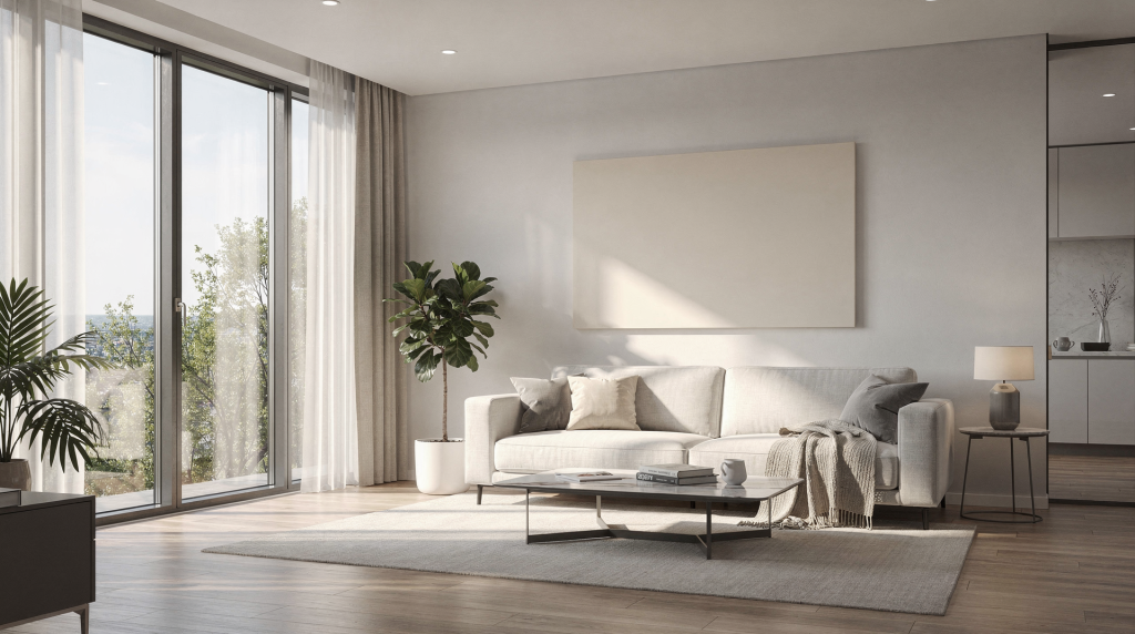
Photorealism in an apartment interior isn’t about chasing beauty for its own sake — it’s about constructing an image where every decision reinforces believability. Scale, light, materials, clutter, and camera behavior all have to pull in the same direction. When they do, the render stops feeling like a 3D scene and starts reading like a real apartment caught at just the right moment.
Why photorealism matters in apartment interiors
A strong interior render does more than impress visually — it tells clients, buyers, and designers how the space will actually feel. That means the image has to communicate room proportions, the quality of daylight, furniture fit, the character of finishes, and the overall mood without creating visual noise.
In real-estate and architectural visualization, the goal goes beyond aesthetics. The image must help decision-making, remove uncertainty, and make the design easier to approve, market, or refine. When the render reads as a believable space, conversations shift from “what if” to “this is how it works.”
The full workflow: from brief to final image
I’ve found that a clear, repeatable workflow is what keeps a project predictable and prevents expensive rework at the final stages. Every step has a purpose, and skipping one usually shows up later.
1. Gather the right references
Start with hard inputs, not just a moodboard. For an apartment interior, I need:
- Floor plans and exact dimensions — without accurate measurements, the entire scene sits on unstable ground.
- Elevations and sections for understanding vertical relationships.
- Ceiling plans and lighting layouts — knowing where actual fixtures will go is critical for believable artificial light.
- Material boards or finish schedules — these define the real-world products I have to match.
- Furniture references, including dimensions and catalog links if possible.
- Site photos when the building exists; they ground the context.
- Mood references that capture atmosphere — the kind of light, contrast, and feeling the client wants.
A moodboard is useful, but it should support the technical brief, not replace it. If the brief asks for a “warm, premium apartment with soft natural light,” I translate that into specific material pairings, lighting temperatures, and composition rules before touching any software.
2. Build the shell accurately
The apartment shell is the backbone of realism. Walls, floors, ceilings, windows, doors, trims, and any built-in joinery must be modeled at true scale. I always work in real-world units — millimeters or centimeters — and check every measurement against the plan. Even a few centimeters off on a corridor width can make the whole layout feel cramped or unrealistic.
Common shell mistakes that immediately break believability:
- Walls that are too thin or too thick — they mess with shadows, ambient occlusion, and the perceived solidity of the architecture.
- Window heights placed arbitrarily — the relationship between sill height, head height, and furniture beneath them has to make sense.
- Skirting boards and trims omitted entirely — real rooms rarely meet the floor with a sharp zero-radius edge.
- Doors that swing into furniture or block circulation paths when open.
- Ceiling heights artificially compressed to fit more objects into the frame — the viewer’s eye detects the squeeze immediately.
If the architecture isn’t right, no amount of material polish or clever lighting will salvage it.
3. Block the furniture before detailing
I place large pieces first, then work down to smaller elements:
- Sofa
- Dining table
- Bed
- Storage units
- Rugs
- Lighting fixtures
- Decor and lifestyle objects
This stage is purely about spatial logic. I walk through the room in my mind (or even do a simple fly-through) to check circulation paths, visual balance, and usability. Can someone comfortably walk between the sofa and the coffee table? Does an open cabinet door block the main passage? An apartment interior should look functional, not like a showroom where every corner is stuffed just because it could hold something. Negative space is part of the composition.
4. Set the camera like a photographer
The camera defines how the apartment is perceived. A physically correct model can still look amateur if the framing is weak. I treat the camera as if I’m photographing a real interior.
For most apartment interiors, I stick to a few rules:
- Keep verticals perfectly straight — use a shift lens in the render engine (native in Corona/V-Ray) rather than correcting in post.
- Avoid excessive wide-angle distortion. A focal length of 24–28 mm (full-frame equivalent) usually gives enough coverage without making the room feel like a fisheye photo.
- Frame around a clear focal point — a feature wall, the dining table, or the bed anchored in the composition.
- Leave breathing room around key furniture so they don’t clip the edges.
- Show depth, not just a flat front view — layers of foreground, midground, and background guide the eye.
The most effective angles I typically use in apartment projects include:
- Entry-to-living-room view — establishes the arrival sequence.
- Living room looking toward windows — reveals daylight quality and connection to outside.
- Kitchen-dining connection — shows how the two zones relate.
- Bedroom corner with visible depth — highlights both the bed and a window or wardrobe.
- Bathroom shot that emphasizes material texture and clean geometry, often with a tighter focal length.
Lighting: the difference between flat and believable
Lighting is the single biggest factor that separates a render that reads as a 3D scene from one that feels inhabited. A perfectly modeled room can still look sterile and lifeless if the light has no hierarchy. I always start with natural daylight and then add artificial sources only where they support the mood.
Build lighting in layers
A layered approach lets me control mood without overcomplicating the scene. I use a basic structure like this:
| Lighting layer | Purpose | What to check |
|---|---|---|
| Key light | Main daylight or primary fixture | Direction, intensity, mood — does it define the main light story? |
| Fill light | Softens harsh shadows | Shadows should remain natural, not washed out into flatness. |
| Accent light | Highlights selected features | Use sparingly — a single painting or textured wall benefits more than ten spots fighting for attention. |
| Practical lights | Visible lamps, pendants, sconces | Must match the fixture design in brightness and color temperature; a real lamp doesn’t flood the whole room. |
| Bounce light | Adds realism through reflected illumination | Surfaces should not feel isolated; light should softly spread from bright walls and floors to nearby objects. |
Natural daylight is almost always my base. I introduce artificial lights only where they make sense — and I keep most of them off during daytime shots. A common mistake is turning on every single lamp, which makes the scene feel like a lighting catalog rather than a lived-in room.
Use real-world logic
Photorealism depends on believable exposure and light behavior. I treat light in the render engine the same way it behaves in a physical room.
Key principles I follow:
- Sunlight enters through windows with a clear, consistent direction — soft morning light feels different from harsh midday, and the shadow angles must match the time of day.
- Interior shadows soften as they bounce off walls; the GI solution should let secondary light fill corners naturally.
- Bright surfaces influence nearby objects — a white wall next to a sofa will spill diffuse light onto the fabric.
- Lamps create localized pools of light; I set their intensity so they illuminate their immediate surroundings without overpowering the scene. Inverse‑square falloff is essential here.
If the apartment has large windows, daylight should dominate daytime shots. For an evening mood, artificial light steps into the lead while window areas darken gradually — I often let them go quite dark, which makes the interior feel warm and protected.
Materials and textures: where realism is won or lost
Materials in archviz are not just color swatches. Real surfaces interact with light through roughness, reflection, depth, and tiny imperfections. I work with a PBR mindset: every material decision affects how light bounces and how the eye interprets the surface.
What every material needs
For a convincing result, I always make sure the following properties are defined:
- Base color or albedo — realistic values; no pure black or pure white.
- Roughness or gloss level — wood grain, paint, metal, and fabric each need distinct behavior.
- Normal or bump detail — subtle surface texture that catches light correctly.
- Reflection behavior — specular intensity and Fresnel; even matte surfaces reflect a bit at glancing angles.
- Realistic scale — a wood grain that’s too large or a tile pattern that’s too small instantly breaks the illusion.
- Imperfections and variation — no two floorboards are identical; I use multi-texture setups or subtle noise to break repetition.
A polished floor should reflect, but not like a mirror — a blurred reflection map or reduced gloss is usually enough. Painted walls need a slight waviness in the bump channel and a tiny amount of roughness variation. Fabric must absorb light differently from leather or metal; I often add a subtle sheen or falloff to the diffuse channel.
Match the real product
Whenever possible, I use actual manufacturer references for:
- Flooring — plank dimensions, texture direction, edge bevels.
- Tiles — exact pattern, joint width, and grout color.
- Countertops — veining, edge profiles.
- Cabinet finishes — matte, satin, or high-gloss, and the precise color.
- Fabric upholstery — weave scale, fuzziness, and measured color.
- Metal fixtures — chrome versus brushed nickel have vastly different roughness and anisotropy.
This is crucial in apartment interiors because clients often care about precise finishes. A beautiful render that shows the wrong wood tone or tile pattern will trigger revision cycles that could have been avoided. I’ve learned to request a physical sample or official PDF whenever the budget allows — it saves time later.
Avoid the “perfect showroom” trap
Real apartments show subtle signs of life. That doesn’t mean mess; it means controlled, intentional imperfections:
- Slight fabric folds on cushions, not perfectly ironed.
- Minor surface variation — a hint of grain disruption in wood, a faint wipe mark on the kitchen counter.
- Soft irregularities in wood floor planks, maybe one with a bit more specular than its neighbor.
- Gentle clutter — a couple of books on a side table, a remote control, but not an explosion of objects.
- A rug that’s slightly asymmetrical or shows a slight pile direction.
The goal is to make the space feel lived-in without looking messy. I usually add these touches at the very end, after the lighting and main composition are locked.
Styling the apartment without overloading it
A photorealistic apartment interior needs props, but props must serve the story. I ask myself: who lives here? That guides every styling choice. The objects should feel like they belong to someone, not like they were pulled from a random pool of “nice things.”
Add signs of life carefully
Good additions that advance the narrative:
- Books with worn spines or a bookmark — they suggest someone is reading them.
- Tableware — a simple breakfast setup or a single coffee cup on the counter.
- Plants — they add organic shape, but choose ones that suit the light levels of the room.
- Cushions and throws that are slightly rumpled, not placed with surgical precision.
- Lamps with a visible glow; a turned‑on pendant above the dining table instantly says “usable space.”
- Wall art that reflects a taste, not a generic abstract print.
- Small personal objects — sunglasses, a notepad, a charging cable half‑tucked away.
Bad additions I try to avoid:
- Random decor with no connection to function or narrative.
- Too many accent colors fighting for attention.
- Oversized plants that block the main view or circulation path.
- Over‑styled surfaces that look like a catalog set — every surface doesn’t need 15 objects.
The rule I keep in mind: every object should either help explain how the space is used or strengthen the composition. If it does neither, it goes.
A practical checklist before final rendering
Before hitting that high‑resolution render button, I run through this checklist. It catches the issues that are easy to miss after staring at the scene for hours.
- Are all dimensions correct against the plans?
- Does furniture scale match the room? Check a few key pieces against real catalog specs.
- Are vertical lines perfectly straight? No keystone effect.
- Does the composition have one clear focal point, or is the eye wandering?
- Is daylight believable for the chosen time of day? Shadow angles, color, and intensity should align.
- Do the light sources match the fixture design? A small pendant shouldn’t output the light of a floodlight.
- Are materials physically consistent? No object looks like it belongs in a different universe.
- Do reflections look natural? Check for missing blurred reflections or overly sharp ones.
- Is the scene too empty (sterile) or too cluttered (unreadable)?
- Are there any floating, clipping, or intersecting objects? A chair leg hovering 1 mm above the floor kills realism.
- Does the render support the apartment’s target audience — does it sell the lifestyle the client wants?
- Are there any hot pixels (fireflies) or excessive noise in shadow areas? I often check with a quick high-sample region render.
The most common mistakes in apartment interior rendering
Over the years, I’ve seen a handful of errors repeat across projects. Here are the ones that hurt realism the most, along with what I do to avoid them.
1. Ignoring real scale
The fastest way to ruin believability is to have a couch that’s 10 cm too wide or a bed that looks miniature. Viewers have an instinctive sense of how a bedroom or living room should feel. In apartments, even small scale errors jump out because the spaces are compact. I always cross‑reference furniture dimensions from the manufacturer’s spec sheet, not from the 3D model’s bounding box alone.
2. Overusing wide-angle lenses
Wide lenses can make a small apartment look more spacious, but they also distort furniture and compress depth in unnatural ways. When the room starts looking like a fisheye photo, the render loses all credibility. I keep focal lengths at 24 mm or longer unless there’s a specific storytelling reason to go wider, and I often stitch multiple views instead of cramming everything into one distorted shot.
3. Over-lighting the scene
Too many lights flatten the mood. Real interiors have a clear light hierarchy — some areas are brighter, others fall into softer shadow. I often see renders where every lamp is turned on at full power, destroying any sense of direction or time of day. In my scenes, I’m not afraid to let corners go dark; it adds depth and realism.
4. Using uniform materials
Flat, perfectly even materials make the image feel synthetic. Large surfaces like walls, floors, and sofa upholstery need variation. I add subtle noise to the roughness, slight color variation across floorboards, or a barely‑visible bump pattern on painted walls. These details are invisible when you look for them, but their absence is immediately felt.
5. Filling space for the sake of it
A cluttered apartment render is hard to read and often feels cheap rather than luxurious. Negative space helps the eye understand layout and scale. In a small apartment, a clean, well‑organized corner can make the whole room feel more spacious and premium. I place objects only when they serve the composition or tell the story of use.
Recommended production order
I stick to a tight order that prevents backtracking and keeps the project moving smoothly:
- Confirm the brief and reference pack — everything locked before modeling starts.
- Model the apartment shell with exact wall, floor, and opening dimensions.
- Place large furniture — no detailing yet, just block volumes.
- Set the camera views — this influences how I approach the rest, because what’s off‑camera can be less detailed.
- Build lighting — establish the core atmosphere.
- Apply base materials — neutral grayscale or simple colors to check material scale and light response.
- Refine textures and surface detail — swap in final PBR maps, adjust roughness and bump.
- Add props and styling — only after the lighting and materials feel solid.
- Test render at low resolution — region renders or whole‑frame preview.
- Adjust balance, contrast, and composition based on the test.
- Produce final render at full resolution.
- Post-process delicately — only what makes the image better, not what fixes underlying problems.
Why test renders matter
Low-resolution previews are one of the most valuable habits in this workflow. A quick render reveals:
- Lighting imbalance — one side too hot, another too dark.
- Wrong camera height — even 20 cm too high or low changes the feel of the room.
- Poor furniture placement — it’s much easier to tweak blocking in an early stage.
- Overbright windows burning out details.
- Dark corners swallowing geometry.
- Material mismatches — a tile pattern that looked fine in the viewport but tiles badly in the render.
Fixing these issues in preview mode is quick and keeps the final render stable. I often use region rendering to zoom in on problem areas and iterate fast.
Post-production: polish, not rescue
Post-processing in Photoshop, Lightroom, or Fusion should enhance what the render already delivers, not hide fundamental errors. I keep it light:
- Adjust contrast — a subtle S‑curve to deepen shadows and brighten highlights without clipping.
- Fine-tune white balance if the raw output feels slightly too warm or cool.
- Enhance mood with gentle color grading; a slight tint in the shadows or a subtle LUT can work wonders.
- Balance exposure — lifting dark areas just enough to show detail, but keeping the original light hierarchy.
I avoid heavy bloom, extreme clarity, or compositing that changes the lighting structure. If an image only works after intense Photoshop manipulation, the base 3D scene usually isn’t strong enough. The goal is a render that already looks convincing straight out of the engine; post is the final 5%.
Apartment-specific considerations
Apartment interiors differ from houses or commercial projects because compact layouts magnify every mistake. There’s no extra square footage to hide awkward proportions or sloppy modeling. Precision matters at every step.
What matters most in apartments
- Efficient furniture spacing: even 5 cm can be the difference between a comfortable walkway and a squeezed feeling. I always simulate a person of average height moving through the space.
- Correct circulation paths: door swings, clearance around beds, and access to storage must feel natural.
- Strong storage integration: built-in wardrobes, overhead cabinets — when modeled correctly, they make small areas feel organized rather than cluttered.
- Smart daylight use: I prioritize letting natural light penetrate deep into the space; it’s often the most valuable luxury in an apartment.
- Clear view lines: what you see from the entry door or from the main seating position affects the whole experience.
- Material cohesion: in small rooms, clashing materials feel chaotic; a restrained palette unifies the space.
How to make small spaces feel premium
- Use restrained palettes — two or three materials at most for major surfaces, with subtle variation.
- Keep furniture visually light — pieces with legs, glass tops, or slim profiles let the floor read, which adds perceived space.
- Let daylight travel deep into the room — I model window reveals and mullions thin enough not to block light, and use bright wall colors to bounce illumination.
- Avoid visual clutter — negative space amplifies luxury; I leave counters and floors relatively clear.
- Emphasize texture over loud color — a rich linen fabric or honed stone reads as high‑end without shouting.
- Use mirrors or reflective accents carefully — a mirror opposite a window can extend the light, but I make sure it reflects something interesting, not a blank wall.
FAQ
What makes a 3D apartment interior look photorealistic?
Realistic scale, physically believable lighting, accurate materials with micro‑detail, and careful styling that implies human presence — these factors together create the strongest sense of realism. It’s also about context: a view from the window that matches the expected location, light that behaves as it would at that time of day, and surfaces that reflect and absorb light correctly.
Should apartment renders look perfect?
No. They should look clean and intentional, but still reflect real-world surface behavior. Perfectly flat paint, wrinkle‑free cushions, and mathematically uniform floorboards signal “computer‑generated.” I deliberately introduce controlled imperfections — a slight asymmetry, a subtle roughness variation — so the eye accepts the scene as real.
What is the biggest mistake beginners make?
They usually jump into detailing and prop placement too early, while ignoring lighting, scale, and camera composition. I always recommend establishing the camera views and key light first, blocking the scene, and only then refining materials and adding decor. That foundation prevents most rework.
How many light sources should an interior have?
Only as many as the scene actually needs. A daytime shot often works with just the sun and sky (via an HDRI or physical sky), maybe plus a single accent light. An evening scene might need three or four motivated practicals. The number isn’t the point — the hierarchy and purpose of each light are what matter.
Do I need expensive assets for photorealism?
Not at all. Good composition, lighting, and material accuracy will carry the image much further than an expensive library. I’ve used free models effectively by ensuring they’re textured well and placed correctly. Paid assets can save time, but they’re not a shortcut to realism.
Conclusion
Creating a photorealistic apartment interior in 3D is a disciplined process built on many small, deliberate choices. When the shell is accurate, the camera is placed with intent, the lighting has a clear hierarchy, and the materials behave like real surfaces, the final render earns trust. The best apartment renders do one thing exceptionally well: they make the viewer believe the space already exists. And that belief is what moves projects forward, from approval to sale.