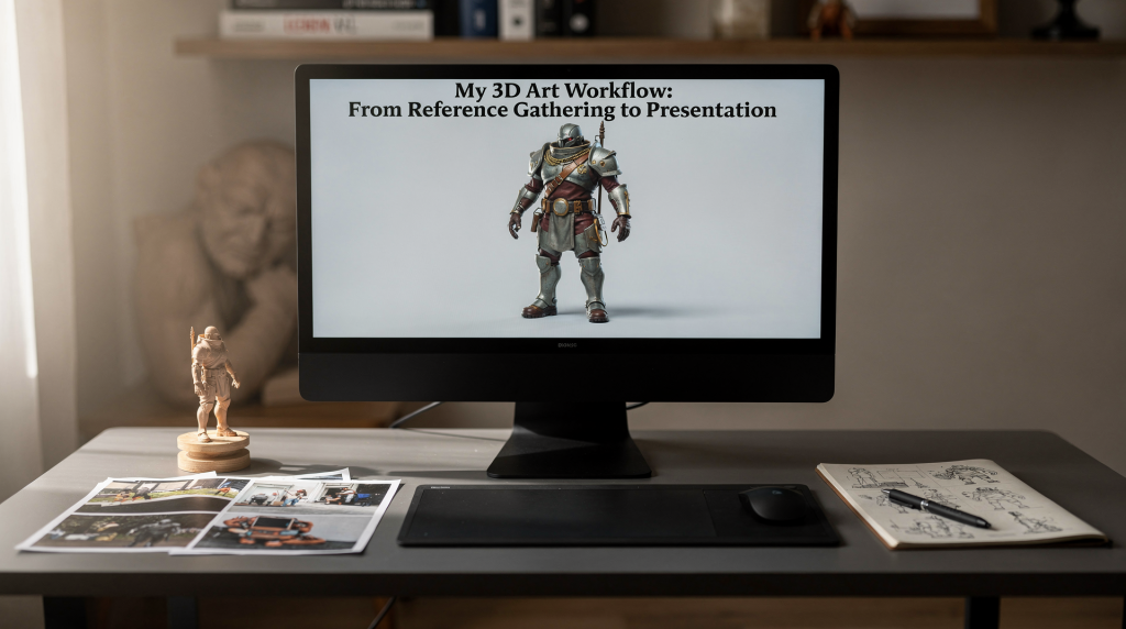
A strong 3D art workflow isn’t just about making pretty images. It’s about building a repeatable process that keeps you organized, lets you make faster decisions, and helps you present work with clarity and intention. In architectural visualization, that counts double: every reference you choose, every material, every camera angle, and every final export should support the story of the space.
Why workflow matters in 3D art
I’ve seen plenty of renders that looked polished on the surface but had no real focus behind them. When the process is a mess, you end up wasting hours hunting for references, revising the wrong things, or showing half-baked ideas too early. A clear workflow removes that friction and gives each stage a concrete goal: collect, define, build, refine, and present.
For architectural visualization specifically, a structured workflow also becomes your main communication tool with clients or collaborators. You’re not just producing an image; you’re showing how a property, interior, or exterior will feel before it exists. When both you and the client know what to expect at each step, feedback becomes targeted, and the final render actually solves the right problem.
The full workflow at a glance
| Stage | Goal | Main output |
|---|---|---|
| Reference gathering | Clarify the visual direction, mood, and material language | Moodboard, organized image library, annotated notes |
| Planning | Decide what the image must communicate | Shot list, camera strategy, style brief |
| Blockout | Lock composition and scale | Simple 3D massing scene with correct dimensions |
| Asset and material setup | Build realism into the scene | Textured models, PBR material library assigned |
| Lighting and rendering | Create mood and legibility | Test renders, balanced lighting, final frames |
| Post‑production | Refine the image, don’t rescue it | Clean, polished renders ready for presentation |
| Presentation | Show the work with context | Portfolio images, case study boards, client‑ready PDF |
1. Start with reference gathering
When a new project lands, I don’t immediately open 3ds Max. The first real step is gathering references. Good references aren’t just a collection of “nice looking” images. They help you answer three very practical questions:
- What’s the visual goal?
- What mood should the scene carry?
- Which details need to be accurate?
In architectural work, I split references into four groups:
- Design references: interiors, exteriors, furniture, landscaping, specific architectural styles.
- Technical references: floor plans, elevations, material schedules, site plans—often provided by the client.
- Lighting references: time of day, weather conditions, artificial lighting setups, seasonal context.
- Presentation references: how similar projects are framed, annotated, and laid out in portfolios or brochures.
How to collect references efficiently
Don’t save everything. Curate with intent. I use PureRef to drop images in, crop them if needed, and group them by category. It’s fast and visual. On disk, I keep a project folder with subfolders for architecture, materials, lighting, composition, and presentation. Only images that solve a problem or clarify a decision stay in. For each, I add a short note directly in the filename or in a side document: “good warm daylight through sheer curtains,” “strong facade rhythm with vertical fins,” “useful kitchen material pairing with honed marble and matte wood.”
This up‑front investment pays off later when you need to explain why a certain texture, camera height, or lighting setup was chosen. It also stops you from endlessly scrolling through Pinterest without a purpose.
Common mistake
Many artists collect references too late—after modeling has already started. I’ve done that, and every time it led to at least one round of unnecessary revisions. Now I block out a solid half‑day just for reference gathering and organization before I touch any geometry. It feels slow at first, but it saves days later.
2. Turn references into a clear brief
A moodboard is helpful, but a brief is better. The brief should define what the final image must achieve, not just what it looks like.
I always ask:
- Who is the viewer? A potential buyer, an architect reviewing the design, or someone browsing my portfolio?
- Is this for marketing, approval, or personal showcase?
- What’s the single most important selling point of the space?
- Which room, facade, or angle matters most?
For architectural visualization, a strong brief typically includes:
- Project type
- Target audience
- Key shot list
- Style direction
- Output format and resolution
- Deadline
- Revision limits
Example
If the project is a luxury apartment interior, the brief may prioritize spaciousness, enveloping natural daylight, high‑end finishes, and a calm, aspirational mood. If it’s an exterior for a new build, the priorities shift to accurate massing, how the building sits on the site, facade materials, and realistic context with landscaping. The brief becomes my compass when I’m tempted to detail an area that won’t even show in the final shot.
3. Build the scene in stages
A disciplined build order keeps you from polishing the wrong thing too early. I work in layers, moving from rough to refined.
Stage 1: Blockout
First, I establish scale, proportions, and camera placement. The scene looks deliberately crude—grey boxes for furniture, no materials, maybe a simple sun light. What matters here are correct dimensions (I always set system units to centimeters or meters and model to real‑world scale), spatial flow, major object placement, and initial composition. If the room proportions are wrong, no amount of shading will fix the image later.
Stage 2: Asset placement
Once the composition holds up, I swap placeholder primitives for actual objects: furniture, fixtures, decor, exterior context elements, and landscaping. But I don’t yet dive into heavy detailing. I keep the layout believable—empty spaces should feel usable, not crowded. Overfilling a scene is a trap I still have to consciously avoid, especially in interiors where every surface seems to beg for an accessory.
Stage 3: Materials and realism
Materials carry a huge part of an architectural render’s credibility. Even a simple scene can feel convincing if the surface response reads correctly. I work mostly with a PBR approach: for dielectrics, I keep albedo values in the 0.2–0.8 range, use realistic IOR around 1.5–1.6, and pay attention to roughness variation—not a flat value, but a good roughness map with subtle noise. I usually source base textures from Quixel Bridge and then adjust in the material editor.
I always check a few things:
- Texture scale—does the wood grain look 10 meters wide?
- Roughness—does the floor reflect like a mirror when it shouldn’t?
- Edge wear and micro‑imperfections—real surfaces aren’t factory‑clean.
- Material consistency across the scene—the same concrete shouldn’t look wildly different in two rooms.
Before moving on, I sometimes apply a grey material override to the whole scene just to confirm the lighting reads well—if the image works in flat neutral grey, the materials will only improve it.
4. Use lighting to shape the story
Lighting isn’t just about making things visible. It’s what sets the emotional tone, emphasizes form, and directs the viewer’s eye. In architectural visualization, lighting decisions get baked in early, and they must align with the brief.
Here are the broad approaches I cycle through, depending on the project:
| Lighting type | Best for | Notes |
|---|---|---|
| Natural daylight | Residential interiors, exteriors, lifestyle visuals | Corona Sun + Sky or V‑Ray Sun; I adjust sun azimuth to highlight facade details or cast long shadows across a floor |
| Overcast light | Product‑like architectural studies, clean presentations | HDRI with soft cloud cover (e.g., Peter Guthrie skies); shadows are gentle, form reads well without drama |
| Golden hour | Emotional portfolio images, high‑impact marketing | Warm low sun, long shadows, cool sky contrast—strong atmosphere but requires careful exposure balance |
| Night lighting | Commercial properties, mood‑driven visuals | Needs balance between interior practicals and exterior ambient; I often rely on Corona LightMix to fine‑tune after rendering |
| Mixed lighting | Interiors with windows and artificial sources | Hardest to nail—daylight spilling into a room with warm lamps; white balance and exposure must be judged per shot |
Practical lighting tips
- I always establish a single key light first, with everything else turned off. That gives me a baseline for direction and shadows.
- Fill light comes in only if the scene needs more readability; often a subtle global illumination boost is enough.
- Use realistic color temperatures: 2700K–3000K for warm residential lamps, 4000K–5000K for daylight sources.
- Test lighting only from the active camera view—viewport impressions can be misleading.
- I keep an eye on the false‑color exposure check in the V‑Ray Frame Buffer or Corona VFB to avoid blown‑out areas that can’t be recovered.
Typical lighting error
A render can look dramatic but become unreadable. If the client can’t understand the layout or the materials because half the room is in shadow, the image is failing its core job. In presentation work, clarity is just as important as atmosphere—sometimes more.
5. Render test passes before final output
I never jump straight to final render. Test passes at low resolution—say 800×600 with interactive rendering—catch problems early and prevent wasted hours. The goal of a test isn’t beauty; it’s verification.
During tests I check:
- Camera framing—does the crop still feel right?
- Exposure and highlight clipping
- Shadow quality and direction
- Material response—any obviously wrong reflections?
- Noise levels and render settings impact
- Object intersections or floating assets
- Reflections that might cause distracting artifacts
If I suspect lighting issues, I’ll render with a material override (flat grey) to see pure light distribution. This has saved me more than once.
A simple render checklist
- Camera locked and composition approved
- Materials assigned and texture paths validated (no “missing map” errors)
- Lighting balanced and tested from the hero camera
- Texture scale and UVW mapping double‑checked
- No clipping geometry or gaps in walls
- Output resolution and aspect ratio confirmed
- Color space and file format planned (e.g., 16‑bit EXR for post work)
6. Post-production: refine, don’t rescue
Post‑production should lift an already solid image, not save a broken one. If the base model, lighting, and materials are strong, post work becomes light and quick. I mostly use Photoshop with curves, LUTs, and a bit of dust‑and‑scratch cleanup.
Useful post steps:
- Exposure tweak—often a gentle curve adjustment
- Contrast and black/white point refinement
- Subtle color grading that matches the intended mood
- Minor highlight cleanup or bloom on specular spots
- Atmosphere enhancement, like a soft distance haze for depth
- A light vignette or depth‑of‑field vignette to guide the eye
Be careful with sharpening, clarity, and saturation. Overcooked renders quickly look artificial. If you find yourself doing heavy cloning or repainting, the issue is probably in the 3D scene, not in post.
7. Present the work properly
Presentation is part of the workflow, not an afterthought. A final image shown without context can feel incomplete. A well‑structured presentation explains the image and supports the decision‑making process for the client.
What to include in a presentation
- A hero render—the strongest, most communicative view
- Supporting views from different angles
- Detail crops that highlight key materials or design moments
- Comparison images if lighting or material options were explored
- Short annotations on material choices, lighting rationale, or design intent
Why presentation order matters
I follow a staged sequence: overview first, then the main exterior or interior shot, followed by detail views, and an alternative option if relevant, closing with a summary. This order helps the viewer process the project from big picture to small nuance—much easier to digest than throwing ten images at someone all at once.
8. Organize your files like a professional
A clean project structure is invisible until you need it. When I hand off a project or revisit it months later, the folder layout tells me exactly where to look.
Example folder structure
- 01_References
- 02_Brief
- 03_Models
- 04_Textures
- 05_Renders_Test
- 06_Renders_Final
- 07_Post
- 08_Presentation
File naming example
Use names that are self‑explanatory. I include a date or version number:
20250408_interior_blockout_v03project_livingroom_lighttest_v02project_exterior_final_day_v01
Avoid names like final_final_new2. They waste time and create confusion the moment you’re not the only one looking at the file.
9. The biggest workflow mistakes to avoid
- Starting to model before the brief is clear
- Collecting too many references without sorting or annotating them
- Ignoring real‑world scale and unit settings until late in the process
- Treating lighting as decoration instead of structure
- Over‑editing in post—piling on bloom, clarity, and fake bokeh
- Presenting work without any context or shot sequence
- Saving files with no version control or logical naming
- Not packing external assets when archiving, leading to missing textures later
Most of these are easy to prevent once you have a simple system in place. They slow down solo artists and client projects equally, and they’re almost always the result of skipping a step in the workflow.
10. A practical workflow you can reuse
Here’s the condensed version I apply to nearly every architectural project:
- Gather references and organize them by purpose.
- Write a short brief and define what the image must communicate.
- Block out the scene with correct scale and rough cameras.
- Place main assets and check composition—still low detail.
- Build materials and test surface realism against references.
- Set lighting and render small previews; iterate quickly.
- Refine the strongest version in post without overdoing it.
- Prepare presentation images and supporting notes.
Each step answers a different question. First: “What are we making?” Then: “Does it fit?” Then: “Does it feel real?” Finally: “Does it communicate clearly?” That sequence removes guesswork and keeps me in creative control rather than reacting to chaos.
Checklist: before you call the image done
- The scene matches the brief’s intent
- The composition is readable and the focal point is clear
- Materials look consistent, believable, and correctly scaled
- Lighting supports the mood without destroying legibility
- Every camera angle feels intentional, not accidental
- No technical errors remain—clipping, UVW issues, missing maps
- The final image is ready for portfolio or client presentation
FAQ
How many references should I use for one project?
Enough to guide the design clearly, but not so many that the direction becomes muddy. A focused set of 10–20 strong references is often far more useful than hundreds of random images. I try to keep it tight and annotate why each image is there.
Should I finish modeling before setting up lighting?
No. Basic lighting should be tested very early, even during blockout. A simple sun or HDRI helps you judge scale, spatial depth, and mood much sooner than trying to imagine it. I often do lighting tests alongside the massing phase.
What matters most in architectural visualization?
Accuracy, clarity, and mood in the right balance. A beautiful render that hides the space’s true layout is far less valuable than a slightly simpler image that communicates the design with confidence.
How do I know if my presentation is strong enough?
If someone without prior knowledge can grasp the project’s purpose, main features, and atmosphere without extra explanation, the presentation is doing its job. Test it on a colleague or a friend who hasn’t seen the project.
Conclusion
A reliable 3D art workflow turns creativity into a repeatable, efficient process. When you gather references with intention, define the brief clearly, build in stages, and present with context, your work becomes stronger and easier to trust. For architectural visualization in particular, that structure is what makes a render feel not just polished, but believable, useful, and professionally ready.