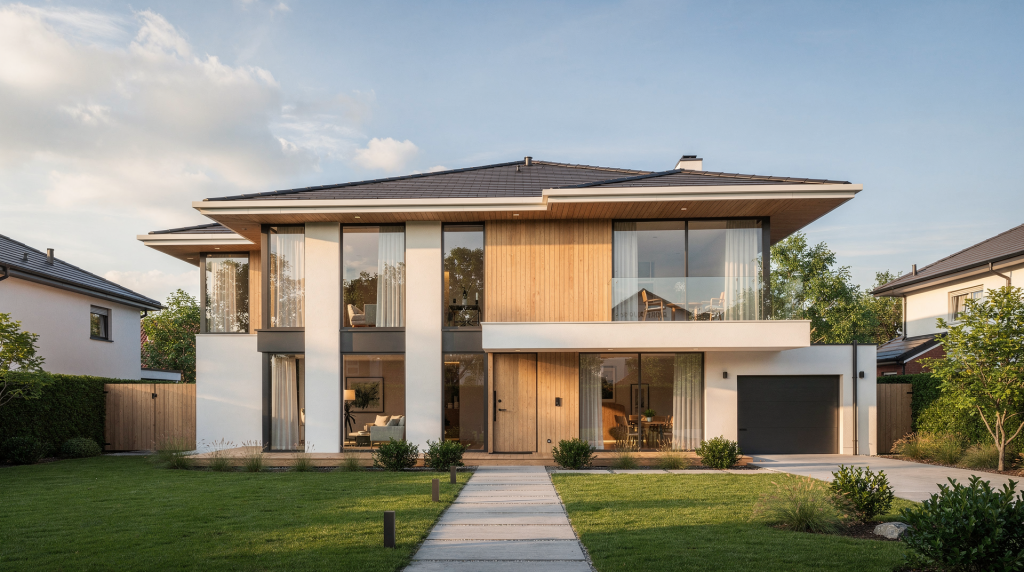
A well‑executed architectural visualization does more than showcase a pretty house. It becomes the first mental walk‑through for clients—giving them a clear sense of scale, the behaviour of materials, how daylight moves through a space, and the quiet, everyday feeling of a home long before construction starts. This case study follows the creation of a modern family house render set, where the objective was not just realism but a calm, believable, commercially useful outcome that could carry the project from design approval right into marketing.
Project Overview
The assignment was simple in theory: deliver exterior and interior visuals for a contemporary single‑family residence, usable for presentation, client sign‑off, and eventually for marketing collateral. The real challenge lay beyond technical fidelity. The renders had to communicate how a family would genuinely inhabit the place—how the rooms flow together, how the light changes across the floor plan, and what the architecture feels like when you stand in front of it, at eye level, as a future owner rather than a bystander.
What the client needed
- A cohesive visual narrative for a modern single‑family home
- Images that supported design review and pre‑construction communication
- A balanced set of exterior and interior views
- Warmth and an understated lived‑in atmosphere, without the house looking over‑styled or “staged for a magazine”
- Consistent design language across all shots
Why this type of project matters
Modern family houses are frequently sold off‑plan, which means the visualizer is effectively the bridge between line‑drawings and an emotional first impression. Good renders shorten decision‑making for clients, architects, and potential buyers because they remove ambiguity. They let you feel the weight of a staircase, the proportion of a living area, and whether the light in the kitchen at 9 a.m. will make you want to stay there. When you get that right, the images stop being “pretty pictures” and start acting as a reliable communication tool.
The Design Intent
Modernist‑leaning architecture can turn sterile if you visualize it too literally. The key was to preserve the clean geometry while warming the presentation with carefully chosen materials, soft daylight, and subtle signs of everyday life. The house had to read as practical, not as a showroom.
Core visual goals
- Emphasise horizontal lines and simple volumetric geometry
- Visualise the relationship between interior and outdoor spaces—thresholds, sight‑lines, and garden access
- Use natural materials (timber, stone, matte plaster) to dial down the visual sterility that often plagues modern CG interiors
- Add a family‑friendly layer of realism through furniture scale, lighting temperature, and carefully chosen props
- Avoid visual clutter that pulls attention away from the architecture itself
Reference Gathering and Planning
Before any modeling or rendering started, the project was broken into three reference categories. This separation helps avoid the common trap of mixing up mood and detail too early.
1. Architectural references
These pinned down proportions, massing, roofline behaviour, window rhythm, and facade composition. With modern family houses, small proportion errors—a sill placed 50 mm too high, an overhang that’s slightly too shallow—become obvious fast, especially on front elevations. References from built projects of similar typology saved endless back‑and‑forth later.
2. Material references
The surface palette needed to feel contemporary but believable. Real‑world examples showed how a restrained mix of plaster, timber, stone, metal, and glass works when you avoid throwing too many “hero” materials at a single facade. The references also helped set expectations for roughness variation, joint patterns, and how materials weather over time—details that add subconscious credibility.
3. Lifestyle references
These guided furniture selection, styling density, and the degree of “lived‑in” character. A family home should look usable, not messy. That line is thin, and the difference between curated realism and visual noise often comes down to a few well‑placed objects—a book on a side table, textiles that soften hard surfaces, tableware that suggests the kitchen was just used. Lifestyle references prevented over‑styling while still injecting warmth.
Workflow: From Plans to Final Images
A structured pipeline keeps a project controllable, especially when feedback loops are inevitable. For this house, the workflow followed a pragmatic sequence designed to minimise revisions and keep the overall look coherent.
Step 1: Review the plans and camera objectives
Not every viewpoint deserves render time. The first decision was which angles would best explain the house. That meant discussing with the architect where the main selling points were, then locking down a minimal but expressive set of cameras:
- Front exterior – to establish architectural identity and street presence
- Rear exterior – to show the garden connection and outdoor living potential
- Main living area – to communicate spatial generosity and daylight
- Kitchen/dining zone – as the functional and social heart of the home
- Optional secondary bedroom or circulation view – added only if it helped describe the volume and flow of the plan
Step 2: Build or clean the 3D model
The base model must be accurate before any visual polish goes on. In archviz, even small inaccuracies—window‑to‑wall proportions that don’t match the drawings, sill heights that drift, stair risers that feel off—can break realism entirely because the viewer’s brain picks up on architectural inconsistencies faster than on texture tiling. Checking the model against the latest plans and aligning it to real‑world units was the first critical quality gate.
Step 3: Block the lighting early
Lighting is the emotional backbone of any render, and it’s best blocked in before you get attached to materials. In a modern family house, a soft, natural daylight setup (HDRI with a well‑placed sun angle) typically gives the most honest foundation. Artificial lights were added later only to support evening or mood shots; they were kept secondary and never allowed to overpower the daylight narrative. Testing light direction early also revealed which views would flatter the architecture and which would suffer from flat shadows.
Step 4: Set materials and textures
This is where the project starts feeling architecturally credible. For a modern house, real‑world imperfections are what sell the image—not high‑contrast, hyper‑clean surfaces. The material work included:
- Slight roughness variation in plaster and painted walls to catch light differently across the surface
- Natural grain direction in timber, aligned with how it would be cut and installed on site
- Imperfect reflections in glass (a touch of waviness and very subtle dirt near edges)
- Soft colour shifts in stone and concrete, using multi‑channel maps to break repetition
All materials were built as PBR‑compliant, which kept them predictable across different lighting conditions.
Step 5: Add landscaping and context
A house never exists in a vacuum. Even minimal landscaping changes the perceived scale, expense, and groundedness of the property. For this project, we used restrained native planting, a simple driveway, and subtle hardscaping—enough to frame the architecture without competing with it. The goal was to make the building feel like it belongs on its site, not floating in a generic CG void.
Step 6: Refine styling and render the final views
This final layer is where the home starts feeling inhabited. The objective was never to decorate aggressively, but to tell a believable domestic story through a handful of props—cushions that soften a sofa, utensils near the cooktop, outdoor furniture that suggests morning coffee. The rule of thumb: add one object, then ask whether it supports the architecture or distracts from it. Most renders die from “prop‑itis”; we aimed to cure that early.
Exterior Visualization: What Makes a Modern Family House Work
Exterior images are usually the first thing a client sees, so they need to be both clear and persuasive. For this project, the exterior mood was built around a calm, premium family‑home atmosphere—nothing overly dramatic, just an honest presentation of light, material, and scale.
Important exterior choices
| Element | What worked best | Why it mattered |
|---|---|---|
| Camera height | Human eye level (approx. 1.65 m) | Made the house feel accessible and real, not drone‑like |
| Time of day | Soft daylight or late afternoon | Supported material readability and added gentle shadow depth without harsh contrast |
| Landscaping | Clean, restrained planting | Kept attention on the architecture while still anchoring the building |
| Materials | Limited palette | Prevented the design from reading as chaotic or over‑styled |
| Composition | Strong front corner or three‑quarter view | Showed massing, entrance hierarchy, and the relationship between solid and void |
Common exterior mistakes to avoid
- Over‑saturating sky and grass – pulls the image into “CG brochure” territory immediately
- Overloading decorative plants – steals focus and makes the house feel smaller
- Making glass too mirror‑like – modern glazing rarely reflects with 100% crispness; a slight roughness and tint help immensely
- Ignoring shadow softness – hard‑edged shadows often feel game‑engine rather than photographic
- Choosing an angle that hides the entrance – clients need to understand the approach and entry sequence
- Pushing contrast so far that the building looks like an illustration rather than a place
Practical tip
If a modern exterior render feels too empty, improve context before adding more objects. A well‑modelled driveway, a few correctly scaled native plants, a subtle footpath, and properly proportioned fencing often do far more for realism than extra decoration. It’s about grounding the house in a believable environment, not about filling dead space.
Interior Visualization: Making the Home Feel Lived In
Modern interiors are shockingly easy to make clean and equally hard to make human. The central challenge here was bridging that gap without resorting to over‑propping or turning every surface into a showroom display. The solution was simple styling that felt emotionally warm but visually quiet.
What the interior needed to communicate
- A family‑friendly layout with logical circulation
- Generous daylight penetration, especially in the living core
- Clear visual flow between kitchen, dining, and lounge areas
- Comfortable, correctly scaled furniture—neither too bulky nor miniature
- A sense of quiet everyday life, as if the owners had just stepped out
Interior styling principles
- Use fewer but better‑chosen props—every item earns its place
- Mix rectilinear architecture with softer organic forms (rounded upholstery, woven textures)
- Avoid showroom perfection: books should be slightly askew, fabrics should have a subtle crease
- Keep surfaces organised but not sterile—an empty kitchen counter reads as unlived, while a cluttered one is distracting
- Add small domestic cues: a pair of reading glasses, a folded throw, a ceramic bowl that suggests morning routine
Best areas to focus on
Kitchen and dining zone
This is often the emotional centre of a modern family house. It works best when countertop styling is minimal—perhaps a single fruit bowl and a pair of neutral tableware items—and the lighting feels practical rather than theatrical. Soft under‑cabinet illumination and a view through to the dining area can instantly boost the sense of livability.
Living room
The living room should feel like a genuine place to sit, not a furniture catalogue spread. Sofa depth, rug size, and side‑table placement directly affect how the viewer perceives circulation and comfort. Even an empty room can be saved by a well‑positioned floor lamp and the warmth of a textile‑based material palette.
Stair or hallway views
These shots are often overlooked, but they reveal volume and vertical flow in ways that floor‑plan‑centric views cannot. When treated with careful lighting and a few considered details—a small console, art on a wall—they give the client a complete mental map of the house.
Lighting Strategy
Lighting is the make‑or‑break element in architectural rendering. A modern family house needs to feel bright without being washed out, warm without turning orange, and dramatic only where the brief justifies it. The goal was to use light to describe the architecture, not to hide it behind glossy effects.
Interior lighting tips
- Daylight should be the primary source; artificial lights should support the atmosphere, not fight it
- Keep artificial fixtures soft and colour‑temperature‑matched across views
- Avoid visible hotspots on ceilings and walls—they instantly reveal an uncritical light setup
- Use shadows to define depth and spatial hierarchy, not to hide awkward geometry
- In open‑plan spaces, let light naturally differentiate zones (kitchen vs. seating) rather than relying on forced contrast
Exterior lighting tips
- Choose a time of day that flatters the material palette: morning light often works for east‑facing facades, while late afternoon brings warmth to stone and timber
- Let shadows articulate the building’s massing—corners, recesses, and overhangs should read clearly
- Window glow should be believable: a slight warm tone inside at dusk, but never glowing like a video game
- Avoid over‑dramatic skies unless the brief specifically calls for a hero shot; most client presentations value clarity over cinematic flair
Rule of thumb
If a render looks visually impressive but the lighting doesn’t make architectural sense—for instance, a key facade is in shadow while the secondary volume is brightly lit—the image may fail in a client meeting. Readability and spatial logic must always come before mood effects. Once the basics are solid, you can push atmosphere further without losing credibility.
Material and Finish Decisions
For modern family homes, materials do a lot of storytelling. What you exclude is often more important than what you include. A restrained palette consistently looks more expensive and more timeless than an overloaded one.
Recommended material logic
- Main facade: light plaster or a concrete‑look finish, with subtle micro‑texture
- Secondary surfaces: timber cladding or darker accent panels, used sparingly to define volumes
- Openings: dark metal or powder‑coated frames with a very fine profile
- Hardscape: stone, precast concrete, or textured paving that grounds the building
- Interior warmth: wood flooring (wide planks), fabric upholstery, matte finishes on joinery
Why restraint works
Too many competing textures make the architecture harder to read. When the material palette is clean—say, two dominant materials on an exterior—the house reads as intentional and contemporary, not as a render that tried too hard. It also sidesteps that nagging “CG over‑designed” feel where every surface shouts for attention. Subtle imperfections within those few materials (micro‑variations in roughness, slight colour shifts, natural joint lines) inject realism without breaking the visual hierarchy.
A Simple Production Checklist
Before final sign‑off, running through a checklist saves time and embarrassment. Here’s what we used:
- Verify camera angles show the project’s main selling points—not just attractive compositions
- Check window heights, door sizes, and stair proportions against the latest plans
- Review all materials for scale issues and visible tiling patterns
- Confirm furniture dimensions match the room size (a 2.8 m sofa in a 3.2 m niche will break believability)
- Ensure landscaping supports, rather than overwhelms, the architecture
- Test the image in grayscale to check contrast and composition
- Inspect reflections, especially in glass and polished surfaces—too perfect reflections are a dead giveaway
- Look for repetitive textures, over‑sharp corners, or surfaces that appear unnaturally uniform
- Ensure all rendered views tell one consistent visual story—same season, same quality of light, same material logic
Typical Client Feedback and How to Handle It
In family‑house projects, feedback often orbits atmosphere rather than factual accuracy. That’s both useful and potentially dangerous, because vague comments can trigger endless, scope‑creeping revisions.
Common feedback phrases
- “It feels too empty”
- “Can we make it warmer?”
- “The house looks too dark”
- “The garden needs more life”
- “The living room should feel more inviting”
How to respond effectively
- Ask whether the perceived issue stems from lighting, styling density, or composition—each demands a different fix
- Offer one or two targeted adjustments (e.g., raise ambient warmth by 200 K, add a few specific props) instead of agreeing to broad, undefined changes
- Show side‑by‑side options if the mood is unclear; a single comparison can clarify the direction faster than a dozen emails
- Keep the architecture itself stable while refining atmosphere—don’t let styling talk mutate into redesigning the building
Lessons from the Project
A few practical truths were reinforced throughout this job:
- A modern family house needs deliberate warmth, not just geometric accuracy
- Small material decisions (like matte wood instead of glossy laminate) have a disproportionately large impact on perceived quality
- The best renders explain how the home will actually be used, not just what it looks like
- Exterior and interior visuals must feel like parts of one unified project, not separate experiments
- Clear, early camera selection saves huge amounts of time and lifts presentation quality more than any post‑production trick
Final Outcome
The final image set presented the house as a realistic, comfortable modern home with a strong architectural identity. Each view supported clear design communication, helped the client grasp the finished atmosphere, and created a polished presentation package that could work both for formal approval and for early‑stage marketing. Most importantly, the renders made the unbuilt feel familiar—and that is the litmus test of good archviz.
Conclusion
A successful modern family house visualization is not about making everything glossy or dramatic. It’s about clarity, proportion, and emotional realism. When architecture, lighting, materials, and styling all pull in the same direction, the result feels believable and genuinely useful—both for the architect and for the family that will eventually walk through the front door. For this kind of project, the best approach remains simple: start with the design logic, keep the material palette disciplined, and add just enough life to make the house feel quietly, comfortably inhabited.
FAQ
What is the most important part of visualizing a modern family house?
Balancing realism with warmth. The house must be architecturally accurate, yet still feel like a place people would actually live in. If it reads as a sterile diagram, you’ve lost the emotional connection that drives client decisions.
How many views should a family‑house case study include?
Usually three to six strong images are enough: one or two exterior shots (front and rear), a main living area, a kitchen/dining view, and optionally a circulation or secondary interior scene that explains the plan. Quality and clarity outweigh quantity.
What makes a modern house render feel believable?
Correct scale, restrained material palette, natural lighting that respects the time of day, realistic reflections with slight imperfections, and subtle signs of everyday use. The moment something feels too perfect, the illusion weakens.
Should modern family house renders look highly styled?
Not usually. The best approach is understated styling—enough detail to make the space feel lived in, but not so much that it reads as a staged set. A believable middle ground keeps the focus on the architecture while inviting the viewer to imagine themselves there.
What is the biggest mistake to avoid?
Over‑polishing the image until it loses trust. A render should look clean, but it still needs small imperfections and practical logic—gravity, wear, scale cues—to feel genuinely real. Perfection is often the quickest way to break suspension of disbelief.