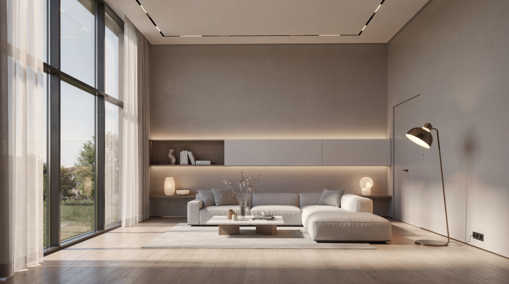
Lighting transforms a perfectly modeled but sterile 3D room into a space that feels lived-in and photographically real. A clean geometry is just a skeleton; the hierarchy of light, shadows, and reflections tells the eye what’s important. Over years of working on everything from compact city apartments to sprawling open-plan villas, I’ve found that the most convincing interior renders aren’t the ones with the most advanced techniques—they’re the ones built on a disciplined, layered lighting system. That system almost always combines window-driven daylight, practical fixtures rooted in the architecture, and a minimal set of accent lights that guide attention without screaming for it.
Why lighting matters more than almost anything else
When clients or art directors evaluate an interior render, their first reaction is almost never about polygon count or texture resolution; they react to whether the room feels coherent. Even a meticulously detailed scene can fall flat the moment the lighting direction contradicts itself, shadows feel depthless, or color temperatures clash. Lighting doesn’t just reveal the space—it defines its emotional weight.
In practice, good lighting achieves three things simultaneously:
- It provides legibility without flattening contrasts, so walls, floors, and furniture read clearly even in shadow.
- It supports the design intent: a calm residential morning, a high-end hospitality evening, a crisp architectural sales image.
- It makes materials behave correctly. Wood grain, stone roughness, fabric texture, glass reflections, and metallic highlights all depend on how light strikes them.
A weak setup usually produces one of three symptoms: the room is too noisy because the render engine is struggling with undersampled dark areas; the image is bright but visually dead because there’s no directionality; or—most common—every surface feels lit by an invisible dome of uniform brightness, killing any sense of depth. The target isn’t maximum illumination; it’s a believable light hierarchy where brightness falls off naturally from the primary source to the deepest corners.
The core lighting model for interior renders
Almost every successful interior render I’ve dissected (or built myself) relies on a three-layer structure. It’s tempting to throw in extra fills and tricks, but starting with a clean separation keeps the render predictable and easy to debug.
| Layer | Purpose | Typical sources | Common mistake |
|---|---|---|---|
| Primary light | Establishes the main direction and mood | Window daylight, sun, HDRI, dominant artificial fixture | Making it too weak or too harsh—both destroy the foundation |
| Fill light | Softens shadows and preserves detail | Sky contribution, bounce light, large area light | Using hidden fill lights that erase contrast entirely |
| Accent light | Adds focus and depth | Lamps, sconces, spotlights, cove lighting | Overusing accents until the scene looks chaotic |
The most reliable way I know is to bring the room to near-darkness and then introduce light in strict order: primary source, then fill, then practicals, then accents, and only after that, small corrective tweaks. This sequential approach prevents the all-too-common situation where ten lights are fighting each other and nobody knows which one is causing the weird reflections in a glass coffee table.
Start with the room’s lighting story
Before you even open the light placement tools, pin down exactly what the render is meant to communicate. I’ve seen beautifully lit scenes fail because the mood didn’t match the project’s goal: a sales image needs clarity, a lifestyle shot thrives on atmosphere. Ask yourself these questions before the first test render:
- What time of day is it? Sunrise, midday, overcast afternoon, blue hour, or purely artificial nighttime?
- Is the room supposed to feel warm, neutral, dramatic, or airy and open?
- Is this a property marketing image, a design review still, or an aspirational lifestyle visual?
- Should the emphasis be on material legibility, spatial volume, or ambient mood?
A morning kitchen with direct sun slicing across a countertop requires a completely different setup than a luxury living room at blue hour or a neutral office for a daylight analysis. If the mood isn’t defined before you start setting intensities and color temperatures, the result often becomes a visual muddle—not quite one thing, not quite another.
Common interior moods and when to use them
| Mood | Best use | Lighting behavior |
|---|---|---|
| Bright daytime | Property marketing, clean product-style interiors | Strong window light, soft shadows, clear material visibility |
| Overcast daylight | Material accuracy, design review, neutral presentation | Even illumination, low shadow contrast |
| Golden hour | Emotional residential imagery, high-end lifestyle scenes | Warm directionality, long shadows, strong atmosphere |
| Blue hour | Luxury, hospitality, evening ambience | Cool exterior light with warm interior practicals |
| Interior-only night | Restaurants, lounges, staged homes, commercial scenes | Artificial lights become the visual story |
I often decide on the mood first and then immediately set my HDRI or sky system to match it—otherwise I’m fighting the base light later with countless compensatory tweaks.
Window light: the foundation of most interiors
In architecture, windows aren’t just portals to the outside; they’re the natural directors of light, and in rendering they serve the same role. The direction, softness, and color of daylight coming through large openings establish the realism baseline. If that base is wrong, every artificial fixture you add will feel glued on top rather than integrated.
What to get right
- Position the main daylight source clearly outside the window opening—don’t let it bleed through walls.
- Ensure shadow direction is consistent across the entire frame; even subtle mismatches register subconsciously.
- Match the exterior lighting quality to the chosen time of day: hard sharp shadows for direct sun, soft diffuse for overcast.
- Balance the physical intensity between exterior and interior. In a physical camera workflow, the sun’s luminance should dominate, while interior lights compensate locally.
Visible windows should almost always be the brightest elements in a daytime scene. Interior fixtures support the image; they shouldn’t compete with daylight unless you’re explicitly selling a nighttime interior. I’ve seen renders where every ceiling downlight was pumped up to 200% to “brighten the room,” and the result lost every trace of natural light—it looked like a twilight shot with a daytime sky outside, breaking the illusion immediately.
Best practice for daylight setups
- Use a high-quality HDRI for ambient sky and reflections. A flat blue sky plus a sun light often looks synthetic; an HDRI brings the natural variation of real skies.
- Align the HDRI sun direction with your directional light source so that shadow angles match and indirect illumination is coherent.
- Add a sun or directional light (in Corona, V-Ray, or Cycles) to control shadow sharpness precisely—HDRI sun alone can be too soft or too harsh depending on the capture.
- Place area lights or light portals near window openings if your renderer uses path tracing with interior-to-exterior transitions. Portals greatly reduce noise and guide samples efficiently.
One underrated tip: always check the exposure relationship between the brightest exterior visible through the window and the interior surfaces. If the window area clips to pure white but the room is still underexposed, consider reducing the overall render exposure and then lightening the interior with a subtle fill rather than pushing the daylight beyond physically plausible levels.
Artificial lighting: make the fixtures believable
Once the daylight foundation holds, I layer practical fixtures. The key is motivation: every light should look as if an architect or interior designer intentionally placed it there, not because the 3D artist needed to lift shadows in a corner.
The most useful types of interior lights
- Recessed downlights for general ambient illumination—position them like a real lighting plan, with proper spacing.
- Pendant lights over dining tables or kitchen islands, which become natural focal points.
- Table and floor lamps for residential warmth and to create islands of brightness in a darker room.
- Wall sconces adding vertical interest and soft stratification of light along walls.
- Under-cabinet lighting in kitchens, essential for making countertops pop without blowing out the whole room.
- Cove lighting for soft architectural glow, especially effective along ceiling edges to separate volumes.
- Spotlights directed at artwork, shelving, or feature walls—but used sparingly.
Use color temperature intentionally
Color temperature is one of the fastest ways to establish believability and separate interior from exterior. Warm practical sources typically sit around 2700K–3000K in residential projects, while daylight hovers between 5500K–6500K depending on the time of day and cloud cover. That warm-cool contrast is a gift—it naturally pulls the eye deeper into the room and gives the image chromatic depth.
A solid rule of thumb that has served me well:
- Keep interior practicals warm (2700K–3000K).
- Let daylight remain neutral or slightly cool.
- Avoid mixing random temperatures without a design justification; a 4000K downlight next to a 2700K table lamp, with 6500K daylight spilling in, often reads as sloppy rather than intentional.
If every fixture has a different white balance, the scene feels accidental. If every light is exactly the same, it feels sterile. I often use a single degree of variation—say, 2800K for lamps and 3000K for ceiling spots—to introduce subtle hierarchy without chaos.
IES profiles: one of the easiest realism upgrades
IES profiles are photometric data files from real lighting manufacturers that describe how a fixture emits light in three dimensions—spread, falloff, hotspot intensity, and beam shape. They take a generic “spotlight” and turn it into something engineered, with the exact scalloped pattern of a real downlight or the asymmetric throw of a wall washer.
They’re particularly valuable for:
- Downlights, where the real-world cutoff angle prevents the ceiling itself from glowing unnaturally.
- Wall washers, which need a controlled gradient of light across a vertical surface.
- Decorative fixtures, such as a pendant that throws a patterned caustic pattern on a table.
- Spots and accent lights, where a smooth, realistic falloff eliminates the “perfect cone” look.
Why they matter: IES profiles create light pools with natural soft edges and a physically plausible distribution. They help fixtures feel genuinely part of the space, and they immediately remove that tell-tale “CG light” look where a circle of uniform brightness appears on a wall. Even if only two or three key fixtures in the scene use real IES data—the kitchen island pendants and the main downlights, for example—the overall realism jump is noticeable. I keep a library of manufacturer profiles organized by brand and beam angle, which saves enormous time when matching specific lighting designs.
A practical workflow for building the lighting setup
Over dozens of interior projects, I’ve settled on a five-step process that keeps chaos at bay and makes troubleshooting straightforward.
Step 1: Block in the daylight
Begin with a near-black room. Add the sun, sky, or HDRI in its approximate position. Place your camera at the final composition angle—or a close proxy—and do a quick low-resolution test to see the light direction, how it enters through windows, and which major surfaces catch it. At this stage, don’t obsess over brightness levels; just verify shadow logic and that the light shape feels natural. Does the sun rake across the floor in a way that leads the eye? Are the shadows falling where you expect? If not, adjust the sun angle now, before any fixtures go in.
Step 2: Set exposure early
Camera exposure is not a post-correction; it’s a structural decision. I lock it in before fine-tuning any light, because an incorrect exposure will mislead every subsequent adjustment. Check in your render’s false-color or highlight clipping mode whether highlights blow out or shadows crush to black. Use a neutral midtone reference (a grey card or a known white wall) to gauge overall brightness. The goal here is for the room to read naturally from the camera position without relying on post-processing tricks. Exposure determines whether the render reads as a photograph taken in a real room or as a lit 3D model fighting a gamma curve.
Step 3: Add practical lights
Now place visible room lights in their real positions: ceiling downlights, table lamps, pendants, under-cabinet strips, wall sconces. Keep every light motivated by the design. If the architecture includes a row of three pendants above a kitchen island, light them individually and let them cast overlapping pools. Resist the urge to drop an invisible area light to “help” a dark corner—first see if a real fixture at that location would make sense. Each practical should support how someone would actually use the space, not just fix render noise.
Step 4: Add accent lights sparingly
Accent lighting’s job is to guide the eye, not to decorate every surface. Use a spotlight to pull focus to a textured stone wall or a piece of art. Add a faint rim light on a furniture silhouette if it enhances depth. But too many accents and the scene starts feeling overproduced—like a showroom where every vase has its own tiny pin light. As a rule, if I notice an accent light before I notice the object it’s illuminating, I dial it back.
Step 5: Refine the balance
This is where the render transitions from technically lit to convincing. Tweak shadow softness to match the weather story; adjust color temperature relationships; fine-tune the brightness ratio between windows and interior fixtures; check reflections in glass and glossy surfaces to ensure bright light sources aren’t causing distracting hotspots. The goal is harmony across the whole frame, not perfection in any single light. Often, a 10% reduction in an accent light or a slight warming of the fill can finally make the scene feel “right.”
Recommended lighting ratios to keep in mind
There’s no universal formula, but these relationships have held up across countless projects in renderers from V-Ray to Cycles:
| Element | Recommended behavior | Why it matters |
|---|---|---|
| Windows | Often the brightest visible source | Establishes daylight hierarchy |
| Interior practicals | Bright enough to read, not overpower daylight | Prevents fake-looking interiors |
| Fill light | Soft and subtle | Preserves form without flattening |
| Accent lights | Small but noticeable | Guides attention and adds depth |
When indoor lights appear brighter than windows in a daytime scene, the image quickly loses credibility—unless there’s a strong narrative reason like heavy overcast or a deliberate evening transition. I often check this by temporarily switching to a false-color luminance view; if the window area isn’t the hottest zone, I know the daylight hierarchy has collapsed.
Shadow quality: soft is not always better
A default instinct for many artists is to soften every shadow, aiming for a gentle, diffused feel. That can work beautifully for overcast scenes or calm neutral presentations, but sharp shadows carry energy and direction. The choice should follow the scene’s story, not a blanket preference.
Use softer shadows when:
- The scene is overcast or you’re aiming for a design-review feel with even readability.
- The mood is calm and neutral, without drama.
- The room is small and highly reflective; too-hard shadows can create harsh contrast hotspots.
Use stronger shadows when:
- The scene needs energy and a clear light direction, such as direct sun through a large window.
- You want to emphasize material texture—strong shadows create micro-contrast on stone, brick, or fabric.
- The render is meant to feel photographic, referencing an editorial shot with intentional shadow play.
- You’re using golden hour, where long dramatic shadows are part of the desired atmosphere.
Consistency is what matters most. If one piece of furniture throws a crisp shadow while the adjacent chair is surrounded by a soft blur, the space feels visually broken even if every individual light is technically correct.
Common mistakes in interior lighting setups
Over time, I’ve seen the same handful of issues derail otherwise solid renders:
- Overfilling the room. Hidden fill lights placed low and omnidirectionally can make the image technically readable but emotionally dead. Real rooms have dark corners—embrace some falloff.
- Ignoring daylight direction. Shadows that point in multiple directions betray the setup. Even if the fill light doesn’t cast shadows, the primary source must be unambiguous.
- Too many accent lights. When every shelf, painting, and plant has its own spotlight, the composition feels cluttered and nervous. Accent lights should support one or two focal points, not scatter attention.
- Wrong color temperature balance. A room with a mix of 4000K downlights, 2700K table lamps, and 6500K window light, all left unaddressed, looks more chaotic than curated. Decide on a temperature hierarchy and stick to it.
- Bright fixtures with no visible source. If a strong pool of light hits a wall, the viewer expects a physical fixture nearby—or at least plausible reflection evidence. An orphaned glow breaks immersion.
- Flat bounce everywhere. Perfectly even global illumination can remove the sense of volume. Real spaces have variation in indirect light; walls near windows bounce more than deep corners.
A quick checklist before final rendering
I run through this mental list before committing to high-resolution or sending anything to a client:
- Is the main light source immediately identifiable?
- Do all shadows agree on direction?
- In daylight scenes, do windows read as the brightest elements, not the ceiling spots?
- Do the fixtures feel appropriate for the room type and scale?
- Is color temperature intentional across all sources?
- Are accent lights subtle enough that they don’t steal attention from the main view?
- Does the image have depth, or is every surface lit to nearly the same value?
- Can materials still be evaluated clearly in shadow areas?
- Does the lighting support the intended mood—or fight it?
If more than two answers feel weak, I stop and do a dedicated lighting pass. It’s always faster to fix now than to try to compensate later in Photoshop masking highlight and shadow regions.
Lighting setups by room type
| Room type | Best lighting approach | Notes |
|---|---|---|
| Living room | Daylight from windows plus warm lamps and soft accents | Focus on atmosphere and comfort; let the eye settle near seating groups |
| Kitchen | Strong window light with under-cabinet and ceiling practicals | Material clarity matters—countertop texture and backsplash need crisp light |
| Bedroom | Softer daylight or low artificial lighting | Keep contrast restrained; emphasize coziness over drama |
| Bathroom | Clean, even lighting with controlled highlights | Watch reflections in mirrors, chrome, and glossy tile—specular bloom can ruin subtle tones |
| Office | Neutral daylight with functional task lights | Readability is more important than mood; aim for even illumination on work surfaces |
| Dining room | Pendant-focused composition with supporting daylight | Center the eye around the table; the pendant should be the dominant interior source |
Final thoughts
The strongest lighting setups for architectural interior renders aren’t the ones with the most layers or the most advanced tools—they’re the ones that feel physically coherent, emotionally appropriate, and effortless to read. Start with a disciplined daylight foundation, layer practical fixtures that feel native to the architecture, and add accents only where they strengthen the composition. A great interior render doesn’t announce its complexity; it reads like a real room, photographed at just the right moment. That effect comes from a clear light hierarchy, controlled color temperature, and restraint in every decision.
FAQ
What is the best lighting setup for interior renders?
A reliable setup typically layers strong window daylight with a soft fill, authentic practical fixtures, and a few carefully placed accent lights. The hierarchy matters more than the number of sources—daylight should dominate in daytime scenes.
Should interior renders use HDRI lighting?
In most cases, yes. HDRI provides natural sky gradients, ambient fill, and reflections that a simple sun-plus-sky system often misses. It’s especially valuable when windows are visible or when reflective materials expose the environment.
Are IES lights necessary?
Not always, but they are one of the easiest ways to elevate fixture realism. Even a single IES profile on a prominent downlight or wall washer can remove the “perfect computer light” look and ground the scene in real-world photometry.
Why does my interior render look flat?
Flatness usually stems from overfilled shadows, weak contrast between light and dark areas, too many competing light sources, or a missing daylight hierarchy. Check if the window area is genuinely brighter than interior lamps—many flat-looking renders have the opposite.
What color temperature should I use for indoor lights?
Warm fixtures around 2700K to 3000K are a safe and natural starting point for residential interiors. Commercial or office spaces might lean toward 3000K–3500K, but the key is creating a deliberate relationship with the cooler daylight outside.
How do I make a render feel more realistic?
Keep the primary light direction consistent, balance daylight and artificial sources so neither dominates artificially, and avoid perfectly even illumination everywhere. Real rooms have variation—let shadow pockets exist and let highlights fall off naturally.