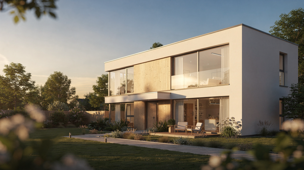
A realistic exterior render does not start with pretty trees or a dramatic sky. It starts with a clear read on the architecture, the site, and the story the image needs to tell. Over the years, I’ve learned that chasing moody lighting or perfectly scattered leaves before understanding the project’s purpose only leads to rework. For residential projects, the goal is usually simple: make the house feel believable, lived‑in, and correctly placed in its environment—without that sterile, catalog feel.
Start with the brief, not the beauty pass
Before opening the scene file, define what the image must achieve. A sales render, a planning authority submission, and a portfolio shot each demand different visual priorities. If that decision stays vague, the render usually turns into a generic “nice‑looking house” with no clear job. I’ve wasted days polishing details that ended up cropped out or irrelevant simply because nobody asked what the image was supposed to communicate first.
Questions I ask first
- What is the main selling point of the property? If it’s the view, the pool area, or the relationship between indoor and outdoor spaces, the composition and lighting should emphasize that.
- Who is the audience: buyer, planner, developer, or homeowner? A developer may need emotional warmth; a planning officer wants factual accuracy, scale, and context.
- What time of day supports the project best? This isn’t just about aesthetics—early morning light can highlight crisp architectural geometry, while late afternoon sun can make materials feel rich and tactile.
- Which parts of the design must be shown clearly? Always prioritize the architect’s intent: can’t hide that signature cantilever behind a tree just because it looks cinematic.
- What should feel calm, premium, approachable, or dramatic? The mood informs every subsequent decision, from camera angle to vegetation density.
A well‑defined brief saves hours later. It also prevents the most common mistake in residential exterior visualization: spending too much time polishing details that do not support the image’s job. You don’t need 4K pebbles everywhere if the hero is the roofline.
Build the scene around the architecture
The house should always remain the visual anchor. Landscaping, cars, paving, people, and atmosphere exist to support the building, not compete with it. When I catch myself adding a foreground flower bed that draws more attention than the entrance, I pull back. Everything in the frame either helps the viewer understand the home or dilutes the message.
My rule for composition
Think in three layers:
- Foreground: pathway, plants, fence elements, driveway detail. This creates entry into the image and establishes scale.
- Midground: the house itself—the clear focal point. Keep this area uncluttered and well‑lit.
- Background: sky, neighboring context, trees, distant buildings. It frames the home and hints at the location’s character.
This layering builds depth quickly and prevents the “floating house” effect. Even subtle foreground shadows or out‑of‑focus leaves make the image feel grounded without demanding attention. It also helps the viewer understand scale without forcing every object to be oversized or overly detailed.
Camera choice matters more than most people think
For residential exteriors, I usually stay close to a natural eye‑level perspective. Around 1.6–1.7 meters often feels human and believable—as if you’re standing on the sidewalk or the lawn, ready to walk inside. Lower angles can make a property feel monumental or imposing, which can work for luxury villas but distances the viewer from that “welcome home” feeling. Higher angles are useful for context but quickly detach emotionally; they start reading like an architectural diagram rather than an invitation.
Avoid defaulting to drone‑style views unless the project specifically needs them. Aerial shots can show site layout and neighboring connections, but they often reduce the emotional connection to the home. I’ll use them for planning renders or masterplan overviews, but never for the hero image of a family house.
Use references like a production tool, not a mood board
Good references are not just inspirational images you pin to a board. They’re a checklist for proportion, material behavior, planting style, weathering, and lighting quality. When I worked on a coastal project last year, I collected not only photos of similar modern beach houses but also local vegetation surveys, paving patterns from nearby streets, and shots of how the afternoon light fell on white‑rendered walls near the shore. That specificity shows up in the final render even if nobody can articulate it.
Reference categories I collect
- Architectural style (volumes, overhangs, window proportions)
- Local vegetation (not just “nice shrubs” but what actually grows there)
- Pavement and hardscape materials (concrete finish, gravel type, joint patterns)
- Sky and weather conditions typical for the season
- Time of day examples with matching sun angles
- Nearby buildings or street patterns (how does the house sit on the plot?)
- Real‑world examples of similar homes occupied and photographed
For residential work, local context is especially important. A house in a coastal area should not be surrounded by alpine plants. A suburban home in a rainy climate should not look like it belongs in a desert brochure. The scene needs to feel geographically honest. When I skip this research, the render looks like it could be anywhere—and that’s usually code for “nowhere.”
Get the modeling and scale right before materials
A lot of realism is lost long before rendering begins. If proportions are off, no amount of post‑production will fully fix the image. I’ve had cases where a client complained a room looked “strange,” and the culprit was a door height that was 2 cm too tall—visually enough to throw off the entire spatial read. Exteriors are even less forgiving because viewers have countless familiar reference points: steps, windows, cars, people.
What I verify in the model
- Door and window sizes (double‑check against architectural drawings, not your memory)
- Roof thickness and overhangs (thin fascias scream CG)
- Step heights (risers between 150–180 mm, never shallower)
- Fence scale (too chunky or too flimsy both look wrong)
- Driveway width (narrower than 2.5 m feels unrealistic for car access)
- Plant sizes at maturity (a 6‑meter tree beside a single‑story house needs that height in the model)
- Human figure scale (place a 1.75 m dummy at key spots; if the railing hits his chin, adjust)
Small architectural inaccuracies become very visible in exteriors. A slightly too‑tall railing or unrealistically thin slab edge can break the scene immediately. I do a quick sanity render with a clay override and a known‑size reference object (like a 1×1 m cube) placed around the building before I ever touch materials.
Materials should feel physical, not painted on
Realistic exterior materials need variation. Flat color rarely works. Concrete, timber, brick, render, stone, and metal all have surface behavior that changes with light, wear, and age. The biggest realism killer is repetition—if every board, tile, or stone looks identical, the image starts to feel procedural instead of built.
Material basics I rely on
| Material type | What matters most | Common mistake |
|---|---|---|
| Brick | mortar depth, color variation, roughness | repetitive tiling |
| Concrete | subtle surface noise, edge softness | perfectly smooth slabs |
| Timber | grain direction, aging, roughness | identical planks with no variation |
| Metal | accurate reflectivity, micro‑scratches | mirror‑like surfaces everywhere |
| Glass | believable reflections, tint, thickness | transparent windows with no environment response |
These may seem obvious, but I still see renders where the windows look like empty voids or brickwork repeats every meter without randomization. In production, I’ll use multi‑tile textures, decals for patches of wear, and Corona/RaySwitch materials to let glass reflect the correct environment while staying transparent for interior visibility.
Texture variation is essential
I usually add:
- Roughness variation (no two slabs reflect identically)
- Slight color breakup (saturation and hue shifts, not just brightness)
- Edge wear where appropriate (corners near ground, handrails)
- Dirt buildup in exposed areas (window sills, base of walls)
- Localized staining near drains, sills, or ground contact
These details should be subtle. Residential renders fail when weathering is pushed too far and the house looks abandoned instead of newly built or well maintained. A newly rendered wall might have micro‑porosity and slight tone variation, but not peeling paint or moss unless the brief calls for it. I often dial weathering back to about 30% of what feels “right” in isolation—when the whole scene comes together, it reads as lively without being dirty.
Lighting sets the emotional tone
Exterior lighting is where the scene becomes convincing or collapses. The best materials in the world still look fake if the lighting is wrong. I’ve seen beautifully textured facades turn plastic simply because the sun angle didn’t match the sky’s softness. Getting the relationship between direct light, shadow, and ambient fill right is more important than chasing Instagram‑friendly contrast.
My lighting approach
I usually start with a physically believable sky and sun setup, then shape the scene from there. In practice, that means using an HDRI from a trusted source (real‑world captures, not artificial gradients), aligning the sun object to the brightest spot, and then tweaking the sun size to control shadow softness. Matching the sun angle, shadow softness, and color temperature to the chosen time of day is more important than chasing dramatic contrast. A common trap is loading a sunset HDRI and then boosting the sun intensity until the house glows like a spaceship—that breaks the global illumination balance.
Practical lighting notes
- Morning light feels cooler and cleaner; shadows are long but not overly warm. Works well for contemporary architecture where crisp geometry matters.
- Late afternoon adds warmth and longer shadows, which can emphasize material texture and make wood tones richer.
- Overcast light is softer and easier for material reading—clients often understand the palette better under neutral skies.
- Golden hour is attractive, but not always the best choice for clarity. It can hide important details in heavy contrast and turn glass into blinding flares.
If the project needs to communicate design details, neutral daylight (clear sky with light cloud cover) is often the safest option. If the goal is emotional impact, warmer directional light can make the home feel more inviting—but I’ll still keep the overall exposure balanced so the architecture isn’t sacrificed for mood.
A useful lighting check
Ask these questions before you consider the lighting done:
- Do shadows support the form of the house? They should describe the massing, not obscure it.
- Are highlights too harsh? Blown‑out white patches on a wall ruin the material read.
- Do reflections match the sky and surroundings? Glass and metal must reflect what’s behind the camera, not a default studio environment.
- Does the facade read clearly from the chosen angle? If sunlight washes out the entrance, adjust the sun position or use a slightly softer sky.
If the answer is no to any of these, the image will probably feel off even if it looks polished at first glance.
Build realism through context, not clutter
A residential exterior becomes believable when it feels like part of a place. That does not mean filling every inch of the frame with props. I’ve seen renders where the artist scattered 40 plant pots and four bicycles on a small driveway—the result was noise, not life.
Context elements that usually help
- Driveways and paths with believable wear (subtle tire marks, slight dirt, asphalt variation)
- Native or climate‑appropriate planting (research what actually grows there, not just what looks good)
- Nearby street hints (a distant road sign, a curb, a neighbour’s roofline)—these suggest a real street, not an isolated 3D model floating in a void
- Low‑key boundary walls or fences that reflect local building habits
- A few parked vehicles (not a lineup of identical luxury SUVs; one or two realistic cars for the demographic)
- Mailboxes, bins, or garden furniture where appropriate—these small functional objects tell the story of daily life
- Subtle human presence: an open window, a light left on in a room, a pair of shoes by the door (but don’t overdo it; empty space should still feel quietly lived‑in)
The key is restraint. One bench placed well can do more for realism than ten random props. Overcrowding the scene makes it feel staged, like a furniture showroom that’s never been touched.
What I avoid
- Too many decorative assets (the eye needs a place to rest)
- Perfectly spaced plants (nature doesn’t use a grid)
- Symmetrical clutter (two identical pots framing the door instantly kill the organic feel)
- Generic asset packs used without adaptation (those same three trees everyone recognizes from the old library)
- “Catalog cleanliness” with no signs of use—a completely spotless driveway has never been driven on
Real homes have small imperfections. Slightly uneven paving, minor dirt buildup, soft ground blending, and imperfect plant placement all help bridge the gap between 3D and photograph. I often place plants in odd numbers and rotate them randomly, then add a few dead leaves or patches of bare soil where grass meets the walkway.
Vegetation should match the property, not just the mood
Plants are one of the fastest ways to break realism. If the foliage does not match the region, climate, or season, the image instantly loses credibility. I once saw a render of a Canadian cottage surrounded by eucalyptus and agaves—gorgeous execution, completely wrong location. The client noticed immediately.
Vegetation checklist
- Use locally believable species where possible (a quick search for “native garden [region]” often gives better inspiration than generic plant libraries)
- Mix sizes and shapes—vary canopy height, leaf size, and growth habit
- Avoid identical trees or shrubs; even within the same species, individuals differ
- Scatter grass and ground cover naturally (use particle systems or plugins like Forest Pack with clustering and exclusion zones)
- Add variation in height and density; young plants can sit beside mature ones
- Match the season to the project story (spring bloom, autumn leaves, winter dormancy—each changes the entire feel)
Trees and shrubs should feel like they belong to the site, not to a generic render library. Even a beautiful planting scheme looks wrong if it ignores the local landscape. I keep a folder of regional vegetation references categorized by climate zone—it’s faster than guessing and reworking later.
Composition techniques that consistently work
A strong composition directs the viewer without making the image feel forced. It should feel natural, as if someone paused while walking toward the house and snapped a photo.
Reliable composition habits
- Use leading lines from paths, driveways, or fences to guide the eye into the frame
- Keep the house dominant in frame—typically at least 60% of the image height
- Use foreground elements to create depth: a low hedge, a car mirror, blurred foliage—even out‑of‑focus shapes add spatial layers
- Leave breathing room around the building; cropping too tight suffocates the scene
- Balance open sky with grounded site detail—too much blank sky makes the house feel small and disconnected
- Avoid centering everything unless symmetry is intentional (e.g., a formal neoclassical entry)
The image should feel composed, not simply framed. I often test compositions with a rough black‑and‑white sketch first—it reveals imbalance immediately.
Focal length and perspective
A natural lens range usually works best for residential exteriors. Too wide (under 24 mm equivalent) creates distortion and makes buildings feel stretched, especially at the edges. Too long (over 85 mm) flattens depth and removes spatial energy, turning the house into an isolated poster. For most houses, I stay between 28 mm and 50 mm—wide enough to include context, tight enough to keep proportions believable. If I need a wider view, I use shift‑lens techniques in 3ds Max (camera correction modifier) to keep verticals straight without distorting the massing.
Post‑production should finish the image, not save it
I treat post as a refinement stage, not a rescue operation. If the render needs heavy fixes—cloning out missing ground contact, re‑lighting entire walls, re‑painting texture seams—then the underlying scene probably wasn’t ready. I’d rather go back and adjust the 3D file than spend hours painting over problems.
My post‑production priorities
- Exposure balance: bring the light to where the eye naturally goes (usually the front door or main living area)
- Highlight control: gently pull back blown sky or glossy reflection peaks without losing contrast
- Slight contrast shaping: a subtle S‑curve keeps the image from feeling flat, but don’t crush blacks
- Color correction: adjust white balance and tint to match the intended time of day and local atmosphere
- Subtle atmospheric tuning: a whisper of haze in the distance, faint lens effects—never overdone
- Gentle sharpening where needed: high‑frequency edges like brick and foliage benefit from a light pass
The goal is to make the render feel cohesive and photographic. Overdoing saturation, clarity, or vignetting usually makes the image look more like an illustration than a property visualization. I often fade the post‑layer to 70% opacity and compare it side‑by‑side with the raw render to ensure I haven’t drifted into “CG fantasy” territory.
Common mistakes in residential exterior renders
These are the errors I see most often, including in otherwise strong scenes. They’re easy to overlook when you’ve been staring at the same view for hours.
Top issues to watch for
- Wrong plant species for the region: tropical plants in a temperate zone immediately break immersion
- Floating building edges with no ground contact: the house must sit in the terrain, not hover above it—use contact shadows and subtle AO blending
- Repetitive textures on large surfaces: especially visible on driveways, large walls, and roof tiles
- Overly crisp shadows in every situation: sunlight isn’t always laser‑sharp; clouds, atmosphere, and bounce light soften edges
- Glass that reflects nothing useful: empty black or milky white windows look like cardboard
- Excessively clean or sterile landscaping: no leaves on the grass, no dust on the path, no variation in mulch coverage
- Props that distract from the architecture: a bright red sports car in front of a subtle minimalist facade pulls the eye away from the home
- Camera angles that distort the home: tilting up excessively makes the house appear to lean back
- Lighting that does not match the sky: warm sun with a cool overcast sky, or sharp shadows under a cloudy HDRI
- Too much post‑processing: over‑sharpening, excessive bloom, artificial vignettes, or film grain that looks like a filter rather than texture
If you fix only these ten issues, your exteriors will improve dramatically. I keep this list taped near my monitor.
A practical workflow I use for residential exteriors
Over time, I’ve settled on a sequence that keeps the scene organized and prevents unnecessary rework. It’s not rigid, but it’s a reliable backbone.
Step‑by‑step process
- Define the render’s purpose. Sales, planning, portfolio—every decision flows from this.
- Gather references for architecture, climate, and lighting. Stay specific to the project’s actual location.
- Check scale and model proportions. Place a dummy human at key points; nothing else until dimensions are verified.
- Set the camera early. Lock the view before you model excessive detail that won’t even be visible.
- Block in the building and site context. Rough masses for neighbouring houses, trees, roads—get the spatial relationships right.
- Apply realistic materials with variation. Use multi‑tile, decals, and roughness maps; avoid the “perfect uniform” trap.
- Build the lighting around the chosen mood. HDRI + sun alignment, adjust sun size, test exposure.
- Add landscaping and props with restraint. Follow the reference—local plants, functional objects, no clutter.
- Render test passes and check problem areas. Look at the image at 1:1 zoom; tiny issues become big in high resolution.
- Refine in post‑production only after the scene reads correctly. Post is the final 5%, not the rescue.
This workflow keeps me from getting lost in details early and ensures the big picture—the home itself—remains the hero throughout.
Pre‑render checklist
- Camera angle supports the property’s key features
- Site context feels local and believable (not a generic green field)
- Materials show variation and roughness (no perfect repeats)
- Vegetation matches climate and season
- Shadows align with the lighting setup (soft/hard, correct direction)
- Ground contact is clean—no floating slabs or grass clipping through paving
- No object feels randomly placed; everything has a reason
- The house remains the focal point (don’t let a dramatic sky steal the show)
FAQ
What makes an exterior render look realistic?
Realism comes from believable proportions, materials with subtle variation, lighting that matches the environment, local‑appropriate context, and small imperfections working together. It’s the absence of “CG perfection” that convinces the eye. Even minor things like softened edges on concrete, slightly uneven planting, and a sky that looks like a real weather condition make a difference.
Should I always use golden hour for exterior scenes?
No. Golden hour is attractive, but neutral daylight often works better when clarity and accurate material reading matter more than mood. For planning or architectural review renders, I’ll often pick a slightly overcast afternoon—the softer light reveals more of the design without dramatic contrast hiding elements. Save golden hour for hero marketing shots where emotional warmth is the priority.
How important is landscaping in residential visualization?
Very important. Landscaping helps place the home in a real environment and strongly affects scale, season, and realism. Mismatched plants or artificial‑looking shrubs can undo hours of careful modelling. It’s not just decoration—it’s part of the architectural storytelling. A modern house in a subtropical setting needs generous, textured foliage; a minimalist urban townhouse might require clipped hedges and structured planting.
What is the most common mistake in exterior residential renders?
Using generic assets and repetitive materials without adapting them to the project’s location, scale, and architecture. I see renders where the same tree appears four times, identical bricks tile across a 20‑meter wall, or the driveway pattern has obvious seams. These shortcuts might save five minutes in the asset browser but cost hours in lost realism.
How do I make a house feel grounded in the scene?
Use contact shadows, blend the building into the terrain, and make sure edges meet the ground naturally. I’ll often add a subtle ambient occlusion pass just for the building‑to‑ground intersection and soften it in post. Also, don’t forget that real foundations aren’t razor‑sharp—there’s always a slight transition of dirt, grass, or gravel where the wall meets the earth. A little bit of displacement or soft ground scatter along the base makes the house sit, not hover.
Final thoughts
A realistic residential exterior is not built by stacking effects. It comes from disciplined choices: accurate scale, local context, controlled lighting, believable materials, and just enough imperfection to feel real. When those pieces work together, the image stops looking like a render and starts feeling like a place people could actually live in. The best compliment I can get is when someone asks, “When was this built?” instead of “What software did you use?”