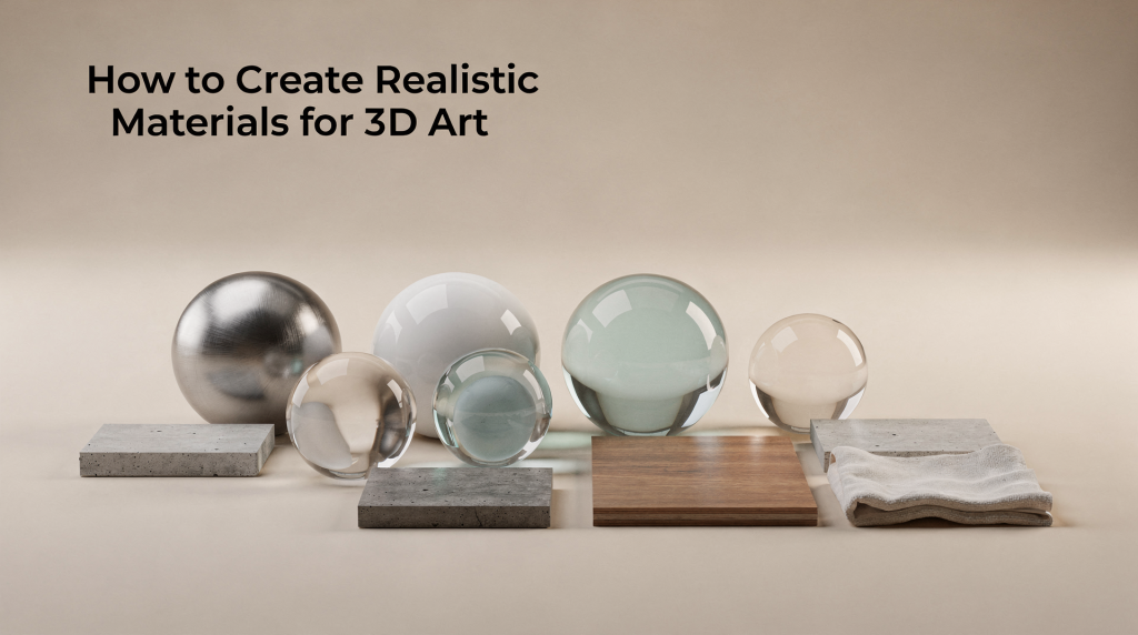
A perfectly modeled chair with flawless topology can still look like a cheap toy if the surface reads wrong. I’ve seen junior artists spend days on geometry only to slap on a flat color and wonder why the render falls apart. The truth is, materials do most of the storytelling in 3D. They tell the viewer what something is made of, how old it is, whether it’s been touched, cleaned, neglected, or polished. Getting that right isn’t about piling on texture maps — it’s about understanding how light interacts with a surface and then recreating that behavior with precision and restraint.
## Why material realism matters
In 3D art, materials carry the visual weight of the entire scene. A wall, countertop, floor, or fabric surface becomes convincing when its color, reflection, and micro-detail respond to light in a physically plausible way. In practice, realism usually comes from small things: roughness variation, subtle imperfections, correct scale, and texture maps that work together instead of fighting each other.
For architectural visualization, this matters even more. Interior and exterior renders are judged quickly and emotionally, so a material that feels slightly off can break the whole image. I’ve had clients reject otherwise solid renders because the wood floor looked “like laminate” or the concrete read as “painted drywall.” They couldn’t articulate the technical problem, but they felt it instantly. The good news is that most realistic materials follow the same core logic, and once you internalize that logic, you can apply it to anything from aged brass to weathered oak.
## The core idea: materials must react to light, not just look detailed
A realistic material is built around how it reflects light under different conditions. That means the surface should have:
– a clean base color
– believable reflectivity
– accurate roughness
– surface detail at the right scale
– imperfections that make it feel used, not manufactured in a vacuum
I’ve learned this the hard way. Early in my career, I’d build materials that looked stunning under my studio HDRI but fell apart the moment I dropped them into an interior scene with warm artificial lighting. The wood became too orange, the metal lost its definition, and the fabric looked flat. If a material looks good only in one lighting setup, it is probably too dependent on the render environment and not physically consistent enough. A truly robust material should hold up whether it’s hit by harsh midday sun or soft bounced light in a shaded corner.
## The essential PBR maps you need
Most realistic materials are built using a PBR workflow, which means the shader uses separate maps to describe different surface properties instead of guessing everything from one texture. This separation gives you granular control and keeps the material physically consistent across different lighting scenarios.
| Map | What it controls | Practical use |
|—|—|—|
| Base Color / Albedo | The true surface color | Paint, wood tone, fabric color, stone coloration |
| Roughness | How sharp or blurry reflections are | Matte walls, polished marble, worn metal, plastic |
| Normal | Small surface relief without extra geometry | Scratches, seams, pores, grain, embossed detail |
| Height / Displacement | Physical depth variation | Bricks, carved details, deep grout, tile relief |
| Metallic | Whether the surface behaves like metal | Steel, brass, aluminum, chrome |
| Ambient Occlusion | Soft shadowing in creases and recesses | Adds depth in cavities, corners, grooves |
### Base Color is not a shadow map
A common mistake is baking lighting into the color texture. I see this constantly in downloaded assets — textures with dark gradients where shadows would fall, or bright spots where highlights should be. Base Color should describe the material itself, not the way the scene is lit. If shadows or highlights are painted into it, the material will look dirty, flat, or overworked once proper lighting is added. Your render engine already calculates light and shadow; don’t fight it by pre-baking that information into the albedo.
### Roughness is often the real realism-maker
Roughness controls how reflections spread across the surface. Smooth surfaces create sharp reflections; rough surfaces scatter them. In many materials, a subtle roughness map does more for realism than a high-detail color texture. I’ve taken flat, unconvincing materials and transformed them entirely just by replacing a uniform roughness value with a varied map. The difference is immediate: suddenly the surface has history, wear patterns, and tactile quality. A polished concrete floor with perfectly uniform gloss looks like plastic; the same floor with subtle roughness shifts near doorways and high-traffic zones reads as real.
### Normal maps create detail without heavy geometry
Normal maps fake surface detail by changing the way light hits the surface. They are ideal for scratches, fabric weave, pores, grooves, and other fine details that would be expensive to model. They do not add real geometry, but they make a simple surface read as complex. In architectural work, I use normals extensively for things like wood grain, textile patterns, and micro-texture on stone — details that would be impractical to model but are essential for believability.
## Step-by-step workflow for building a realistic material
### 1. Start with the real-world reference
Before opening your shader, gather references. Look for:
– close-up photos of the actual surface
– examples in neutral daylight
– worn and clean versions of the same material
– reference at the correct scale
A brick wall, for example, is not just red rectangles. It has mortar variation, edge wear, roughness shifts, and subtle color noise. I keep a reference library organized by material type, and I’ll often spend ten minutes studying how light catches the surface at different angles before I even launch my 3D software. This observation step saves hours of trial and error later.
### 2. Identify the material category
Every material behaves differently, so decide what you are making first:
– dielectric materials: wood, fabric, paint, plaster, stone, glass
– metal materials: steel, copper, aluminum, brass
– mixed materials: painted metal, coated plastic, lacquered wood
This matters because metal and non-metal surfaces do not use the same logic. For example, bare metal relies heavily on metallic response, while wood and fabric should stay non-metallic. I’ve seen artists set metallic values on wood because they wanted a “shiny” look, and the result was physically nonsensical. Shininess comes from low roughness, not from metallic properties.
### 3. Build the base color first
Keep the base color simple and physically believable.
Good base color habits:
– remove shadows and highlights from the texture
– avoid over-saturated colors
– keep color variation subtle and natural
– respect the material’s real-world palette
If the base color is too dark or too colorful, the render can become stylized even if the shader setup is technically correct. I usually desaturate my base colors slightly more than I think I should — render engines tend to amplify saturation under certain lighting conditions, and a slightly muted albedo often looks more natural in the final image.
### 4. Add roughness variation
This is where many materials become convincing.
Think about how the surface is actually used:
– glossy areas where hands touch
– matte areas exposed to wear
– dull patches from dust or aging
– uneven sheen from cleaning, coating, or weathering
A perfectly even roughness map often looks fake. Real materials are rarely uniform across their surface. In interior renders, I pay special attention to roughness around door handles, light switches, countertop edges, and floor paths — these are the contact points that accumulate wear and tell the story of how a space is lived in.
### 5. Add normal detail with restraint
Normal maps should support the material, not overwhelm it.
Use them for:
– grain in wood
– weave in fabric
– fine scratches on metal
– pores in leather
– tiny bumps in plaster or concrete
Avoid using overly strong normals on surfaces that should stay soft or subtle. Too much normal intensity is one of the fastest ways to make a material look game-like or exaggerated. I typically set my normal strength lower than the default and increase it only if the surface genuinely needs more definition at the intended viewing distance.
### 6. Use height or displacement only when geometry must be seen
Height maps are useful when the shape itself matters visually:
– bricks
– tiles
– engraved patterns
– deep seams
– chipped surfaces
If the detail is shallow, normal maps are usually enough. Use displacement only when the camera gets close enough to benefit from true depth. Displacement is computationally expensive, and in architectural scenes with dozens of materials, unnecessary displacement can tank render times without visible benefit. I reserve it for hero assets and surfaces that will be seen in close-up.
### 7. Finish with edge wear and imperfections
Real surfaces are rarely pristine. Add small flaws like:
– dust
– fingerprints
– edge wear
– smudges
– scratches
– micro-variation in gloss
These details are especially important in architectural visualization, where too-clean surfaces often look synthetic. A luxury interior still needs imperfections; it just needs controlled ones. The key word is “controlled” — a high-end residential render shouldn’t look like an abandoned warehouse, but it should have enough subtle wear to feel inhabited rather than rendered.
## Practical material recipes for common surfaces
### Wood
Wood becomes believable when the grain matches the scale of the object and the roughness is slightly varied.
Use:
– warm but restrained base color
– directional grain in the normal map
– slightly glossier worn edges
– subtle color shifts between planks or boards
Avoid overly visible grain on small objects. A chair and a floor plank should not use the same grain intensity. I’ve seen renders where a dining table had grain lines thick enough to belong on a barn door — the scale mismatch immediately signals that something is wrong, even to viewers who don’t know why.
### Concrete
Concrete usually works best with low saturation and strong micro-variation.
Use:
– muted gray base color with subtle tonal noise
– fine bump or normal detail
– patchy roughness
– slight discoloration or staining
Concrete that is too uniform looks like painted plastic. In my architectural work, I often layer subtle noise patterns into the roughness channel to break up the surface — real concrete has tiny air bubbles, trowel marks, and curing variations that catch light differently across the surface.
### Metal
Metal needs a convincing relationship between roughness and reflection.
Use:
– correct metallic value
– sharp but controlled reflections
– scratch patterns in the roughness map
– edge wear where appropriate
Polished metal should show clearer reflections, while brushed or oxidized metal should scatter them more. One trick I use for brushed stainless steel in kitchen renders: a subtle anisotropic roughness pattern that follows the brushing direction. It’s a small detail, but it makes the difference between metal that looks like a generic gray surface and metal that reads as actual steel.
### Fabric
Fabric realism depends on weave scale and softness.
Use:
– low-shine, non-metallic response
– fine weave in the normal map
– roughness variation based on thread direction
– soft color breakup, not hard contrast
Overly strong highlights usually make fabric look like synthetic vinyl. I test fabric materials by checking how they respond to a strong key light at a glancing angle — if there’s a harsh specular hotspot, the roughness needs adjustment. Real textiles scatter light softly, and your shader should reflect that.
### Glass
Glass is mostly about correct material behavior rather than texture richness.
Use:
– transparency and proper refraction
– very subtle roughness if the glass is imperfect
– dirt, smudges, or edge irregularities only when needed
Clean glass should not be overloaded with texture maps. The realism comes from how it interacts with light and the environment. I often see beginners piling roughness maps and normal details onto window glass, which just makes it look frosted or dirty. Architectural glass in a clean, modern interior should be nearly invisible — its presence is felt through subtle reflections and slight edge distortion, not through surface texture.
## Common mistakes that make materials look fake
| Mistake | Why it fails | Better approach |
|—|—|—|
| Painted-in shadows on the texture | Breaks physically based lighting | Keep base color clean |
| Too much contrast in roughness | Creates artificial-looking reflections | Use subtle variation |
| Overpowered normal maps | Makes surfaces look noisy or game-like | Reduce strength and check scale |
| Repeating texture patterns | Reveals tiling and kills realism | Break repetition with variation |
| Wrong material scale | Makes wood grain or fabric weave look off | Match texture scale to object size |
| Every surface is too clean | Removes believable wear | Add controlled imperfections |
| Using one material for everything | Creates a generic look | Customize materials by surface type |
## How to test whether a material is realistic
A material should be tested under different lighting conditions, not just the setup where it was built. I keep a test scene with multiple light rigs — neutral daylight, warm interior, harsh directional — and I run every new material through all of them before approving it for a project.
Check it in:
– neutral daylight
– strong directional light
– soft interior lighting
– close-up camera views
– wide shots where scale matters
Ask these questions:
– Does the material still read correctly when the lighting changes?
– Are reflections believable?
– Does the roughness feel natural?
– Is the texture scale appropriate?
– Do the imperfections support the story of the object?
If the answer changes wildly from one lighting setup to another, the material probably needs refinement. A physically consistent material should look different under different lighting — that’s expected — but it should never stop looking like the material it’s supposed to be.
## A simple checklist before you call a material finished
– The base color is free of baked lighting
– Roughness varies naturally across the surface
– Normal detail matches the material scale
– Metallic surfaces use correct metal behavior
– Imperfections are subtle but present
– Texture repetition is not obvious
– The material looks believable in both close-up and wide render views
– The surface still makes sense under different lighting setups
## Working smarter: when to create, when to reuse, when to tweak
Not every material should be built from scratch. In a typical architectural project, I might have sixty materials in a scene, and building each one from the ground up would be inefficient and unnecessary.
Use a custom material when:
– the asset is hero-level and camera-facing
– the surface is unique to the project
– close-up detail matters a lot
Reuse a library material when:
– the object is secondary
– the material is common, such as generic concrete or matte paint
– the scene needs speed and consistency
Tweak an existing material when:
– the base shader is right, but the color or roughness needs adjustment
– you want the same material to appear aged, polished, wet, or dusty
This approach is especially useful in architectural visualization, where many materials repeat across a project but need slight variation to avoid a flat look. A single wood floor material, for example, can be duplicated and subtly adjusted for different rooms — slightly glossier in the living area, more matte in the bedroom, slightly warmer near the windows. These small variations add up to a scene that feels considered rather than copy-pasted.
## Final thoughts
Realistic materials come from observation, restraint, and control. The best results usually do not come from adding more and more texture maps, but from making each one work cleanly and purposefully. I’ve spent years learning that less is often more — a material with three well-crafted maps will almost always outperform one with eight sloppy ones.
If a surface has the right color, believable roughness, subtle micro-detail, and realistic wear, it will hold up in almost any render. That is the difference between something that looks textured and something that looks real. And in architectural visualization, where the goal is to make unbuilt spaces feel tangible and livable, that difference is everything.
## FAQ
### What makes a material look realistic in 3D?
A realistic material responds to light in a physically believable way. The biggest factors are correct base color, roughness variation, appropriate normal detail, and subtle imperfections. When these elements work together consistently across different lighting conditions, the surface reads as genuine rather than computer-generated.
### Do I always need all PBR maps?
No. Some materials need only base color, roughness, and normal maps. More complex surfaces may also need height, metallic, or ambient occlusion. The key is understanding what each map contributes and using only what the specific material requires — adding maps just to fill shader slots usually introduces noise without improving realism.
### Why does my material look too plastic?
Plastic often happens when roughness is too even, reflections are too sharp, or the surface lacks small imperfections. Adding subtle variation usually helps. In my experience, the most common culprit is a uniform roughness value — real surfaces have micro-variation that breaks up reflections naturally, and replicating that variation is often the fastest fix.
### Should I bake lighting into the texture?
No. Lighting should come from the scene, not the texture. Base color should stay clean so the material works under different conditions. Baked lighting locks the material into one specific scenario and makes it unusable in any other context — it’s a shortcut that creates more problems than it solves.
### What is the biggest mistake beginners make?
The most common mistake is overworking the material. Too much contrast, too much normal strength, and too much repetition usually hurt realism more than they help it. I see beginners cranking every slider to maximum, thinking that stronger equals better, when in reality the most convincing materials are often the most restrained ones.